That’s it!
I added a comment for clarity
That’s it!
I added a comment for clarity
manny being a porygon collector is so damn fitting

I am a pory collector for the psychadelic and cerebral qualities however
(I’m gonna figure this extension thing out, I too do not want notifications for unread or new threads)
I am increasingly convinced that e4 could start its own country. We have such an eclectic group of professionals here.
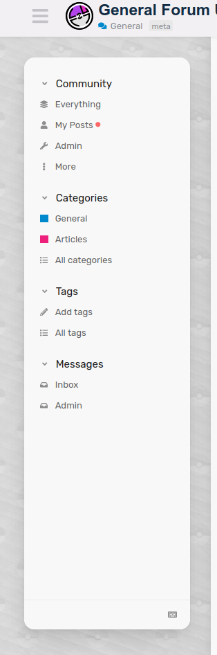
I’m interested in feedback on the new sidebar feature (desktop only). It is the same as the hamburger dropdown but persists on the side of the screen (and is collapsible). I’ll leave it up for a week minimum so we can get a good feel on it. The benefit is that it uses a lot of the horizontal deadspace present on most desktops. I have future plans for other things that could also fill up that space
I don’t really like it, mainly because it shifts thread bodies (and the main forum navigation as well) to the right and makes them off-center quite a bit. I think if that were fixed it wouldn’t be as intrusive.
Something like this and other style-based choices are a relatively easy fix. I personally don’t like that the height isn’t 100% but similarly, an easy change to make.
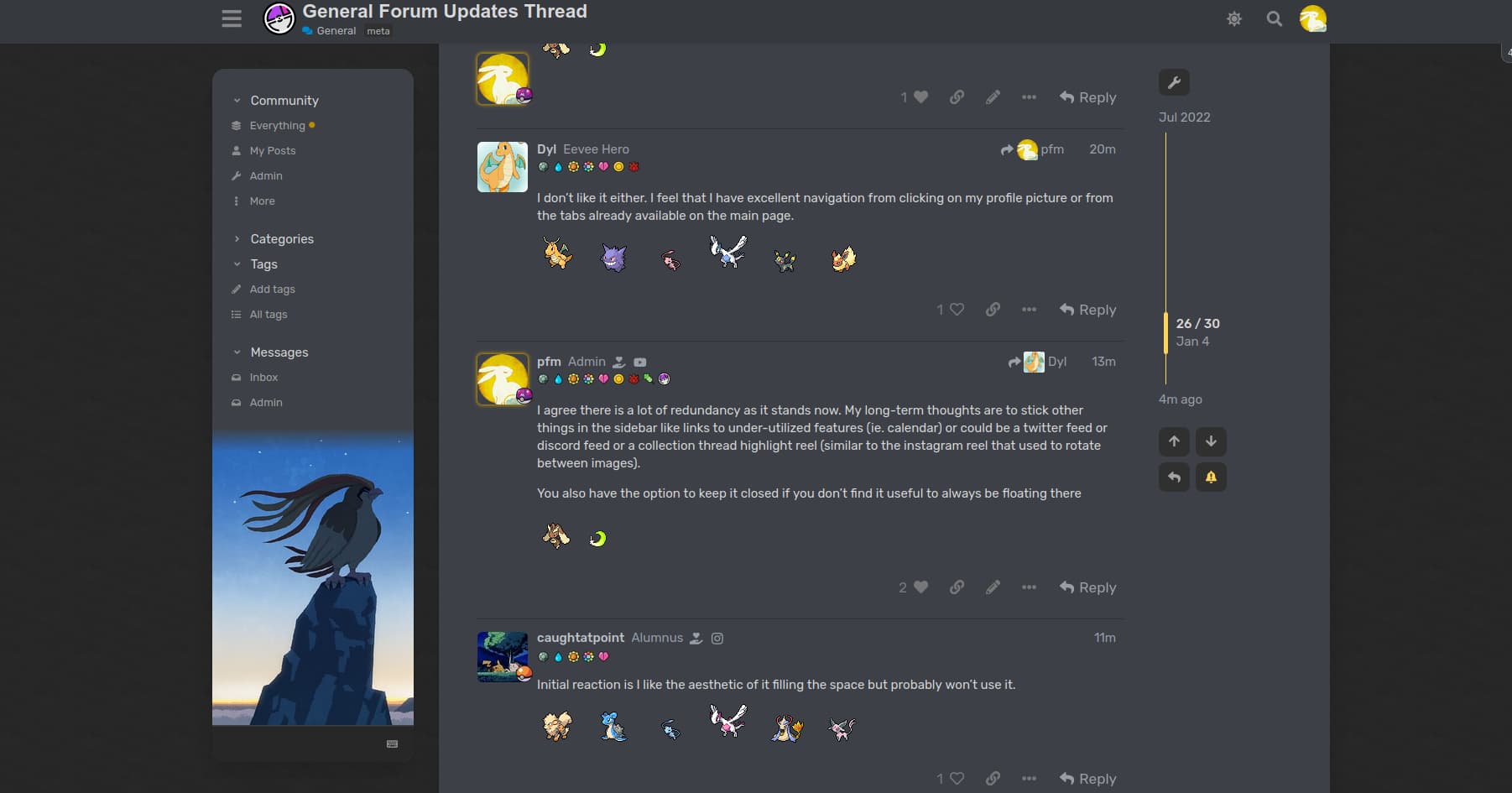
I don’t like it either. I feel that I have excellent navigation from clicking on my profile picture or from the tabs already available on the main page.
I agree there is a lot of redundancy as it stands now. My long-term thoughts are to stick other things in the sidebar like links to under-utilized features (ie. calendar) or could be a twitter feed or discord feed or a collection thread highlight reel (similar to the instagram reel that used to rotate between images).
You also have the option to keep it closed if you don’t find it useful to always be floating there
Initial reaction is I like the aesthetic of it filling the space but probably won’t use it.
I love this. I think additional functionality or features would be great but I’m a sucker for a nice aesthetic.
I like the function of it but I agree with @fourthstartcg re: about it making things off-center.
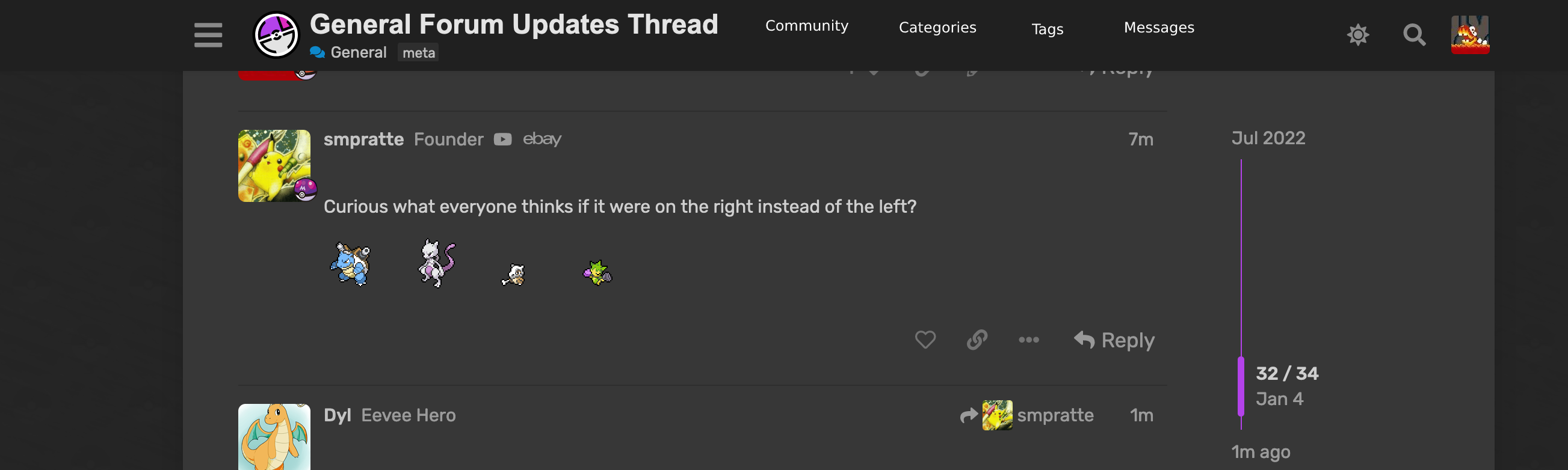
Curious what everyone thinks if it were on the right instead of the left?
What if the Community, Categories, and Tags tabs were put below the Profile tab? This would put everything in one place, with a single click to your profile picture.
I’d like to put @pfm to work and give us the option of moving it to the right, as well. ![]()
I don’t know why it’s a thing but I think most sidebars are always on the left. I don’t know that I can recall one that has it on the right ![]()
what if it was included in the menu up top but when you roll over each column (Community, Categories, Tags, Messages), you get a drop down with the other sub-menus for each of those categories? (very quick reference mock attached)
that way is saves space, keeps everything centered, and only interacts with the user when they roll over?
(indecisively) Move it to the right. Mm, no, how about the left? Actually I think I liked it better on the right! Hmm, now that it’s back on the right I’m wondering if the left had a certain quality—
I have efour open on my second monitor which is located to the right of my laptop. It shifts over the threads so I have to mouse over farther than I’d like. That being said, I probably won’t use it even if it were on the right side vs the left side of the threads. I do like how you can collapse it though so it goes back to normal.
When I use efour I have it default to the latest posts section, so the other sections I rarely ever go to, save for the search feature sometimes.
me irl