New here and just got back into collecting last year with 151.
I’m wanting to buy some e-series-era cards and a lot of the pictures I’ve seen of the holos make it seem like the background art isn’t visible through the holo layer/pattern. Just wondering if this is the case when the cards are in-hand because I’d like to see all the background art on, say, the Umemoto cards and others. It would also allow me to save a lot of money since the holos are pretty expensive.
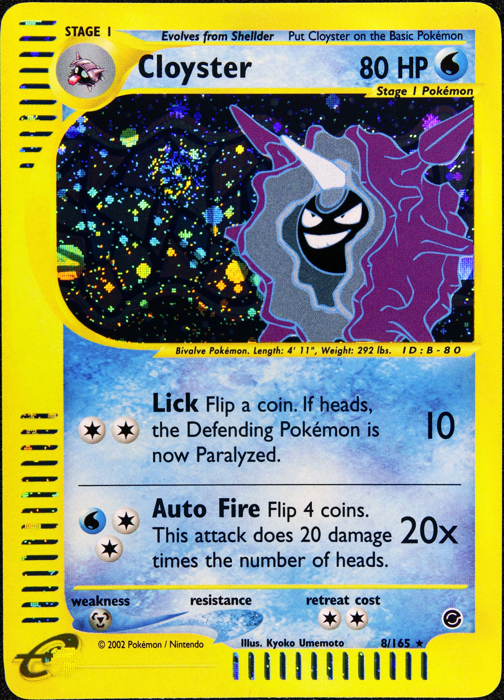
If the background art is important to you, I would recommend getting the non-holos. The cosmos holo layer can often mask the background art.
To get a pretty close perspective of the cards, I would recommend using this website and typing in the sets that you are interested in. The darkness of the background is pretty accurate to what you would see in person.
Too bad about some of the holos, I’d love to have some sparkling cards, but the styles of Umemoto and Komiya don’t suit it, to me. I really would like to see all the line work and background lighting. Also, the really delicate wheat field on the sides of the Mew card are totally drowned out.
I think the only holos I’ll go for are Clefable and Dragonite.
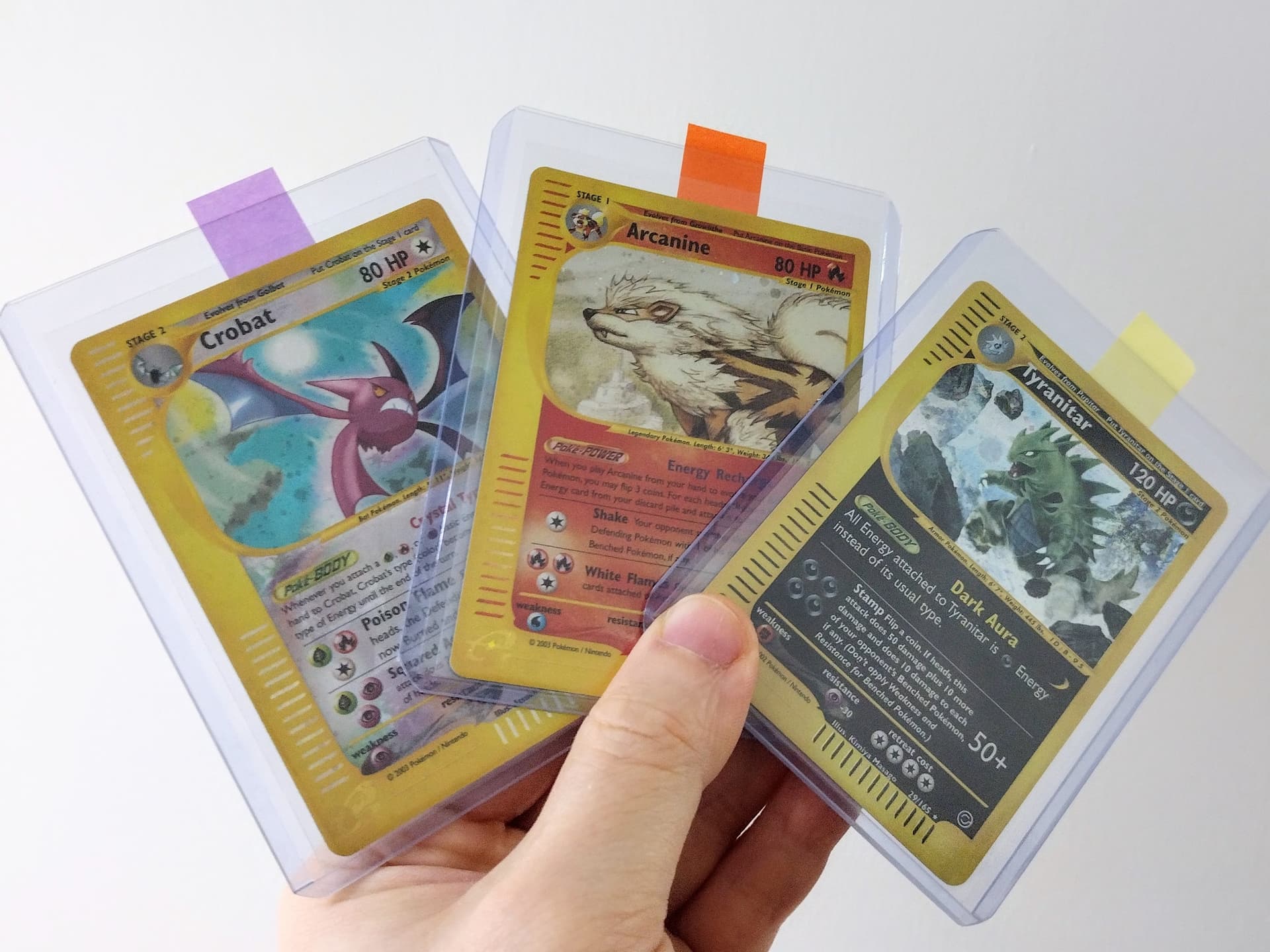
It’s also very much dependant on the lighting of the photograph. I think my current setup makes the holo completely overpower the background for some of these cards, but when you have them in hand it’s not as bad. Here an example you can compare to the pkmncards version:
Thank you for the photo, that makes things more difficult because of course I’d rather have the holo cards, but the Japanese ones are much more expensive on ebay than their non holo counterparts.
You’ll always find holos to be more expensive than their non-holo counterparts, especially from sought after sets like E-Series.
A good middle ground might be to have a look at English reverse holos; they still have some shine, but are a lot cheaper than regular holos and give a clear view at the artwork.