Are there really only 30? What evidence shows this?
Information from Rusty’s Production Manager contact:
“Three full press sheets were printed with the WB movie logo foil upside down before the error was caught. Two press sheets were destroyed. The other sheet was slit and round-cornered and sent to production. That means that there were 30 each of the 4 pokemon cards with the upside down foil and there was a blank in the bottom right corner that had NO black or color printing, had the yellow border only and the foil stamp. I only received 5 of each error card. Don’t know where the others ended up.”
I want that.
It’s been a while since I last updated this thread. So let’s get back into it.
Gem Mint 1995 Topsun Green Back Charmeleon

Appeal of Artwork *
It’s stock art, and the background is pretty boring but I do like how it goes throughout the card.
History of Card ***
It’s something special to be the first of something. So you know you have to give the history a bit of a bump when you’re dealing with the 1st Pokemon card to be produced, even if it’s technically the 3rd print run.
Cards Rarity **
Mass produced card sure and Green backs are the most common of the three 1995 topsun cards, but it’s not an easy find especially in Gem Mint condition.
I love cards that come from the earliest years. It’s always fun to get to tell people that there really was pokemon before 1999-2000. Haha.
Nice post! I always passed these cards up over the years but need to get them for that early concept art. The charmander with the spike on its back is one of my favorites.
1 Like
I’ve posted quite a bit non TCG, so I have to break that chain.
Gem Mint 1st Edition Fossil Gengar (non holo)

Appeal of Artwork ***
I really enjoy the little details in Gengar, has anyone notice that his eyes aren’t looking in the same direction?
History of Card ***
Not much to report, simply a card that’s part of the third expansion.
Cards Rarity *
Mass produced card, what more can I say?
1 Like
When I was about 8, there was a Japanese student who had transferred to my class. He also collected Pokemon but he had Japanese cards that none of the other kids in the playgroud had ever seen before. He was shuffling through them and I saw the holographic version of this card.
13 years later, it was the memory of that sparkly card that brought me back. This is what Pokemon really comes down to for me - accessing the excitement of my 8 year old self. If a card can’t do that, I have no interest in collecting it.
You have a great collection @cullers and this post is exceptional. I couldn’t like it any more.
2 Likes
After eleutherarch post it’s made me really want to post up a bunch more under appreciated cards.
Gem Mint 1st Edition Fossil Recycle
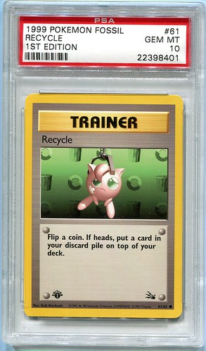
Appeal of Artwork ***
It’s got everything I’m looking for minus the entertaining background.
History of Card **
Another card for the third expansion.
Cards Rarity *
Do I need to explain this ranking?
2 Likes
Gem Mint 1st Edition Jungle Tauros
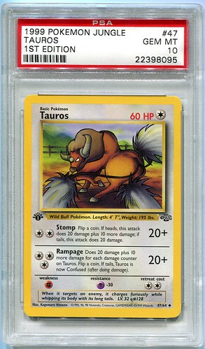
Appeal of Artwork ****
Another interesting artwork to only have it knocked down a peg, because of my character fitting with the background rule.
History of Card **
See the above only for the second expansion instead of the third.
Cards Rarity *
I’m going to stop writing text for these mass produced cards with only one star rankings.
Gem Mint 1st Edition Jungle Exeggcute

Appeal of Artwork **
Cool character design but that’s it.
History of Card **
Second expansion
Cards Rarity *
Gem Mint 1st Edition Base Dugtrio (Thick Stamp)
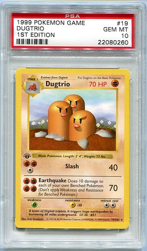
Appeal of Artwork ****
One of the benefits to the computer generated design is as long as you make the character and background both the card will automatically get a high ranking, but more could be done to the background to make it more appealing.
History of Card **
You know already.
Cards Rarity *
1 Like
Gem Mint 1st Edition Base Nidoran (Thin Stamp)
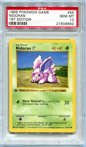
Appeal of Artwork **
Stock art, on a not so thrilling background.
History of Card ***
Not much to report, simply a card that’s part of the third expansion.
Cards Rarity *
I’m sure some are going to ask how I define the thick and thin stamp for non holo cards, considering there isn’t the same visual difference between the holo and non holo cards. It’s hard to explain unless you look really close to the stamp. Here’s two very close images to both the Nidoran and Dugrio I’ve posted above.

If you look you can see two portions of the stamp, the actual ink used for the stamp, and an outline for the E_ITION. I’m not sure as I wasn’t around for the card printing process, but I think the E_ITION was put onto the card by Wizards, then the card was taken to the 1st edition stamping process and used the E_ITION as an guide to where the stamp would go. This would explain why the Ghost Pikachu error exists. It should be noted that holo cards don’t have the E_ITION outline on them.
So back to the original explanation, I decided to take the cards that have their stamps off centered to the E_ITION line and considered them Thin stamps, and any that are almost completely centered Thick stamp variants. This is of course completely unofficial and only a product of my own doing but I felt the explanation was needed.
1 Like
Great posts - keep them coming. I also didn’t know a lot about how Thin/Thick was differentiated so cheers for that.
How would you rate the Base Set Abra artwork? It’s probably in my top five favourites. The night sky, savannah-like background just looks so peaceful.
It’s funny I was on the verge of grading a German first edition copy of Recycle too but then didn’t because I wasn’t too positive about it getting a 10. The card is amazing I love its artwork and even with its simple background I think the colours match beautifully. There will be people who cannot understand this because it’s not an expensive card but like you said before sometimes it’s much more satisfying to appreciate the artwork and not the price!
I would love to have this card graded PSA 10 in my collection too one day!
So many classic cards! This is really taking me back ![]()
Jigglypuff’s expression and emotion shown on Recycle is pitch perfect, talk about perfection right there! So melancholy in its body language, right down to the way its head thing swirls, and the placement of its limbs.
Also really cool info about the 1st edition stamps, it does very much look like the printed them like the ghost Pikachu first then the stamp was stamped on top. Really neat!
Thanks again for sharing ![]()
Great post on the differences in the 1ED stamps. I had no idea until now…
Have you found a 1st Ed Base Dugtrio with that Nidoran stamp or a Nidoran with that Dugtrio stamp?
I thought thick and thin referred to the thickness of the “1” in the stamp?
1 Like