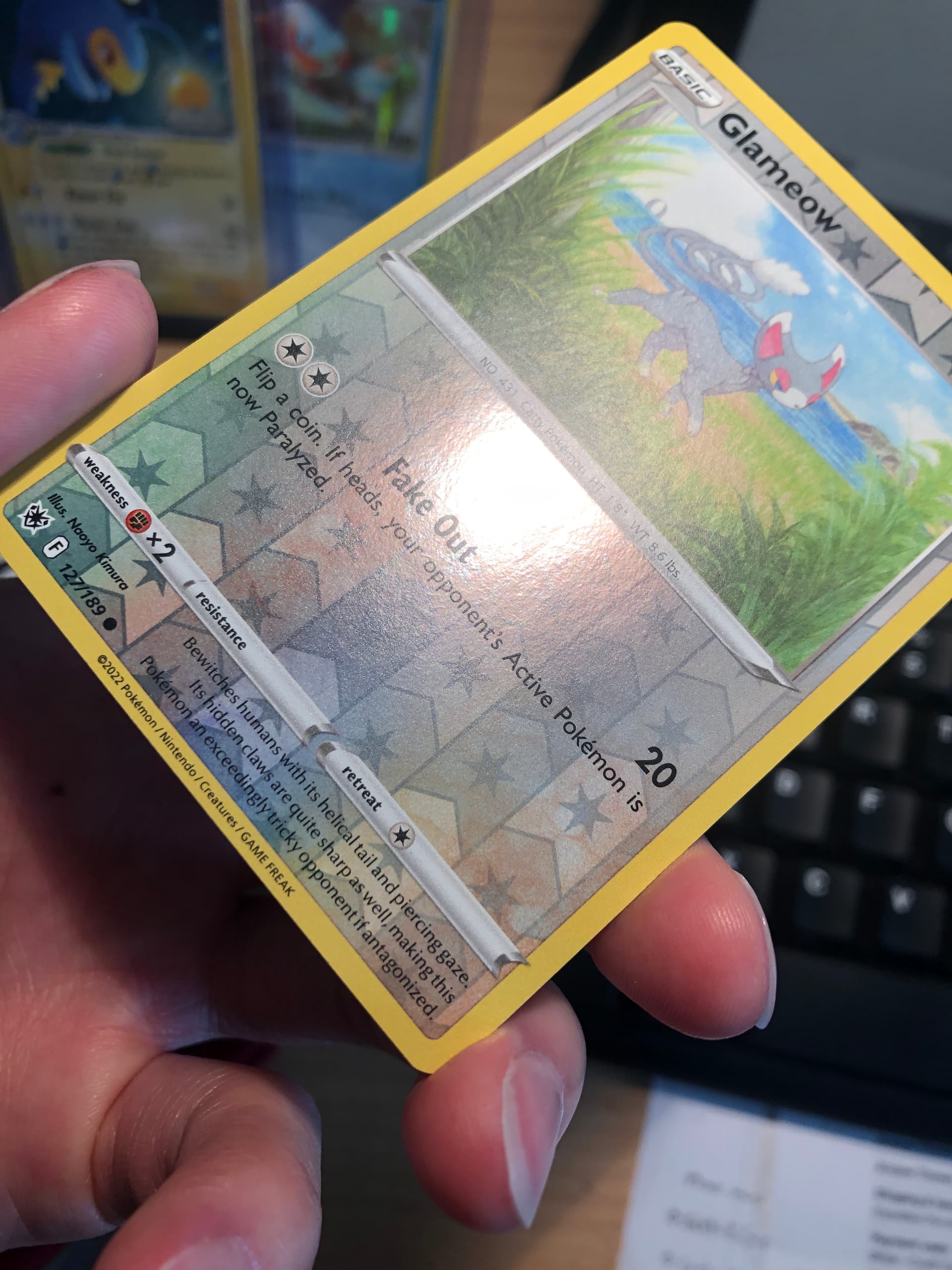
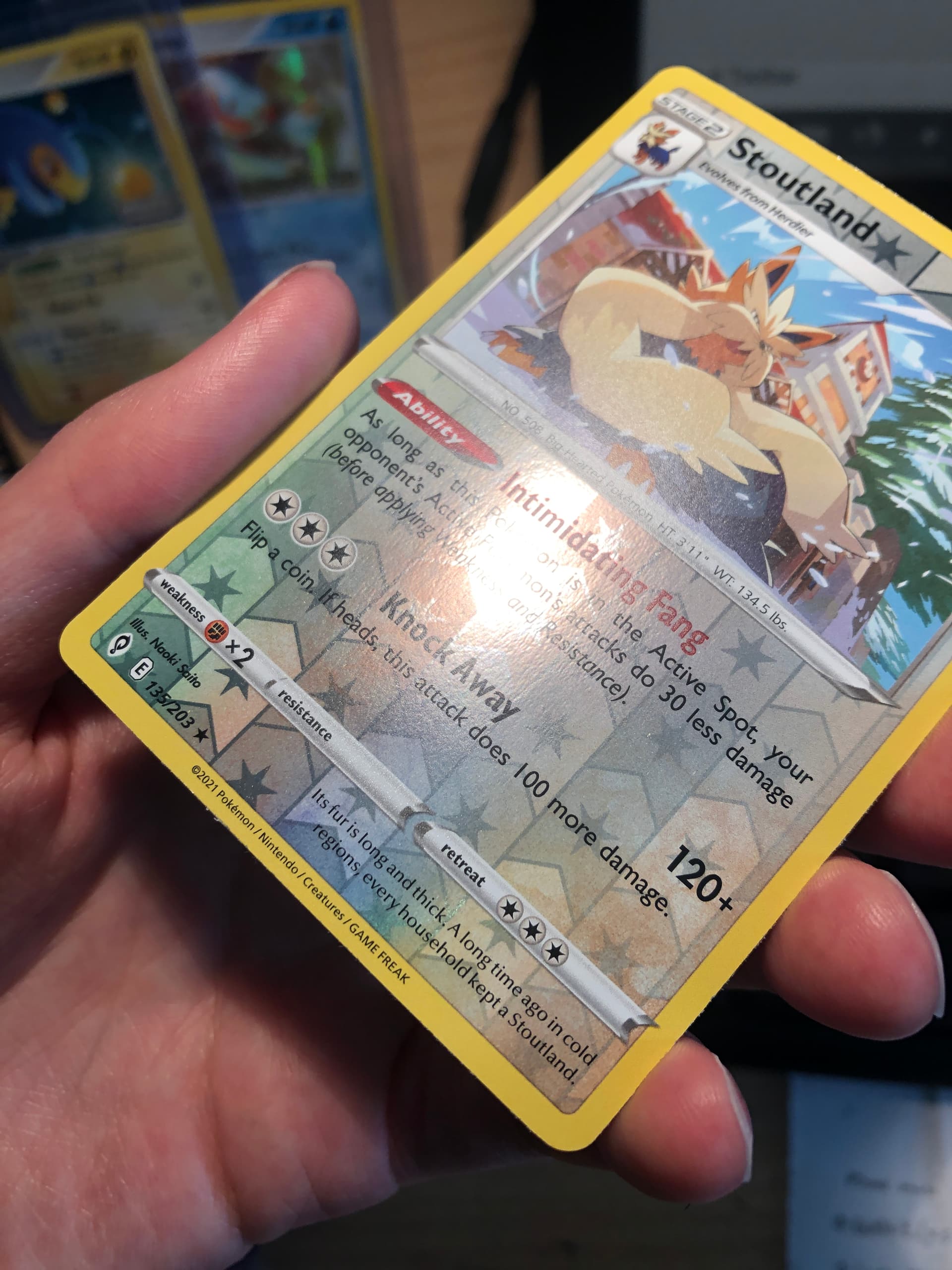
I have been inspecting reverse holos in bulk for my binder collection and noticed that the quality of the card stock for some are quite unacceptable.
From what I can gather, bad quality reverse foils were printed only between vivid voltage to lost origin, with chilling reign, fusion strike, and astral radiance having the highest rate of bad prints. In fact, I have not seen a single copy of an astral radiance reverse holo with good print quality.
Albeit being pack fresh, bad quality card stock will cause the reverse holo to:
Lose the gleam it has on the front (and back to a lesser extent)
Lose the smoothness it has on the back
Often have whitening on edges
Sometimes have scratches
Has anybody else noticed this issue? If you have a astral radiance reverse foil, just compare it to one from an older SWSH set like rebel clash under the light and you should see a big difference in gleam.
Now I am practically begging for TPCI to reprint astral radiance so that good quality reverse holos actually exist…I need that Saitou Shaymin reverse in good condition!!
I noticed this on most of the Celebrations stuff I opened. Seems like the reverse holos were all marred with print lines. Might have just been my bad luck, but they were pretty rough. Some cards were also legit damaged as well, usually on the corners or edges.
I’m sure you’ll find something good eventually. Modern still has much better production quality than a lot of vintage cards did.
Celebrations cards I have (from 1st print run) have pretty bad print quality too, but not as bad as astral radiance. Also, the front isn’t fully holo, so it is harder to tell. I can still find some decent scratch free copies so .