I found theses cards in a lot i bought to an old player.
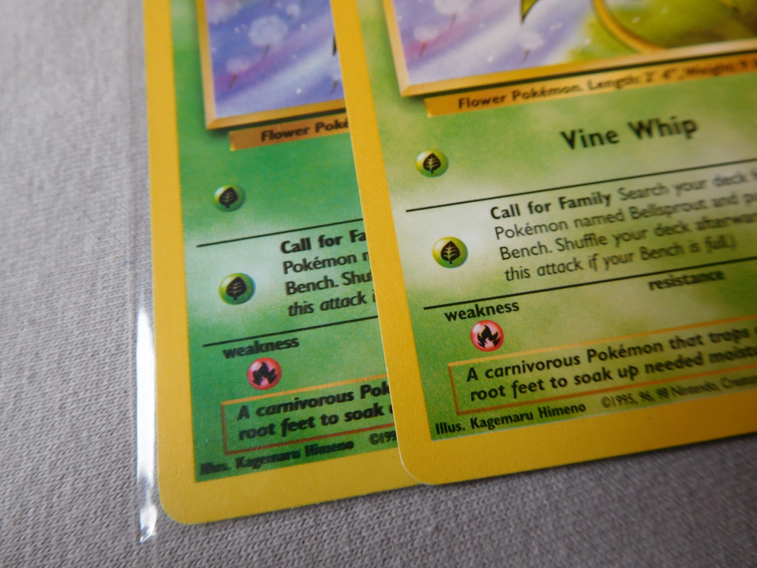
The cards are mint, back are real and patter holo also but as you can see they looks more grey than the common cards from this set and also the font is just thinner.
Do you think it’s common, fake cards ? ^^, missprint ? Any advise ?
Yes they are light i agree but the back are 100% same and also the patern holo just impossible that s a fake and theses are also same patterns holo than the french cards i have.
Well, more i look the cards more i see that is fade is all concrning the black ink and i wonder if they didn’t meet a problem of black ink for theses card cause the red is red , yellow is yellow it s just the black became like grey and also about the font there wasn’t enought ink …it s a supposition but maybe not so stupid like that.
At first I thought it might have to do with low on black ink, but then it would actually be grey instead of black, instead of thinner font.
I have some cards which were low on black ink, like these EX Holon Phantoms grey prints I own at the bottom (sorry for the bad picture, the only one I could find right now).
And some other pictures:
The grey Surfing Pikachu at the top here (not mine unfortunately):
Or this Dark Gyarados from the Team Rocket set as well (also not mine):
Maybe cards by default are printed twice, and it only happened once with your cards? I do know some cards where the black is thicker than normal because they printed it an additional time, like these Base Set 2 cards I own myself:
And also those where the black parts are misaligned with the rest of the card (not mine again):
Anyway, color differences happen pretty often, although I must say your cards do look kinda extreme. I’m unfortunately unable whether they are real or fake. If they are fake, they are done very well. But I have the feeling they are real and something went wrong during the printing process.
I actually have some very comparable cards in Yu-Gi-Oh, where the font and thickness of the font also doesn’t match every other card released and look rather weird. Those I know for fact they are real though, since I’ve pulled them myself from a legit deck. I currently don’t have pictures of those Yu-Gi-Oh cards, but might post them later on to show. Although they are non-Holo, the weird difference of the text which almost looks like a different font is very similar as your cards, and also very noticeable every time I look at those cards.
So although it’s still possible they are fake. I’m by no mean an expert in determining real vs fake and can only identify the obvious fake-indicators. But it’s plausible they are indeed real, and something weird happened during the printing process.
The way wotc pokemon cards used to be printed was digital print for the majority of the card, then black ink for for the blacks (and text), and a yellow spot for the frame. In these cases something went wrong with the black ink, yes.
When you see the blacks misaligned, thats what you in graphic design and print terminology call color shift. When you’re not doing digital print, but a 4 color CMYK offset print like for newspaper, its quite common for the different color plates to hit slightly different, as you print at very high speed with low thresholds for error.
Why do you think WOTC cards were not done on an offset printer? Offset is optimal for larger volumes of printing. MTG is done on an offset printer www.misprintedmtg.com/how-mtg-is-made
Pokemon cards also display many of the errors you’d expect to see from an offset printer
You can tell from the low resolution dot raster, typical of older digital print with powder ink burnt to the surface with lasers, or simply using film. Hence the big difference between the yellow frame/blacks and the rest of the card. Its typically used in printing processes where you have a lot of similar product with small variations, compared to offset where you rapidly print out a ton of identical product, with less importance placed on accuracy and sharpness, since a bit of color shift is to be expected. I have yet to see any pokemon cards with color shift, other than the blacks being shifted. Youd have a ton more color shift errors if the entire card was printed in offset, bc of the amount of thin lines and delicate details.
You can tell the difference yourself, if you compare the color surface of the yellow frame with the yellows in the rest of the card. The frame has a more uniform, organic texture to it which comes from offset ink plates, while the yellows in the rest of the card have a digital print dot raster.
These other cards in the thread is also a great example, the little black that does appear in the cards is from the digital print part of the process. They then do a layer of black offset over it to make the text more legible, as well as make the rest of the card deeper with more contrast.
I havent seen mtg cards up close personally, but they look more like low dpi cmyk web offset like a lot of newspapers tend to do. The errors you linked can come from offset but also from digital print using film and not powder.
This is just speaking from experience by working as a graphic designer for print, and having visited a fair bit of printing houses, and knowing how to prepare designs and files for print. I might be wrong, and they somehow chose to use low dpi offset for the layout of the card and then 2 extra plates of either spot or higher dpi. Its just usually you see color shift as the single most common print error in offset by far, and i havent seen that in any pokemon cards yet. Which is weird considering how delicate some of the details are design wise.


