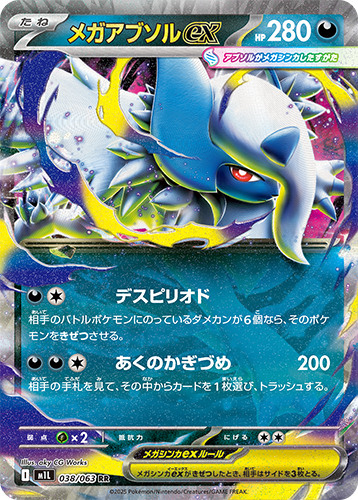
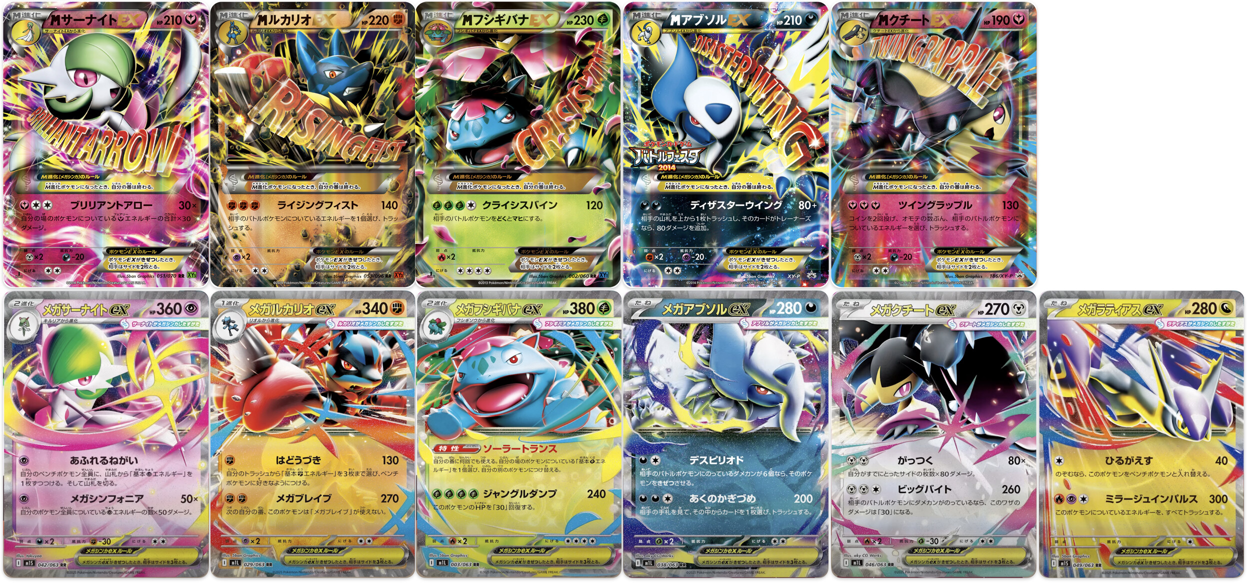
I’ve seen a lot of people online compare these to the old mega card designs as worse, but they’re growing on me already. It’s a cleaner look while still staying unique even as half arts, and I really like the name and ex font coloring.
It will likely look a lot better in person with its partial texture and glitter. Unlike XY, the textbox is translucent so you can observe the entire Pokémon as a faux full art
5 Likes
For me it’s mixed.
Dislike how much less emotion each Pokemon shows on the new cards. The old CGI was much more expressive.
but
Love the cleaner aesthetic of the cards and that awful graphic of the signature attack is gone.
I’m just waiting for those sweet, succulent, ARs and SARs ![]()