I think there’s a nice little economics lesson hidden in all this. It’s not my specialty so maybe I’m not the best person to explain it but I can make an attempt.
Here’s a thread right when the price started climbing.
There was a bit of talk about price manipulation back then too. I don’t know if you can conclude either way based on this data. But the interesting thing is that this is the ultimate result you can expect of an attempted price manipulation.
Prices are what they are for a reason. It’s an equilibrium between supply and demand, if you attempt to disrupt that equilibrium, the market will always return to the equilibrium unless there is a true change to either supply or demand.
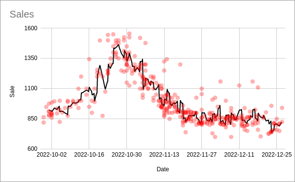
replotting of the original data - price over time, black line is a mean rolling average
The more interesting thing to me over the actual price trend is the number of sales over time. You can visually notice that the density of points goes up with the price. To quantify this, see the plot below:
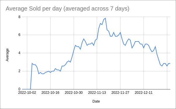
This takes the average number of sales for the previous 7-day span. Meaning November 7th shows the average number of sales per day from Nov 1-7.
It’s clear from the trend that there is a reaction happening to the price. I want to call this the FOMO curve, going back to the idea from the post I linked above. Let me overlay the two plots above:
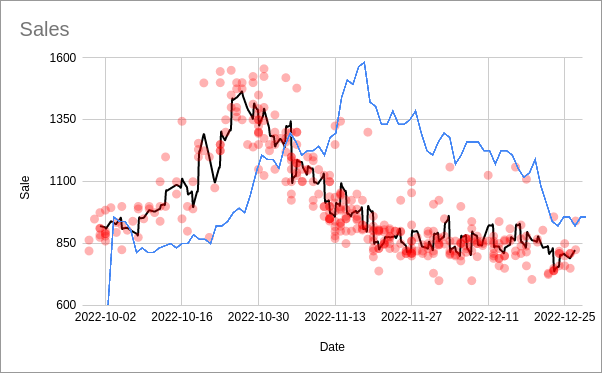
You can see the lagging reaction of sale quantity to the price (partially because of the way I averaged the number of sales but also a real effect). There’s a contradiction happening because as the price rises, more people start buying at the higher prices. That’s the FOMO aspect, the lagging realization that prices are climbing and then many people deciding they either need to lock in a price or get on the rocketship.
The peak number of sales happens sometime in the middle of the price falling back to equilibrium (the blue line is shifted slightly to the right because of the way I averaged). No doubt this volume helps contribute to the quick return to the equilibrium. The number of sales returns back to “normal” too, lagging behind the price, now the the hype has died down.
The piece of data I’m missing is the actual quantity available across time (ex. new ebay listings). I bet it would also show a similar trend, lagging prices but slightly ahead the FOMO curve. I think that would really explain the overall trend. I can imagine that as soon at that price is hitting 1.2k, you’re getting a ton of new listings posted that eventually start to undercut each other and that’s what really drives down the price.
Anyway, it’s a very interesting case study. A great example why temporary hype or “manipulation” never really matters unless the fundamentals of either supply or demand has changed.