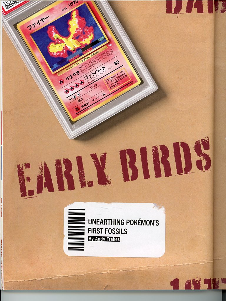
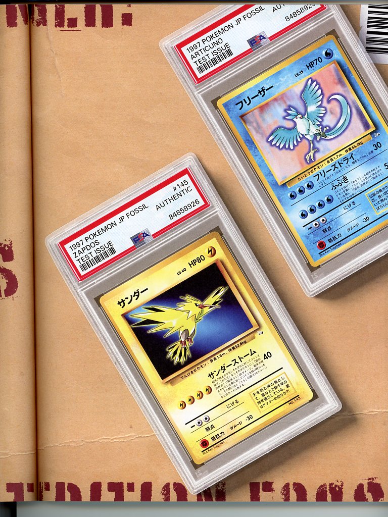
I am an appreciator of all things Pokemon history and my favorite Pokemon are the 3 Legendary birds from Gen1, so when the Fossil Test Print sheets featuring Articuno, Zapdos, and Moltres started coming out I was naturally intrigued. Follow along for a story that turns from history into mystery.
Context
Over a year ago, odd “prototype” versions of Japanese Fossil cards began to surface.
- @pfm wrote a comprehensive background on them, read it here
- This now-deleted reddit post had an Articuno: https://www.reddit.com/r/PokemonTCG/comments/15ntrsq/has_anyone_ever_seen_these_cards/
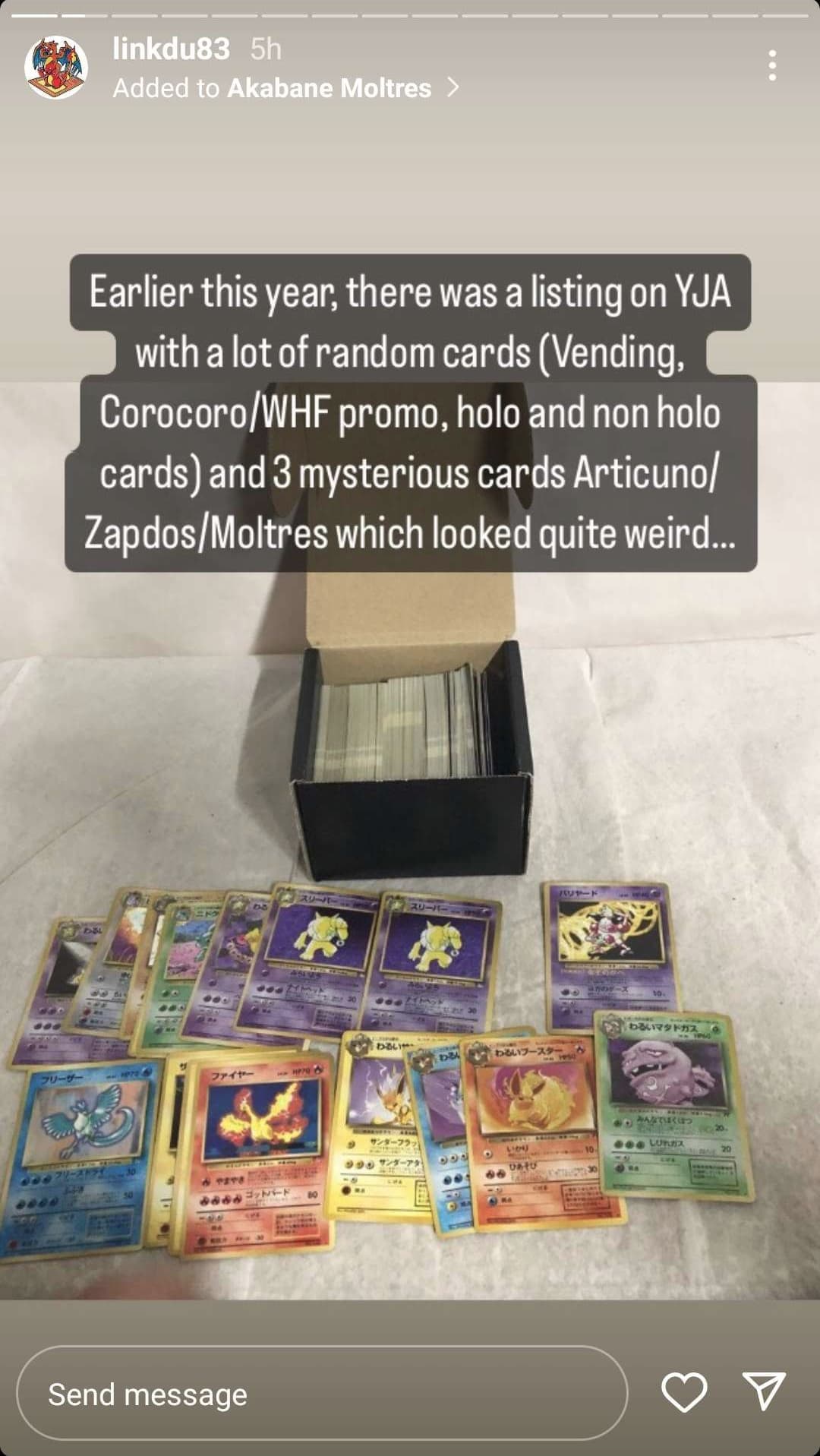
- In 2023, @linkdu83 bought a listing from YJA that included a set
Origins
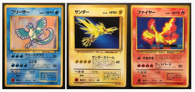
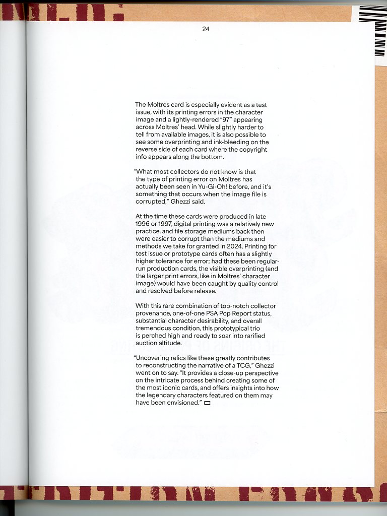
These cards are clearly different from what eventually made it into the Fossil expansion, and their origins were quite mysterious until very recently.
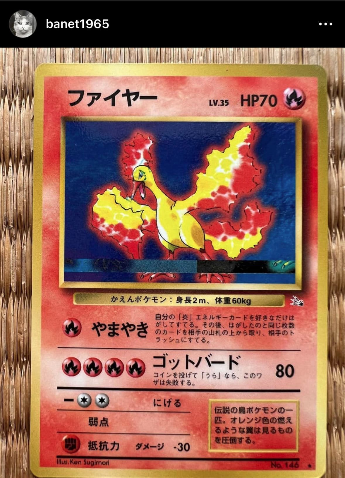
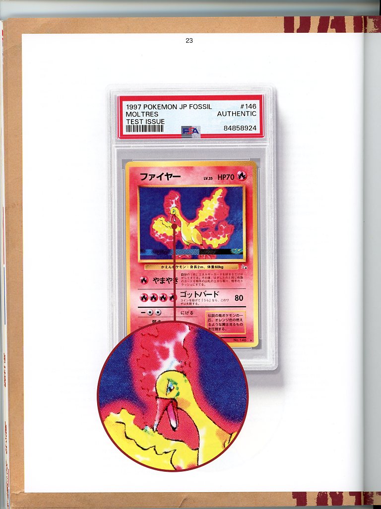
Pokemon TCG creator (and alleged accomplice in the prototype scandal) Takumi Akabane showed the very distinctive Moltres with visual artifacting in 2023:
It was also eventually revealed that these come from peelable sheets:
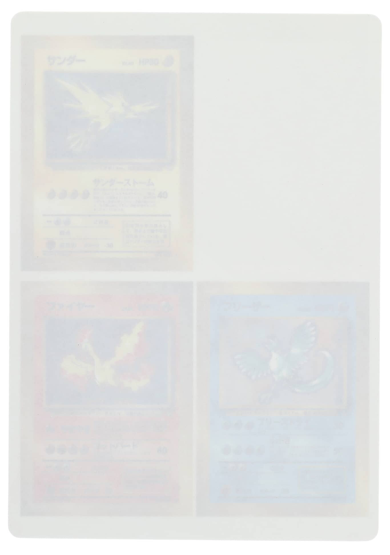

These sheets are the exact same size as the Vending sheets that also feature glossy, peelable cards
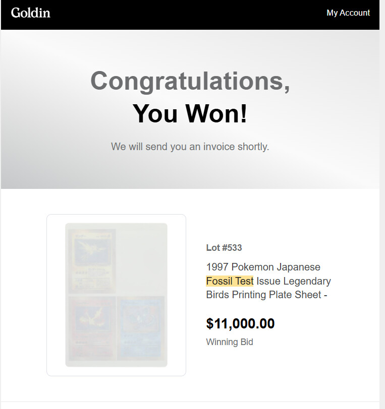
Several of these sheets have sold on auction houses over time. Earlier this year I decided to purchase one from Goldin Auctions since buying them directly from Japan had a higher risk (especially given the Prototype Scandal). I felt that even if things went badly and the unpeeled sheets were deemed fake, Goldin (and its associated company PSA) would have my back.
Mail day
I received the sheet from Goldin shortly after winning the auction. I recorded the full unboxing and sleeving for submission process here:

I also scanned the cards to take a look at their rosette patterns. The patterns look authentic, with proper black layer separation on the text and expansion symbol.
Additionally, I took some peeled vending sheet cards I had of each type and compared them at a 600 DPI scan.
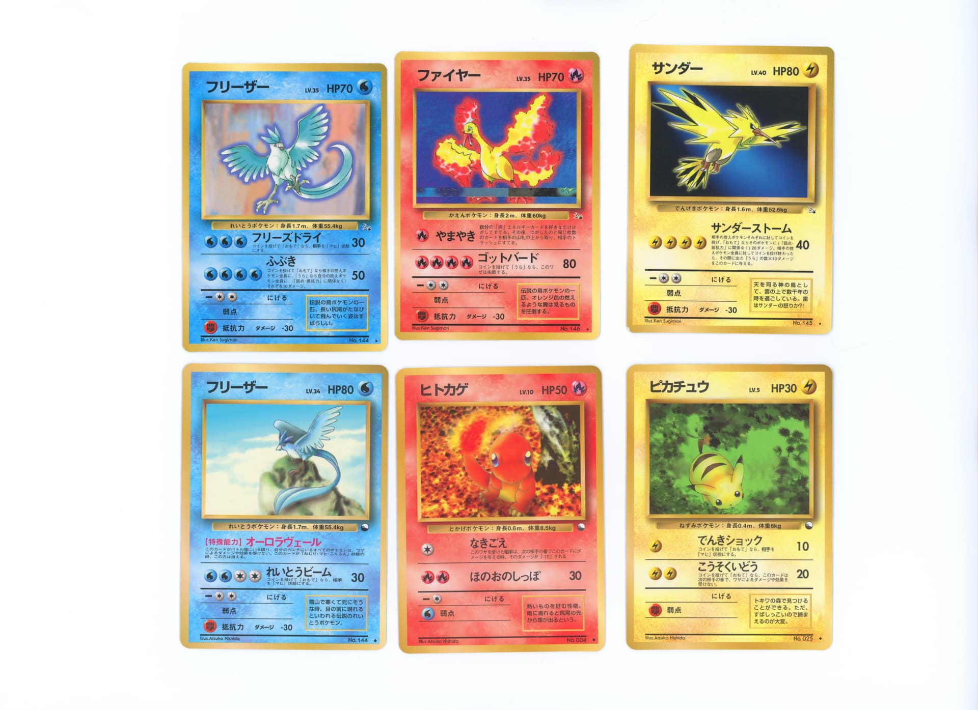
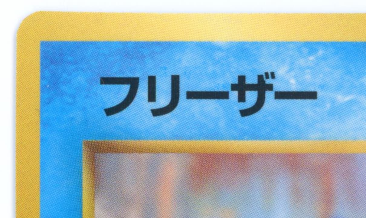
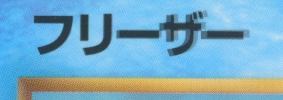
The Articunos are fairly easy to compare–the prototype prints are printed with an offset print in the same way as the vending sheet.
Prototype
Vending Sheet
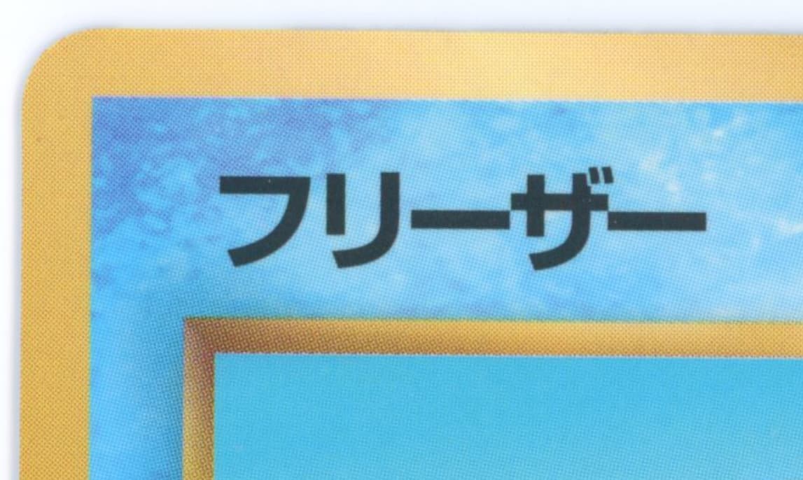
The kerning (spacing between individual characters) on the name is slightly different, but that could just be layout adjustments:
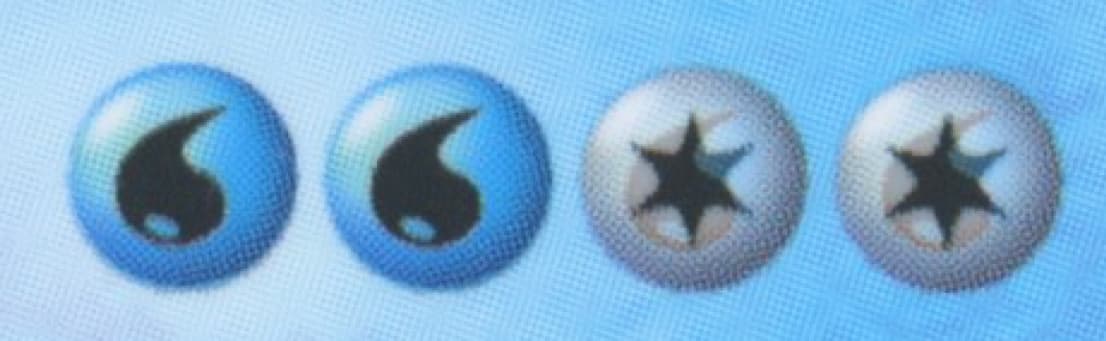
The HP text, Lv. text, and energy symbol all match up

You can again see a difference in kerning on the typeline, with the prototype’s text being a lot more spaced out
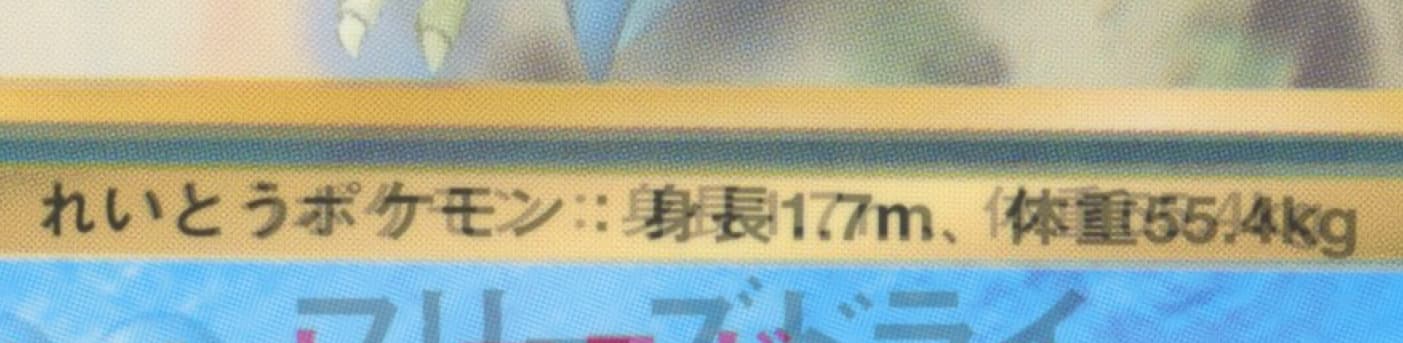
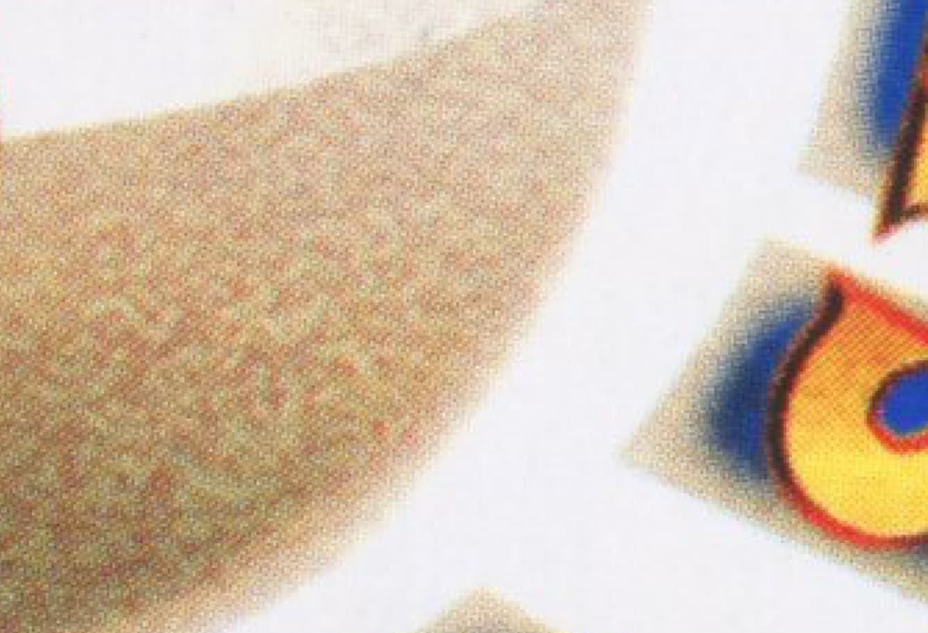
The energy symbol have consistent spacing and have the same raster graphic rosettes
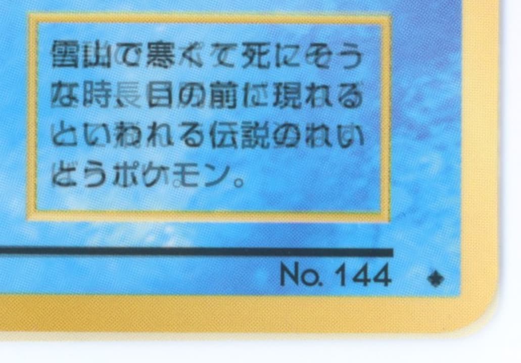
The flavor text, number, and rarity symbol also all line up
And comparing them side-by-side, they have identical rosette spacing, rotations, etc
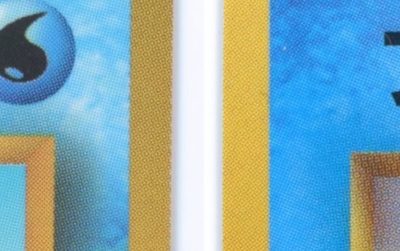
The backs are noticeably different in saturation, with the vending sheet being much richer in color (vending on left, prototype on right)
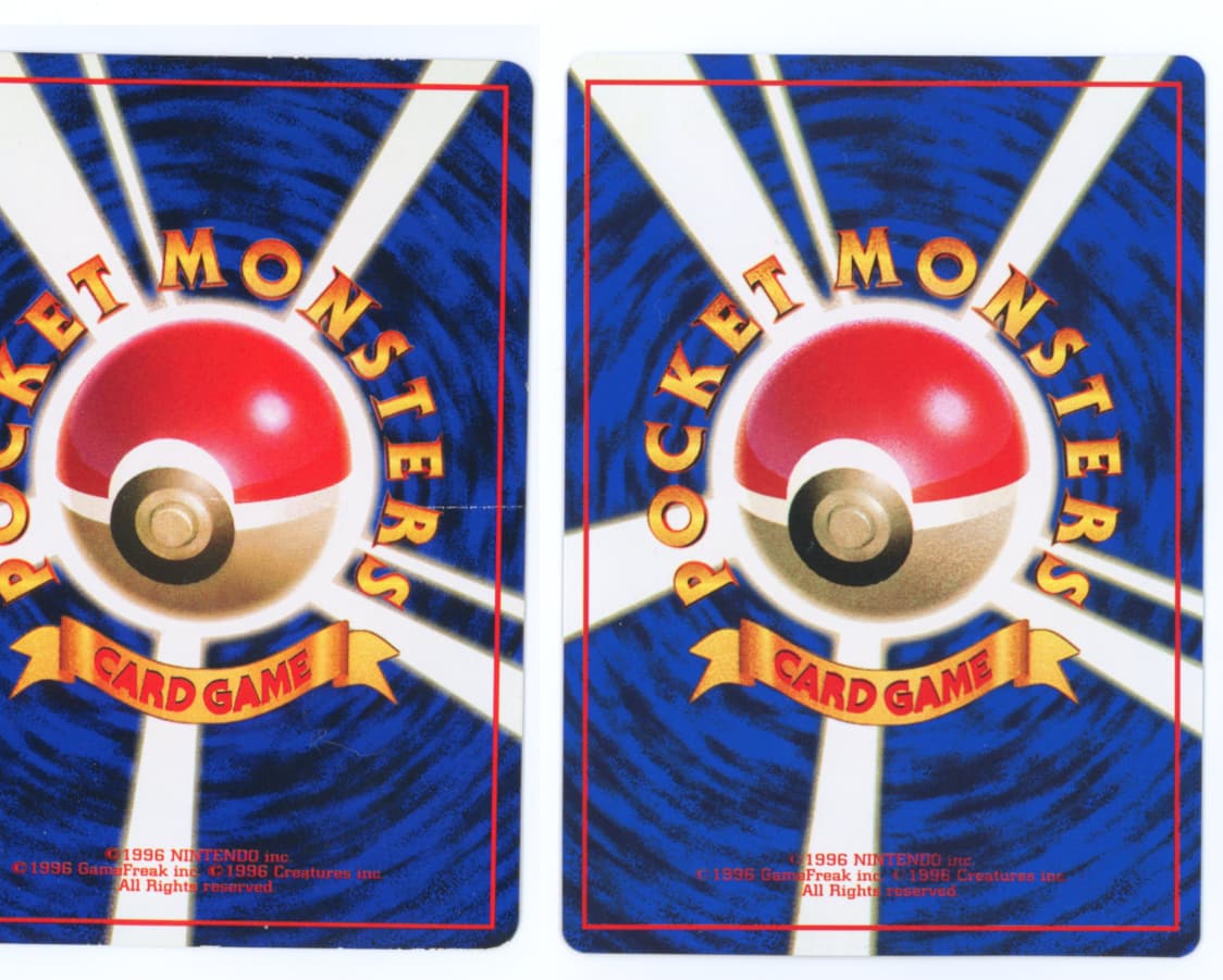
The rosettes are similar size but slightly different in arrangement due to the difference in color.
Vending

Prototype
The text is much more faint on the back of the prototype but is laid out identically. What’s interesting is that the (C) symbol is much more faint on the prototype and you can actually see more of the blue background through it than is available on the vending card.
Vending
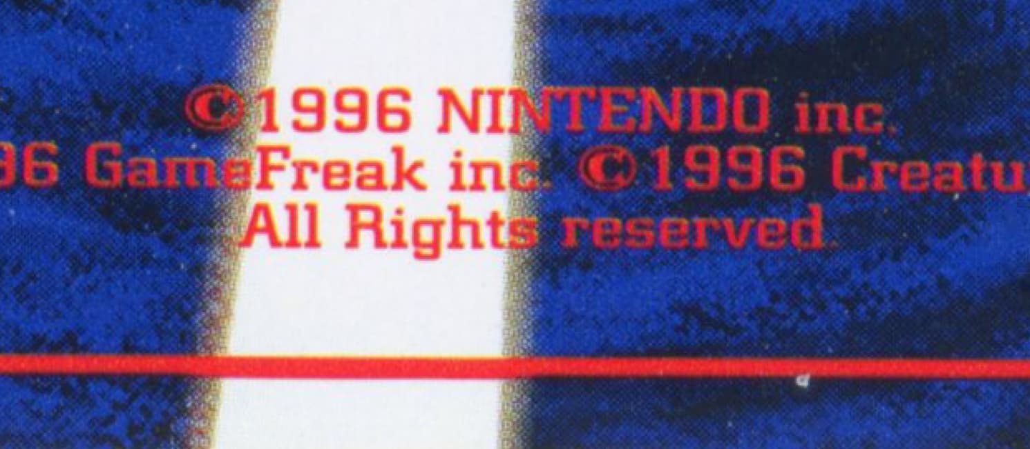
Prototype
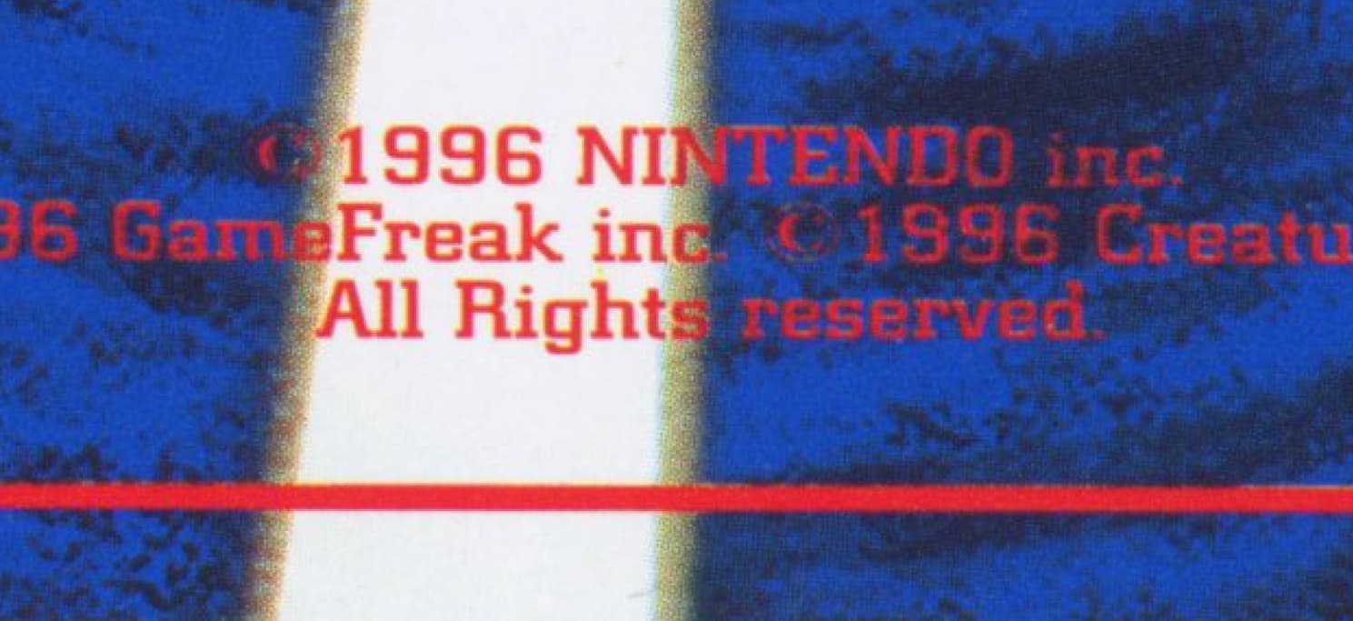
This implies that when the prototype was made, they likely had access to the actual digital file and were playing with some of the layout / font opacity. The vending one also has a slight bevel / emboss on each letter.
OK so are they real?
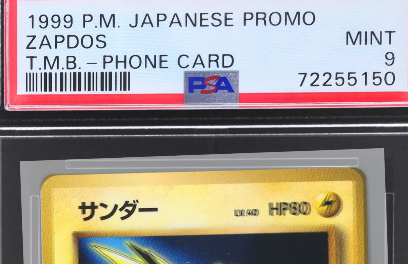
One of the reasons I felt comfortable spending a healthy sum of money on these is because PSA had authenticated 4 full sets of the trio.
While there are not telltale signs of print dates since offset prints don’t leave behind metadata, I can say with high confidence that they were printed in a way that is consistent with how Pokemon cards from this era were printed.
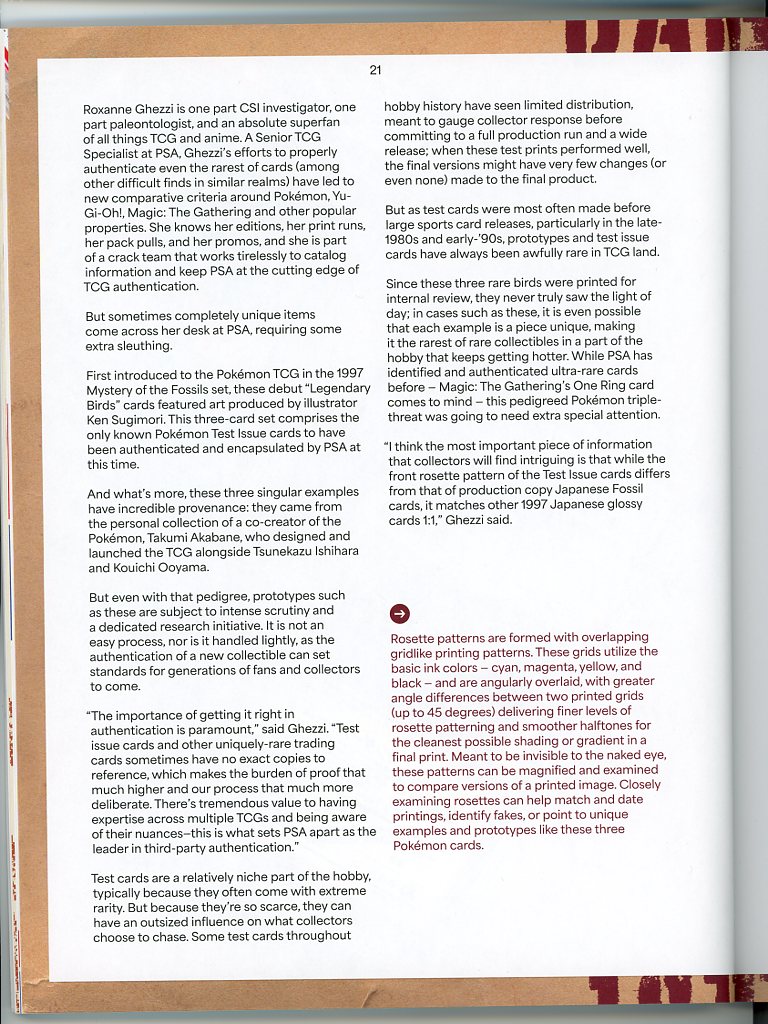
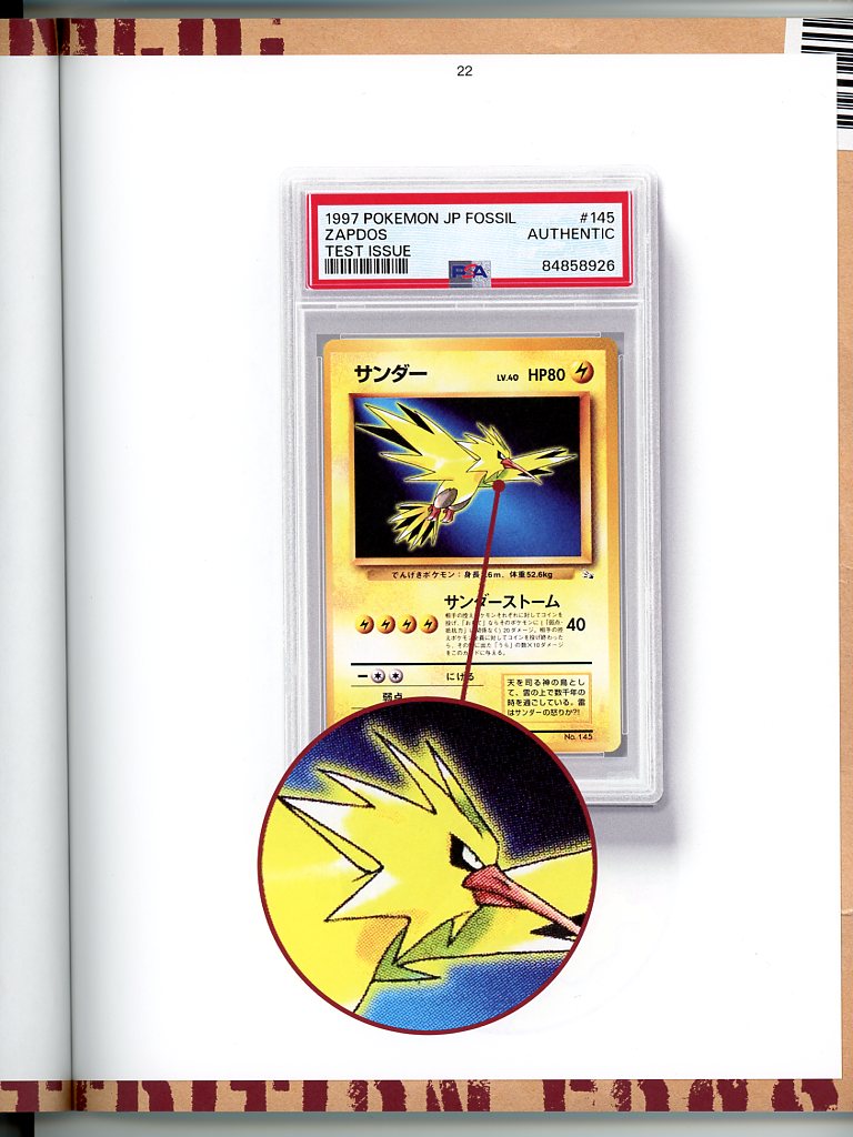
PSA also had an article in their magazine devoted to the cards and their authentication. They wrote about utilizing rosette patterns and speaking to “experts” (likely Akabane lol) about their authenticity.
Thanks to @smpratte for these pics of the magazine article

Sending to PSA
With PSA having written an article on them and promoting them on their social media, I sent my set in.
A few weeks later and well…that’s not good
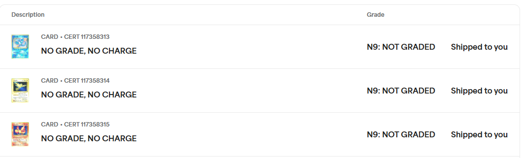
I contacted PSA support, and received this response. The “end of January” timing lines up exactly to when PFM published his findings on the playtest / prototypes.

I asked for a bit more clarification and was met without a great response. Funny enough they tried to distance themselves from Goldin despite the companies still being in the signature

So of course, I contacted Goldin

Looks like a dead end here, so I went to CGC
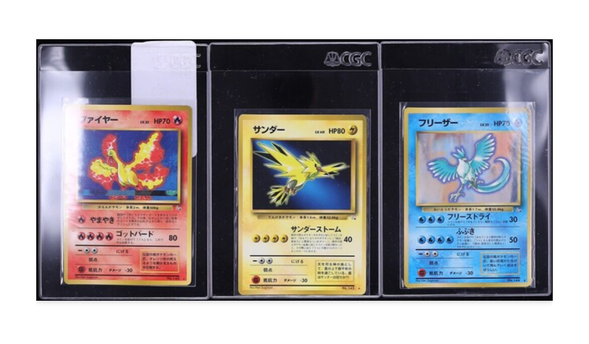
Sending to CGC
CGC has also graded a set of these cards

So I went ahead and sent them in, then…
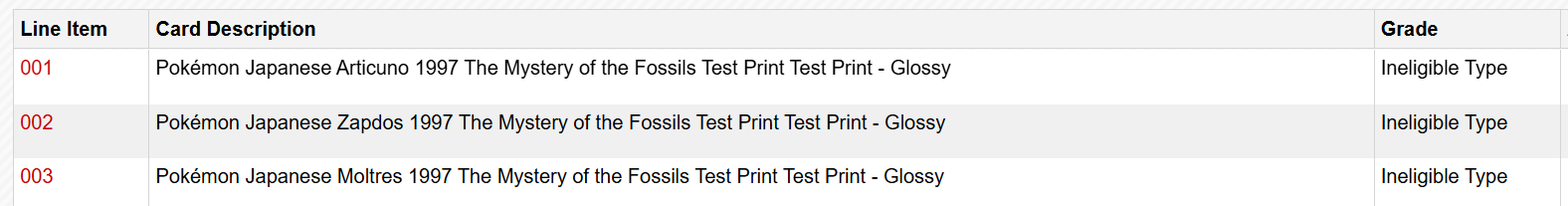
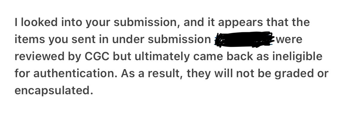
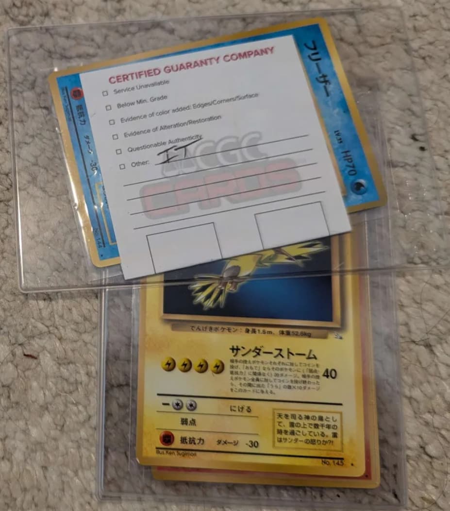
Of course, I proceed to contact CGC, and get this response

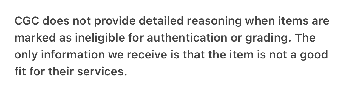
I ask for more detail and am told that I’ll get more info on the white slip that graders include when they mail it back

I’ll save you some suspense and show you the very detailed explanation I received back
I reached back out and got another CGC rep
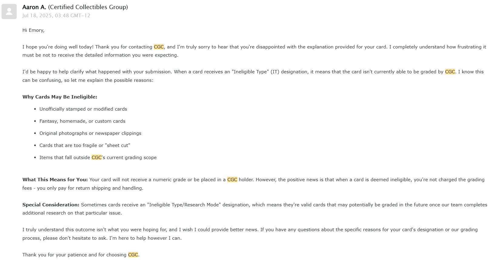
I inquired further, because CGC graded these in the past and was finally told it was a decision made at the VP-level

Conclusion
- Unfortunately as a result of the prototype scandal it seems that grading companies will no longer grade these cards
- I believe they are authentic, so maybe in the future they will be graded again some day.
- I can’t blame the grading companies from turning these away, but it feels very disingenuous given that they very recently graded them and made no such announcement that they had stopped. Nor were any of the certs for existing ones deactivated or their pop reports removed.
- I’ve got some neat binder cards now