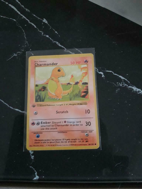
Hi i just created an account to ask for your help. I am willing to buy a 1st edition charmander from an online marketplace in my country but i have to little knowledge to tell if this is a real card. Maybe someone can help me tell by looking at the pictures:
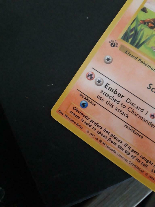
The stamp looked off and was the first thing I saw. It looks like a thin stamp which doesn’t exist as far as I know for non holo 1st base set cards, usually with a thin stamp the word ‘edition’ that circles it is very thick, you can check out this great thread www.elitefourum.com/t/1st-edition-stamp-variations-lets-iron-it-out/17624/1, also font is slightly off and border color is faded/off. Also I believe when looking at borders it usually sways in one direction, so for this card both the left & right borders are thin, its usually one is thinner and the other side is thicker, if I’m incorrect someone more knowledgeable can correct me.
The copyright date contains dots instead of commas between the 1995, 96, 98, 99 Nintendo, Creatures.
The “Lizard Pokémon” text below the artwork is slightly shifted down, even though all other black text is at the correct positions
Both of these can be seen in the second picture.
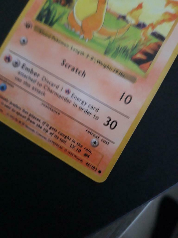
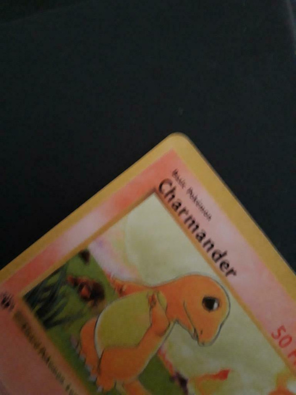
And third: apart from the second picture, all pictures are trash where you can barely see anything. All of them are out of focus, and I have a feeling this is done on purpose because the seller knows it’s fake card. Or they just have a crappy camera like myself, despite the reasonably looking second picture…
Those front borders look like they were designed based on the old japanese cards with the thinness and gold tint (and terribly so), English wotc borders are fat and yellow. Text is too thin and font is way off. Coloring is faded out in the front and back. Thin 1st edition stamp on non-holos is a thing but it’s very rare, another unlikely factor. Same with the spelling errors. Card stock itself looks off, too smooth.