I landed back in California late on the 30th, returning from a short vacation in Hawaii (a couple months too early for Worlds  ), and had a bit of time to check E4 really quickly. I noticed the notification for the new badge I earned and was definitely caught by surprise. The competition was extremely strong this year, so it was completely unexpected.
Comments
@zyxxke A well deserved first place finish! The coloring is beautiful and the overarching tone of blue with the interspersed red makes for a very calming, but not monotonous, drawing. Love the varied pokemon choice too! This really looks like an Art Academy card and certainly would be a sought after one if it were!
@khairis A rampaging Magikarp is already interesting enough, but a playful Torracat cosplaying as a rampaging Magikarp?! Insane. For whatever reason, this drawing reminds me of the Lungfishopolis level in Psychonauts (I only remember bits and pieces because I just watched my brother play ). Poliwhirl’s Splash of Color is also great, with the awesome stylized Poliwhirl and Psyduck and great shading and coloring (really love the blue, green, and purple incorporated in the water).
@joponnes Just another day in the life of jopo and his slime family. I loved how much fun the little Grimers are having running away from big Muk because that’s exactly how my little one is right now: running around being crazy and causing chaos with a big smile on her face. Also love that the little ones contributed to the coloring. The Recreation piece is also on point—that’s basically the card right there (minus the plush tag)!
@Dyl Another advertisement to spread Rowlet’s greatness! Although he takes on a somewhat odd form, he is lovable nonetheless (maybe…). Only using circles was a really interesting idea too!
@chrisundrum The Child drawing is stunning, and though you didn’t have time to color it, it looks like a page straight out of a Pokemon coloring book you could buy. The flora is full of detail, and the piece is overall beautifully hand-drawn. I’m still looking to see if I missed any pokemon hidden anywhere (the only one I don’t see in plain sight is that Exeggcute). And, of course, congratulations on 2nd place in the Original category! After Battle has great lighting and overall composition. Again, the flora are great, and the little water pokemon looking on cautiously at the pensive, battle-worn Scizor really draws you into the mood of the piece.
@kromaticlanturn The Azumarill and Marill piece is just too cute. It reminds me of the fun I have with my little one currently and also of the Azurill and and Marill brothers in Pokemon Mystery Dungeon Explorers of Sky (which I am very slowly getting through right now). Also love the participation of the kiddo—things like this really make the event something to remember! And then, diametrically opposite of Again! Again!, we have Outrage, which captures the often-derpyish Dragonite in a not-so-good mood. He is a cute dragon, but he is also powerful, and this piece reminds us of that. The mixing of colors in the flames are also really nice.
@MaxyMaxy The master of the Child category is back with another great piece! The colors and simplicity of the background and pokemon really embody the category well. A great varied choice of pokemon too—not ones you’d find hanging out together too often! A well-deserved second place!
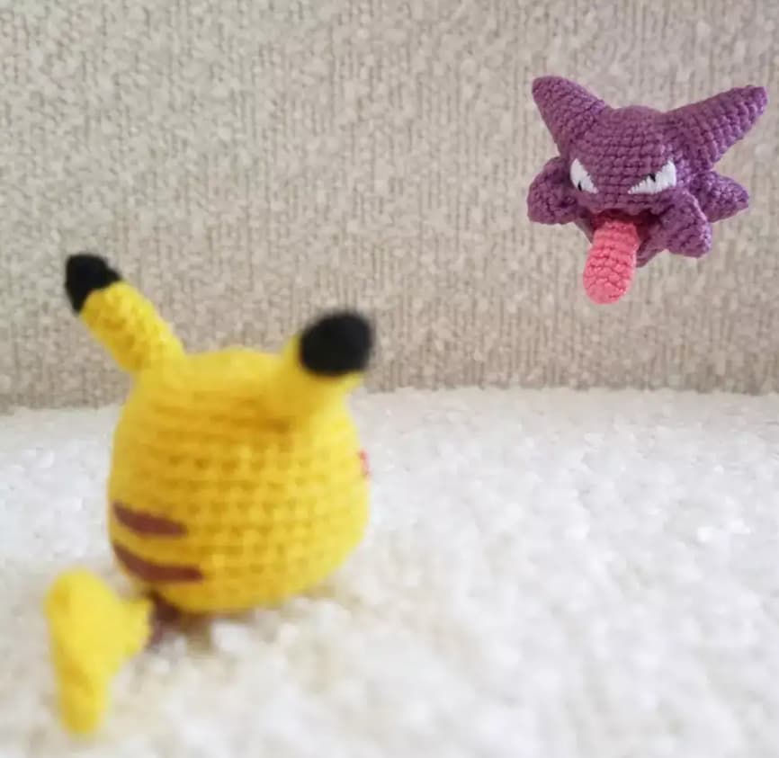
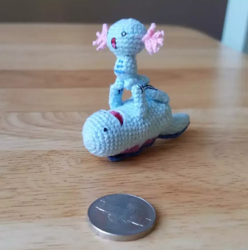
@Rattlesnake I loved Marco Polo. There’s just so much going on, with each pokemon doing their best not to be found by Mudkip. It’s very fun and playful—perfect for the Child category! I also spy a Conkquer, but I thought they’d be a bit bigger than what’s depicted  I also worry for that Charmander and all the pokemon in that pond with that Voltorb going off (except that Sandile and Wooper, I guess). The Hunter is a great and gritty depiction of the viciousness of Kabutops too and a great homage to your well-written contribution to the E4 articles!
@coil This is the movie we all need to see. Just how does Magnemite get out of that mess?! I also see you’ve taken a stance on the blue vs gray Magnemite debate! The Metagross piece is a great photograph. Love how the fence breaks up the sunlight to create “rays.” The only thing missing here is the Holon Research Tower!
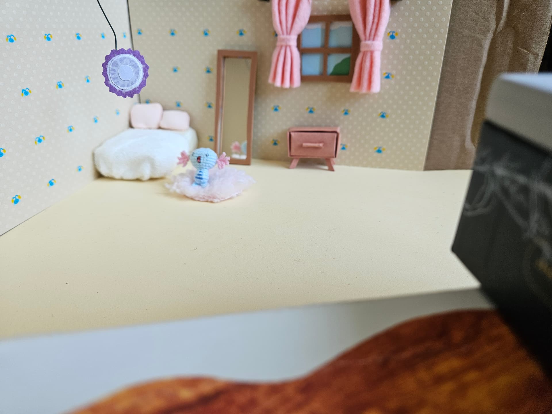
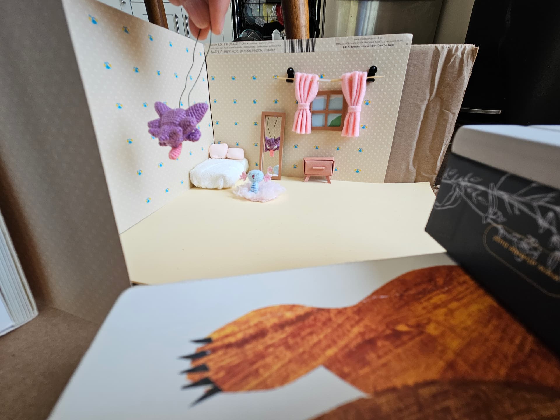
@BANKS I’m not sure how that Ditto got to the moon, but he sure is enjoying himself there! The homage to the Yuka Morii cards is a great touch. Did you make the Gengar out of clay, or is it a 3D model? If you look close enough, maybe you can still see that Ditto up there on that moon in Silph Siege! Silph Siege is a great piece that captures the menacing silhouette of Mewtwo ready to bear down on Team Rocket. He is out for revenge on this night!
@Josh I think everyone knows your submission was the obvious winner to sweep all four categories, but I’m sure the organizers had to give other users a chance. Amazing memeability, and if lyleberr hadn’t asked if that was a Slowpoke, I probably wouldn’t have guessed it. Although I’m not a huge fan of the lake guardians, their fall to irrelevance is certainly a sad sign of the times!
@Versy Dark Houndoom is a well-deserved first place finisher! This recreation makes the original look like a harmless puppy. Houndoom is an awesomely designed pokemon and this piece really captures his ferocity more than the original. I also love the spray brush/texture of the piece. Every element you’ve added really augments the original illustration! Skimming the Sea is also a beautifully done piece. I love the composition and the perspective. Dragonite is looking really proud and determined here, emotions that really embody the dragon that he is! I also love the water sliding off his body—really great attention to detail.
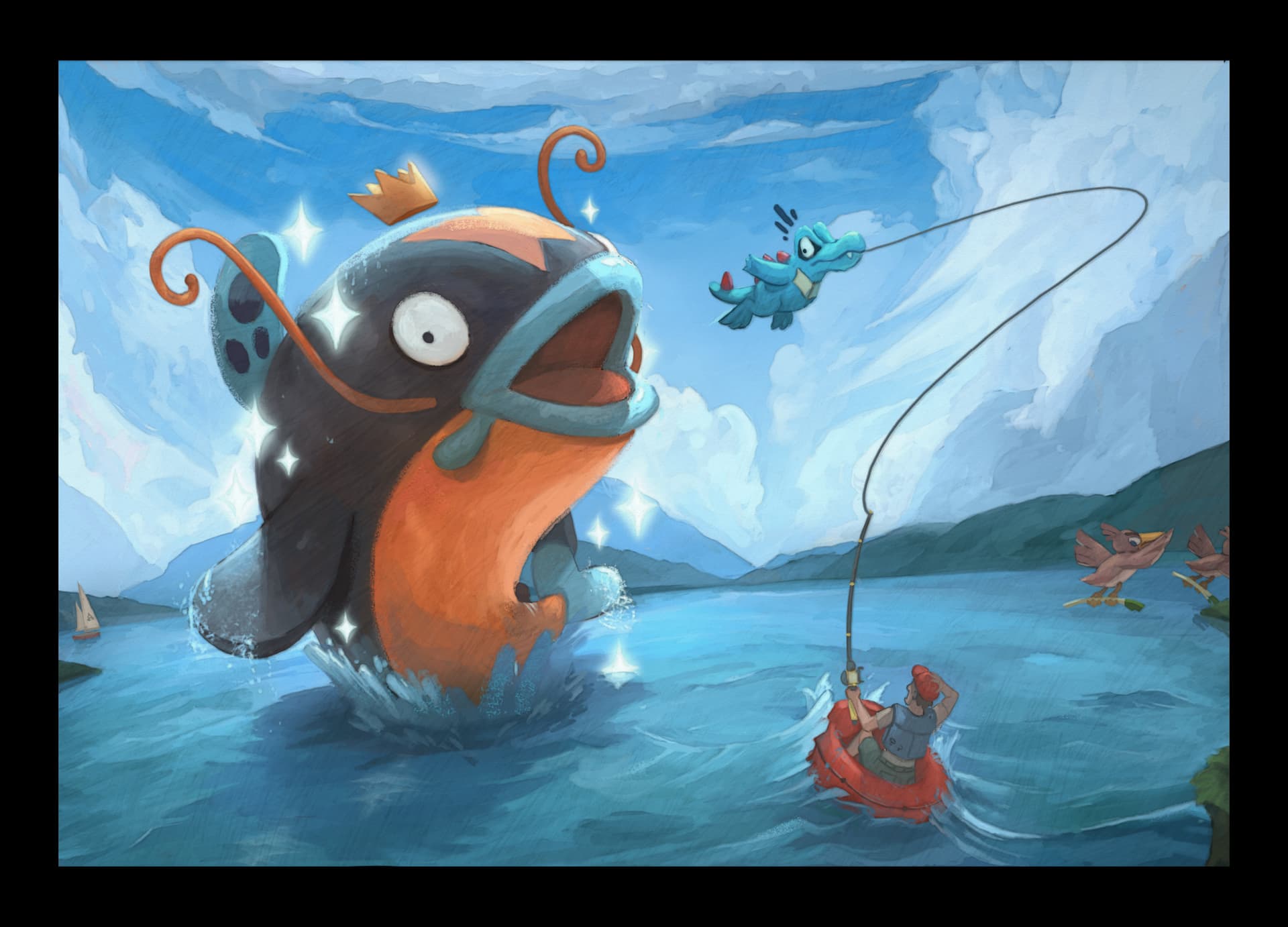
@ayoveer The video accompanying Magikarp in Space is hilarious and certainly a great accomplishment that deserves a commemorative drawing! False King of Swamp is also great, but he is no false king! Look at that crown! The Politoed here is amazingly derpy, and the little fly (or Cutiefly?) buzzing around his head is really the cherry on top.
@pfm I absolutely loved Plyrs Crmny. Maybe it’s because my recreation piece was similar, and I can recall the effort put into making all the little pieces and trying to fit them together in the right way. But yours was way more creative and way more of a pain to assemble, I’m sure (given the size of the hole punches). The fact that you can make so much of the illustration out when it’s zoomed out is really a testament to the great attention to detail that you put into this piece. Yours was my top choice for Recreation. Lugia v The World also looked like it took a ton of effort, and although I didn’t fact check your statement of all of the Johto pokemon being there, I believe it! The care put into putting the pokemon in generally reasonable “biomes” is not unnoticed (although I’m not sure how that Slugma and Magcargo and getting off that rock, and why the Ampharos family is so far back then they could be doing some heavy super-effective lifting against Lugia). All of this being on top of a great picture you took makes it an incredible piece.
@lyleberr I loved Hidden Hoenn. I’ve never gotten a Magic Eye to work and never really understood how it worked, but after giving your piece a few goes, it was really cool to see the Gold Stars pop out. Certainly a very fun and interactive piece! (Although it seems like many couldn’t see the intended pokemon ). I think the concept of Cubone’s Reunion was really cute. Like you said, Cubone is often seen as brooding and melancholy, so it’s nice to see him enjoy a good day after seeing his not-very-alive mother! As always, will be anticipating your recap for the Magic Eye piece, as I’m curious as to how you made it.
@niece Your Recreation submission is great. The contrast in color, Darkrai’s glowing eyes, and the overall mistiness of the piece really improve upon 5ban Graphics smooth 3D Darkrai VSTAR. And The Thinker! Boy, don’t get me started on that. I really loved the piece. Geodude’s expression and pose is perfect, and the colors and shading of everything is amazing. And then the extra splash of color with the blue flowers adds great contrast. The tiny Cutiefly is on point too! The real-life inspiration of the setting is really a great way to visualize how pokemon may interact with the world that we live in too. Great pieces overall.
@Paper I am amazed that you could organize the thread so neatly in A Thready Field. The effect is really cool, and even though you didn’t get to finish the Eevee with thread, the piece is great. I’m curious, do you do any other crafts? Mostly people don’t just have yarn and embroidery floss (or is it sewing thread) laying around. The simplicity of A Strange Wiglett just adds to the cuteness of the situation depicted. This piece brought a smile to my face, so thank you for submitting it!
@lookaclara The softness and varied colors of An Odd Leaf in Bloom are super cute, and the title is creative and clever! A great recreation of the original illustration. I really loved Gardevoir’s Trail too. The fact that most of the plants are actual scanned plants is just amazing! Your love of plants and flowers really shine through in your pieces, and it’s always a joy to see your creations (e.g. the signature exchange cards).
@chefonaquest Another excellent piece made with energies (and other cards!). Your pieces are always so clean, and the way the natural shading/lighting on the energies is used shows an extreme (and aesthetically pleasing) attention to detail. Using acetoned shattered-ice foil for the crystals is a just another testament to your attention to detail and ability to elevate your card recreations. Worm Pals (aka: Burmy (Apple Cloak)) is also a really cute and humourous piece. Burmy is not an oft-loved pokemon, so it’s nice to see him getting some attention here!
@cyberurchin It was really just a matter of time until one of your pieces placed in the E4 Art Contest. You are extremely talented, and both your submissions this time really showcase your abilities well. Your Recreation entry is just spot on and looks like it should be the actual illustration for the art rare. And Icy Paradise is a beautiful illustration of Froslass with great attention to detail, shading, and composition. Congrats again, and I’m sure this won’t be the last time we see you in the top placements for this contest!
@dromanyte The Delibird is perfect and recapitulates Sumiyoshi Kizuki’s line-less art well! Meowth’s Party is also a blast. DJ Krabby has finally gotten the recognition he deserves! I don’t know if it’s because I don’t have an X/Twitter account, but I tried to follow your post to see what the other references were, but I couldn’t find the thread/references I see the flying Pikachu, but not sure I’m catching much else. I’d be happy if you could somehow post them here or guide me to where I can find the references!
@0rion The Suicune looks great, especially in the mock up. The small hints of the art spilling into the border is a great concept when it comes to augmenting the art/card in the most subtle of ways. Rooftop Psionics is also crazy good. The composition and shading are amazing, and the cityscape background is a great reference to Mewtwo’s hatred for humanity. Again, the mock up for this piece as a card looks like an actual card that could be printed.
@rtas As a first illustration, this is amazing! The shading and composition are great. Sometimes Dragonite needs to remind others that he, too, is a dragon type and capable of ferocity!
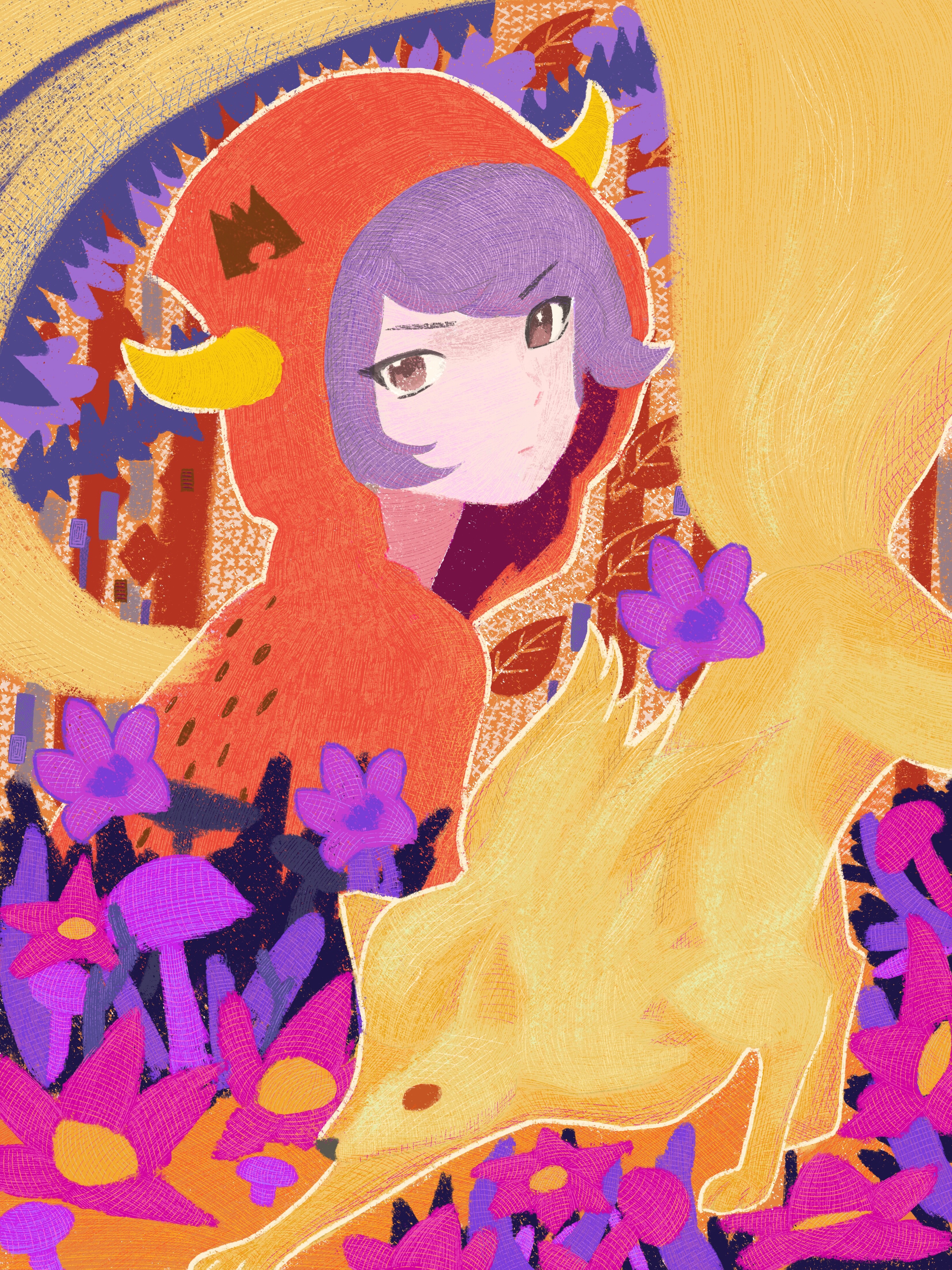
@viridian I absolutely love Observer of the Crystal and am ecstatic that you walked us through your creative process. The composition is great, and the effort you put into creating this piece is not lost. It definitely gives off Asako Ito vibes, but it also gives off the air of a Sachiko Adachi composition (another artist I love). I really can’t stop looking to appreciate it. The second place in the Recreation category is well deserved.
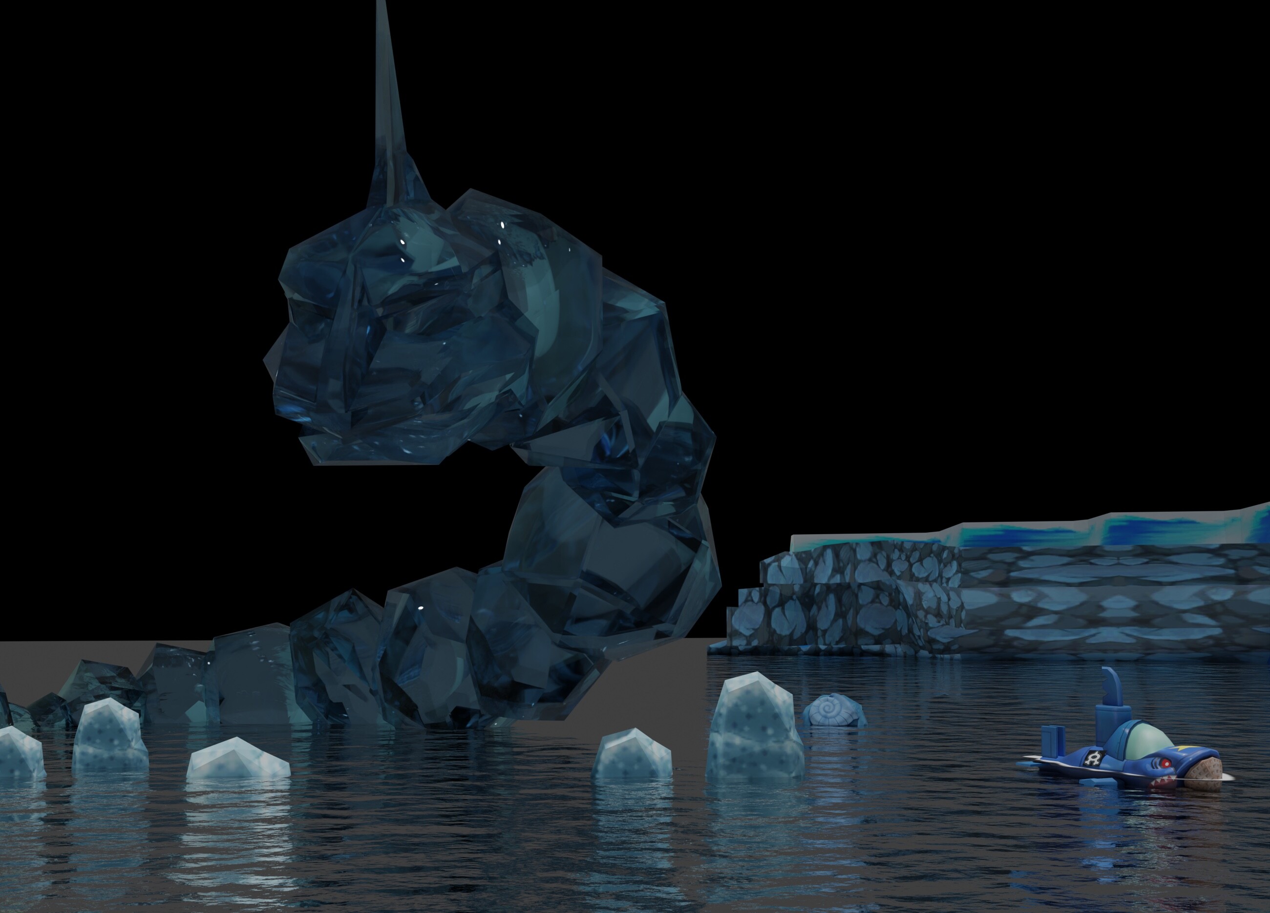
@decoypalmette Both your submissions killed it. The elements that went into forming the background of Crystal Onix Cave were really creative, and the effect is brilliant. Also love the little toy-like Team Aqua vessel—it makes the whole piece feel like a beautiful diorama. The texture of the Crystal Onix is also gorgeous. Everything just comes together to make this encounter with the Crystal Onix feel like a once-in-a-lifetime event. Courtney’s Ninetales is also a great piece. Definitely reminiscent of your N’s Typhlosion entry last year! I love that you can see texture/strokes in the piece and am digging the white outline. The added Little Red Riding Hood vibe with the forest is also really cute.
@citriina The interaction between Dawn and Piplup here is just too cute! The overall pink and blue tones of the piece also give it a lot of charm and softness. And the added twist that we’re actually looking at a reflection of the two is a neat addition!
@mada0 This is Gengar at his spookiest! Looking like he’s absorbing the souls of those in the graveyard. I love how Gengar’s features are the brightest elements in the piece too—it really draws your eyes towards Gengar and his ghostly march! But, in the future, we might have to censor those gravestones
@mrbubbles The little Dratini trying to learn the ways of post delivery is really cute! I also love that you drew a piece connected to your life experiences with your son. Details like that make the illustration feel a lot more warm. Hope to continue to explore your artsy side in next year’s contest!
@northerninfernape Great work! Though he’s supposed to be menacing, like you said, I really can’t get the selfie interpretation you mentioned out of my head  He isn’t scaring anyone with that smile! Definitely nice to see two pokemon that don’t get too much love.
@HumanForScale I actually never noticed the odd similarity between Feraligatr and Magikarp’s fin This piece is full of so much joy. You can see it on Feraligatr’s face, and in all the Magikarp swimming around and jumping for joy! I think it would’ve made a great entry for the official art contest!
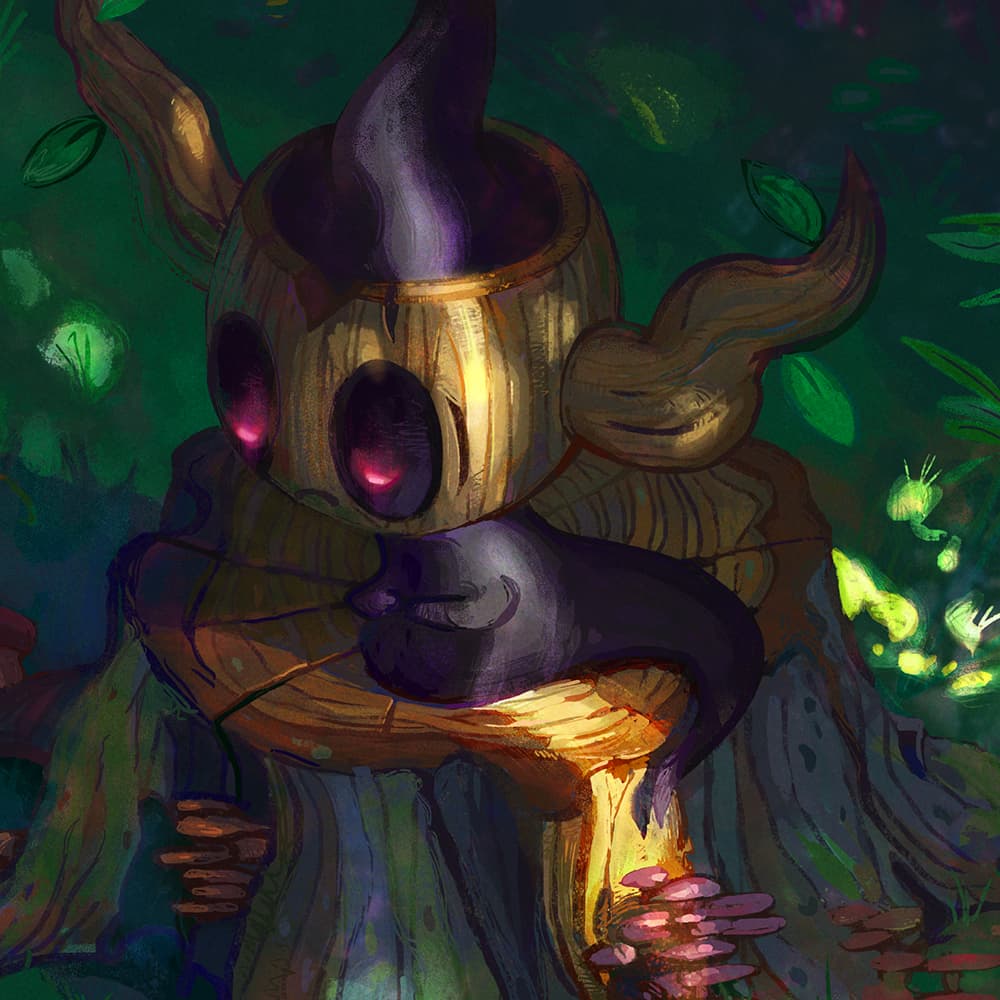
@oxidelake I think Introspective Woods was my favorite piece amongst all the categories. The melancholic Phantump juxtaposed with the peaceful and lush setting was an amazing contrast. The attention to detail (espeically with the lighting) and the overall technique looks masterful. I really thought you had 1st place cinched. I’m glad the piece was further recognized by the Judge’s Pick, and I can’t wait to get a sneak peek of the trophy card you’ll be illustrating for next year’s contest.
Hope I didn’t miss anyone And sorry for any typos—I’m definitely not going back to check my post for grammatical/spelling errors.
I’ll make another not-that-long post about the behind-the-scenes and thought process for both my submissions a bit later.