not even a debatable question, japanese all the way
All for the Japanese packs for sure, I think the only ones in recent times where I think English are on par, albeit different visual style, is the Evolving Skies packs, they look pretty nice.
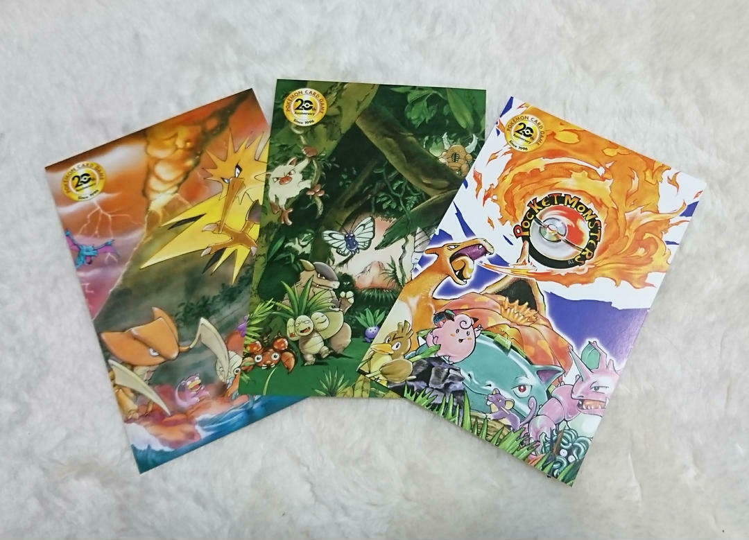
Just an FYI; The Japanese pack from base, jungle and fossil are also in postcard form with the full artwork to enjoy.
5 Likes
While I like the multiple artworks of English, the Japanese artworks are more aesthetically pleasing and pop better off of the pack.
2 Likes
Yes, agree. Maybe one day Nintendo will bring out a booster pack artwork with holo?
lol nintendo would probably make rainbow rare packs before cool art like those old jpn packs has
Japanese all day. I love the English ones for the nostalgia but the art is seriously boring in comparison
Japanese oof I’m handling them like a card (looking at them up close). English, if they’re on a display and I’m looking them them from a bite more of a distance. I know, sounds weird right?
1 Like
Japanese art is an absolute killer (love it)… English more nostalgic!
English as kids need to know what if the holo they get is good.
1 Like
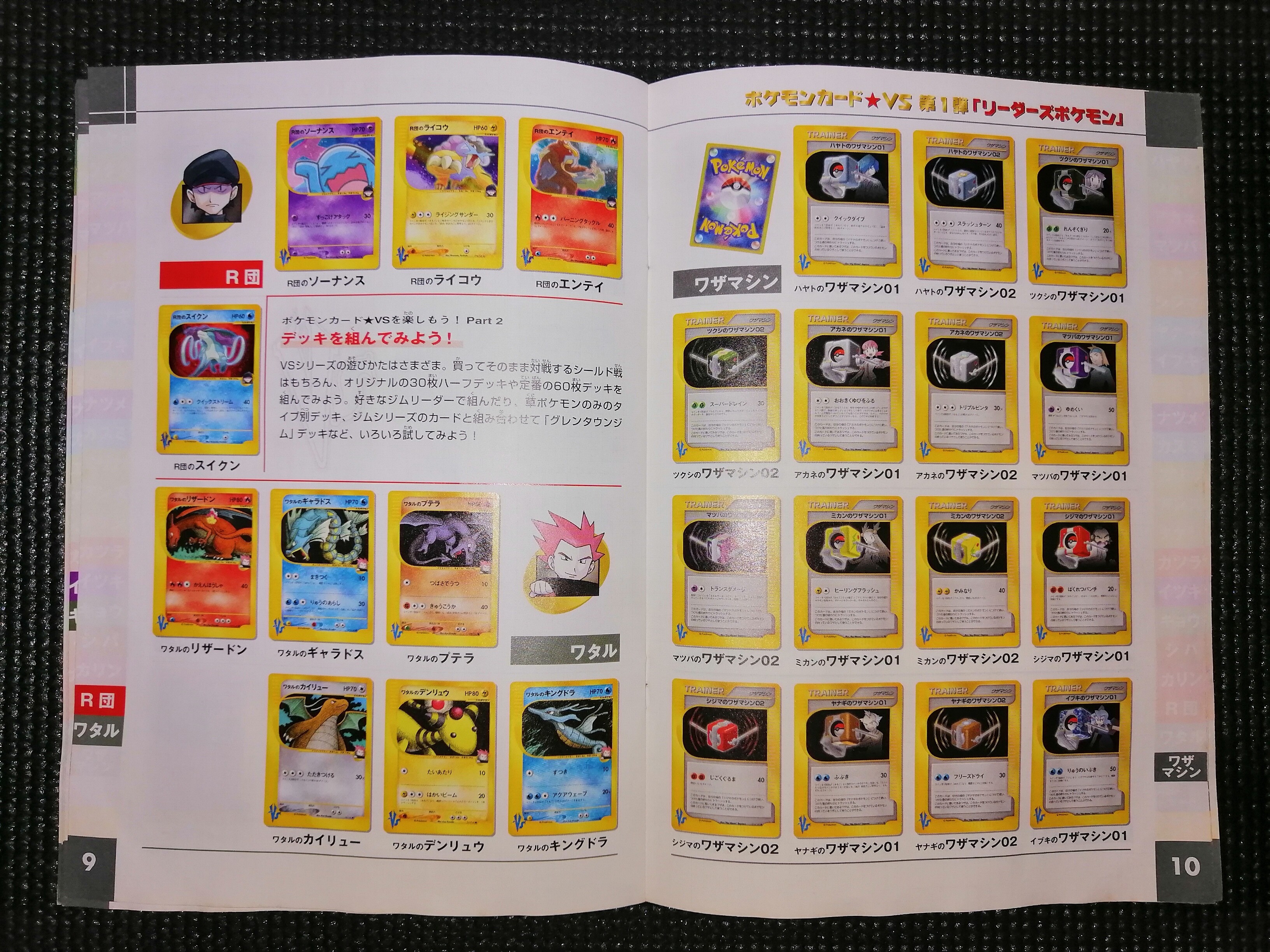
This is so cool. Definitely need to get into the VS sets now. Stunning different art!
A couple of interesting points about the VS series.
-
It never made it to mainstream English distribution.
-
It was the 1st Japanese series to use to use the new modern back style artwork.
-
It was the 1st Japanese set to adopt the card series numbering system (eg. 004/112) unlike the old card numbering that used the Pokedex character ID number.
-
1st to use the electronic card type reader print format. You either love it or hate it but still it was a 1st.
-
I don’t think any other sets booster pack is as big and chunking as the VS booster.

Although a lot of the cards are ENERGIES.
-
Was the first to introduce 1st Edition release stamp and the first to have a secret rare card. 142/141

And each card in the series has a Trainer associated to it.
All in all a pretty unique series and in my view, totally underrated and seems to have been forgotten in time.
2 Likes
Japanese is superior for vintage artwork but for modern I really love what they’ve been doing for pack artwork. SwSh really made me love Akira Egawa
1 Like
Makes sense because there’s less detail on the English packs
Japanese pack arts are more interesting and I’d have to say have better artwork. But I will always love English WOTC packs for the nostalgia and for that reason alone I’m going with English all day.
@vintagetcg Are those pages from the “silver bible”? But it kind of looks like a poster? Curious what it’s from if you don’t mind sharing. ![]()
I like English. Japanese packs look very busy to me.
1 Like
I like the Japanese pack art for those vintage ones; for newer sets I think English is doing an amazing job.
1 Like
Not at all, love to share. ![]()
Not from the Silver Bible but if my memory serves me rights, it’s a flyer that came with the Japanese Pokemon Trainer Magazine. Not sure which volume. I’ll try and dig out my magazines to see which one it’s from.
Here’s some other VS stuff. ![]()

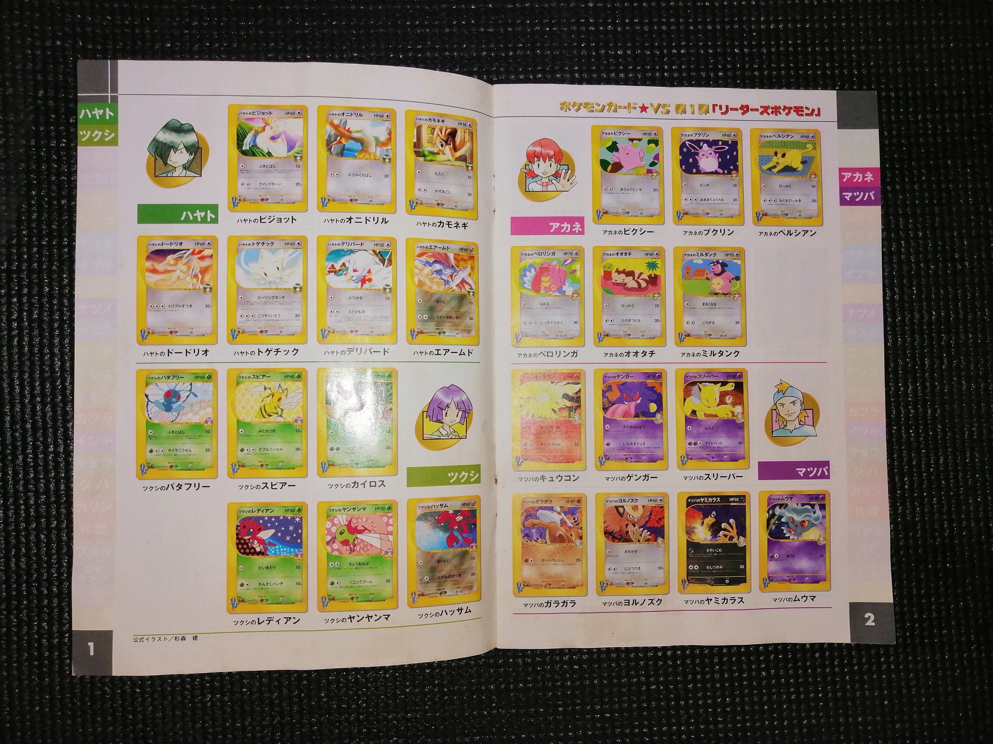
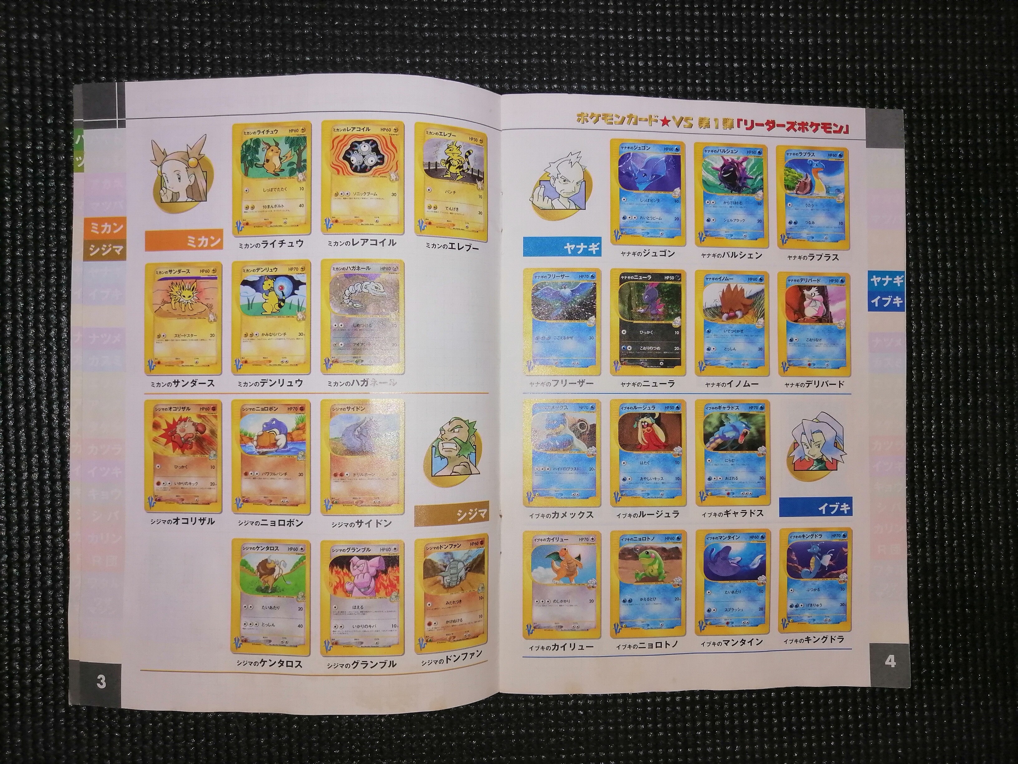
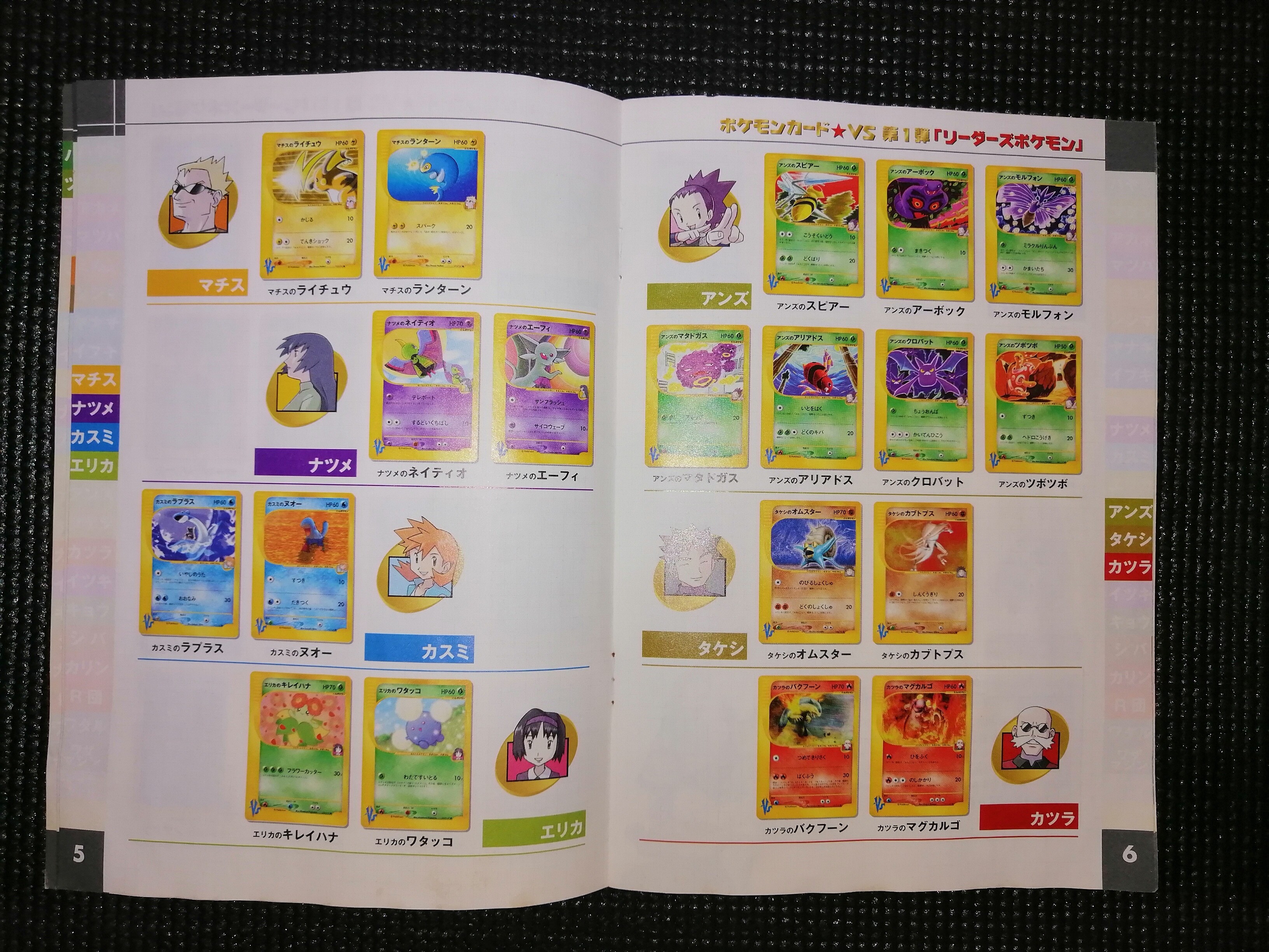


4 Likes
Those are awesome, thanks for sharing! It’s always a treat to look through vintage promotional materials with all the artwork. ![]()
1 Like
Japanese one for sure!!
Those japanese packs artwork makes ripping them apart harder emotionally. Haha…