I’ve picked one up as it was at a price I could take the risk.
I’ve taken some scans if interested.
![]()
![]()
I think CGC is gonna think a little longer before they grade these haha. Or maybe they won’t! Inb4 we see a graded copy ![]()
![]()
It would be ideal to test it with another glossy stock sheet, like vending, if we have detailed scan of one. I unfortunately don’t own any.
CGC has graded multiple sets of them
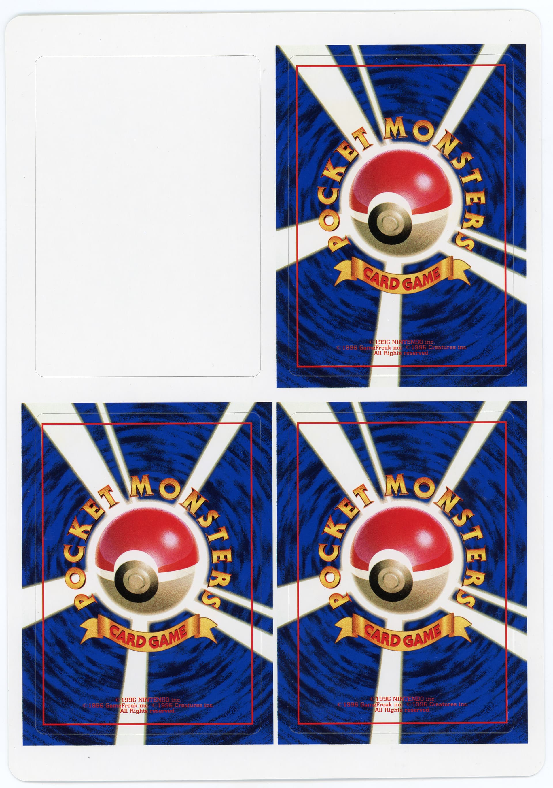
I bought a sheet too and peeled them because I have no fear. ![]()
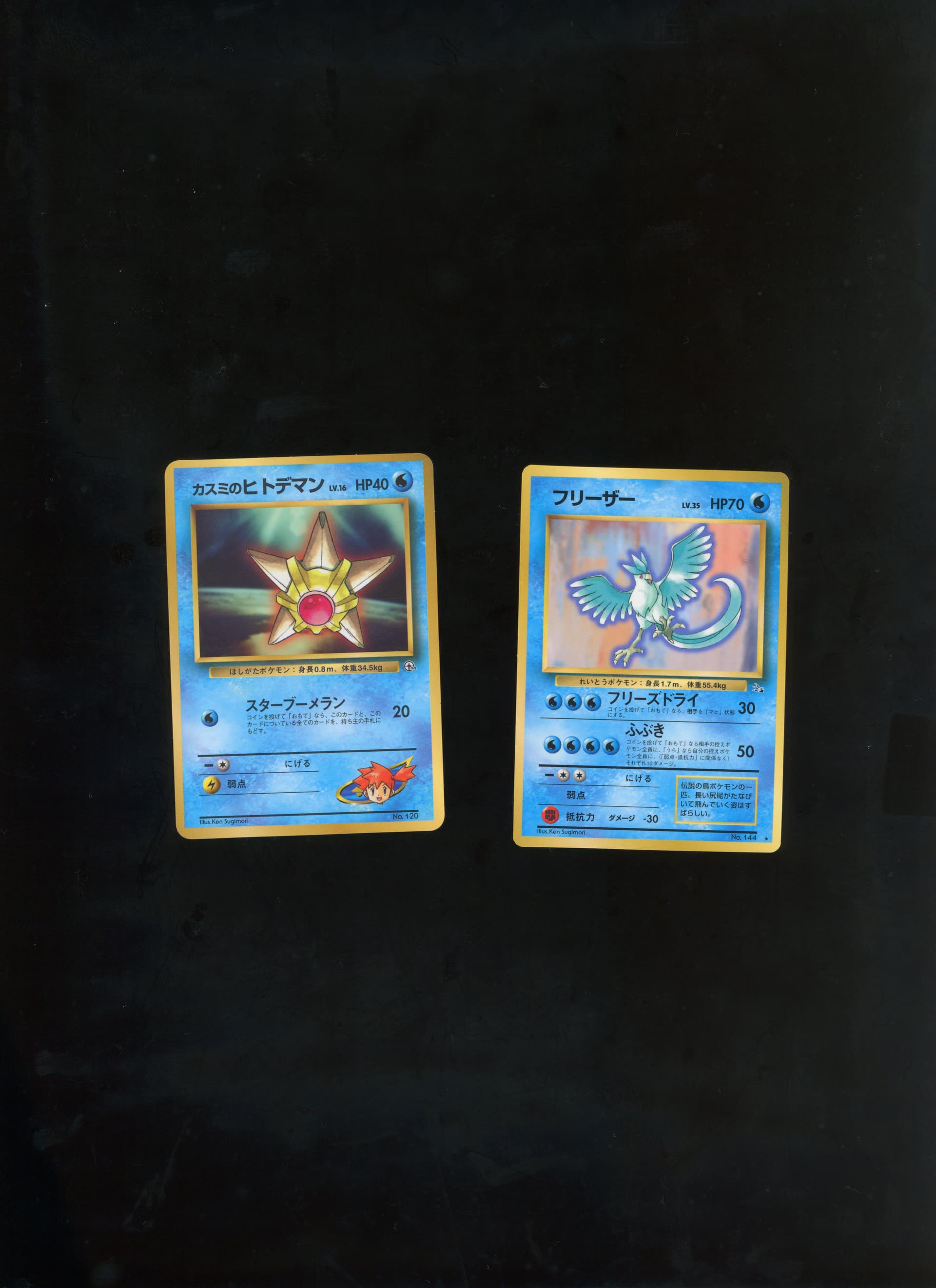
Here are scans next to a corocoro Misty’s Staryu which is similar stock. I think they look legit, especially when you look at the rosettes and the separation of the K layer for the text
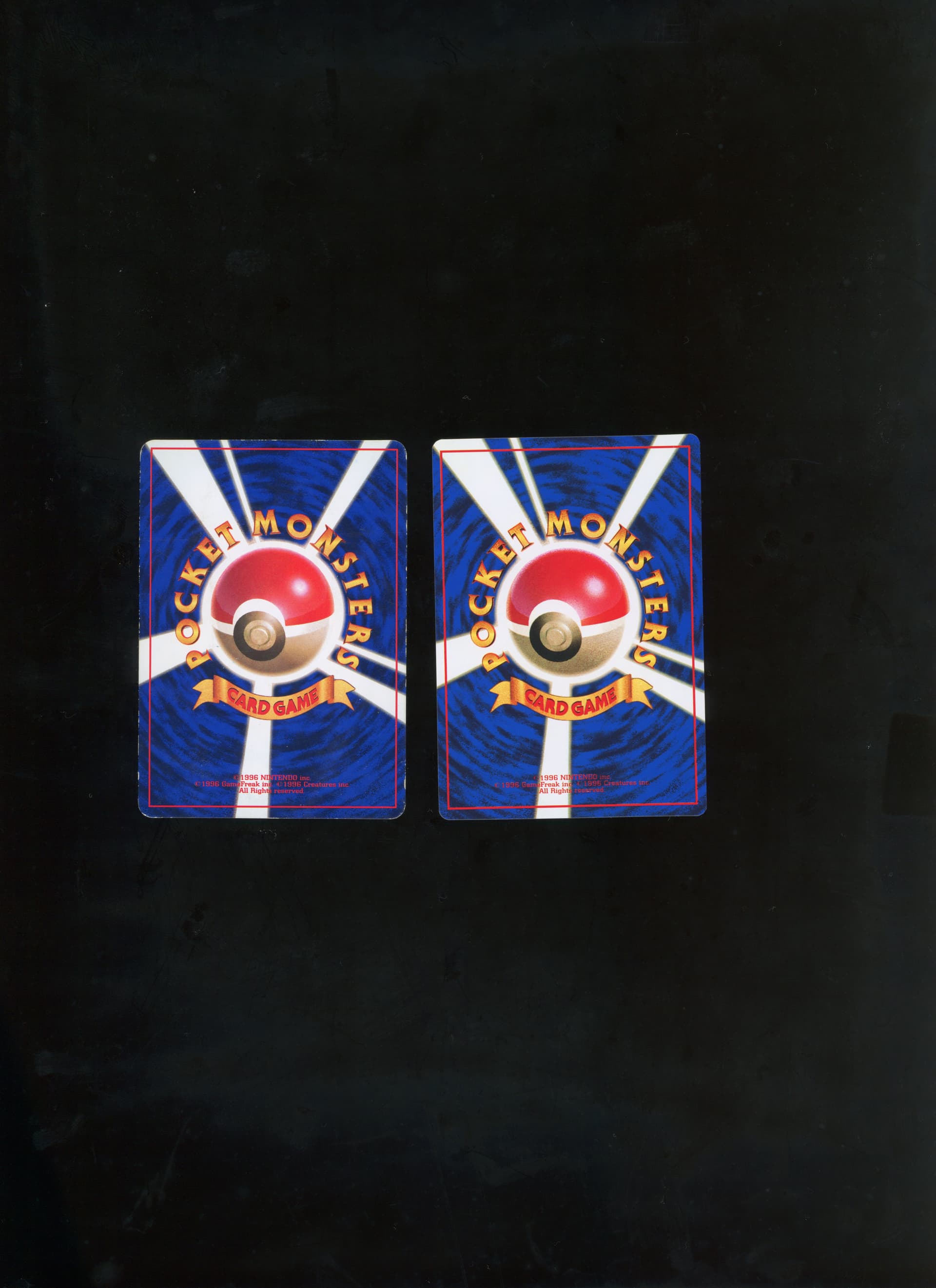
Backs as well, the Staryu is the much more damaged one ![]()
There is definitely a difference on the backs but they have rosettes that are similar even if the image quality itself seems worse on the test prints
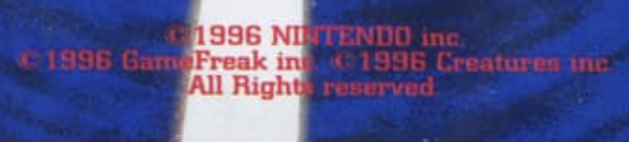
IDK about the gradient, but the text look a lot better. At least, without a Oh, that IS a direct comparison… ![]()
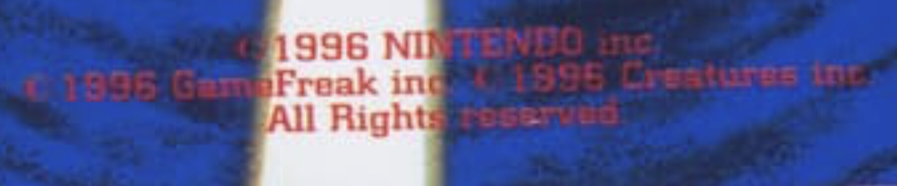
When you look at the copyright symbols, are they the same thickness and font? It’s probably hard to tell due to image clarity, but the Articuno (C) looks a little thinner than the Staryu (C). Are the words as clean as you would expect when you zoom in under a loupe?
I noticed that the outline of the white beams is yellowish on the Articuno but silverish on the Staryu. Maybe this is normal print variance or an issue with the scan.
Thanks for taking this risk for science!
Yellowish beams I found to be pretty common, I’m looking at a Base Blastoise now with as yellow beams as the comparison.
I don’t want to go out on a limb, but this looks like terrible AI photo enhancement to me. Don’t want to hate on Android, but I bet that picture was taken with an Android and some sort of AI enhancement turned on.
This can also happen with modern scanners, but not to the same extent.
You know i always forget about that reality and you could very well be right.