Hello,
I recently saw several people mention a “05” and a “07” version of the PLAY Promo Japanese Gold Star Umbreon & Espeon cards. I’ve never heard of such a thing before.
Does anyone have more information to share?
Thanks!
Hello,
I recently saw several people mention a “05” and a “07” version of the PLAY Promo Japanese Gold Star Umbreon & Espeon cards. I’ve never heard of such a thing before.
Does anyone have more information to share?
Thanks!
Can you link where you read this?
Maybe they were referencing 05 for “Pop Series 5”, and 07 since the pop series 5 packs came out in 2007?
I just saw you mentioned it was Japanese you were referring too, so yeah it was 05. Maybe theyre all thinking of the english version, and are just trying to shill it? It clearly comes from 2005. Are there alot more of those posts?
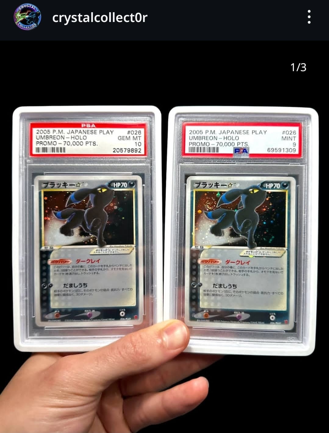
Apparently, the printings for these cards were spread out over several years (maybe just 2005 and 2007, and not 2006), and according to some major collectors on IG (the other one was pokespiffs who owns both psa 10 umbreon and espeon), there are differences between the print runs. However, I haven’t been able to find any information about this… which is why I created this topic, to see if anyone might have more information on the subject ![]()
Thats kind of interesting tbh. Im noticing that the play promotional cards didnt run in 07 (as per bulbapedia), so how was this given out exactly if it was a different print run? The other post mentions it too, but now Im curious and on board lol.
Nice, thanks! Since the info comes from the same source I posted — crystalcollector — I’m starting to wonder if it’s actually a real thing
It’s clear that some differences exist (e.g., borders on the back, slight differences in saturation), but whether it’s reflective of a different printing period or just a different batch printed at another printer is beyond me.
Hey! Yes I coined the term to help distinguish it after seeing many copies. The thicker gold borders on the back of the card are most commonly seen on the cards given out towards the tail end of the play promo campaign (2007) I’ve compared many new back Japanese cards PLAY promos or not and it seems there is a slight shift around this year in the back of the cards. The saturation of colors on the play promos is what makes it the most different and the reason I noticed anything in the first place.
https://www.instagram.com/p/C_ilBBcRJ-T/?igsh=MWcxZXJoeWd6MmFoMA==
Thanks for sharing — it’s actually obvious now (the back borders don’t lie!).
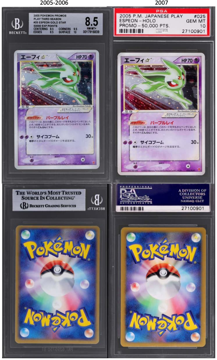
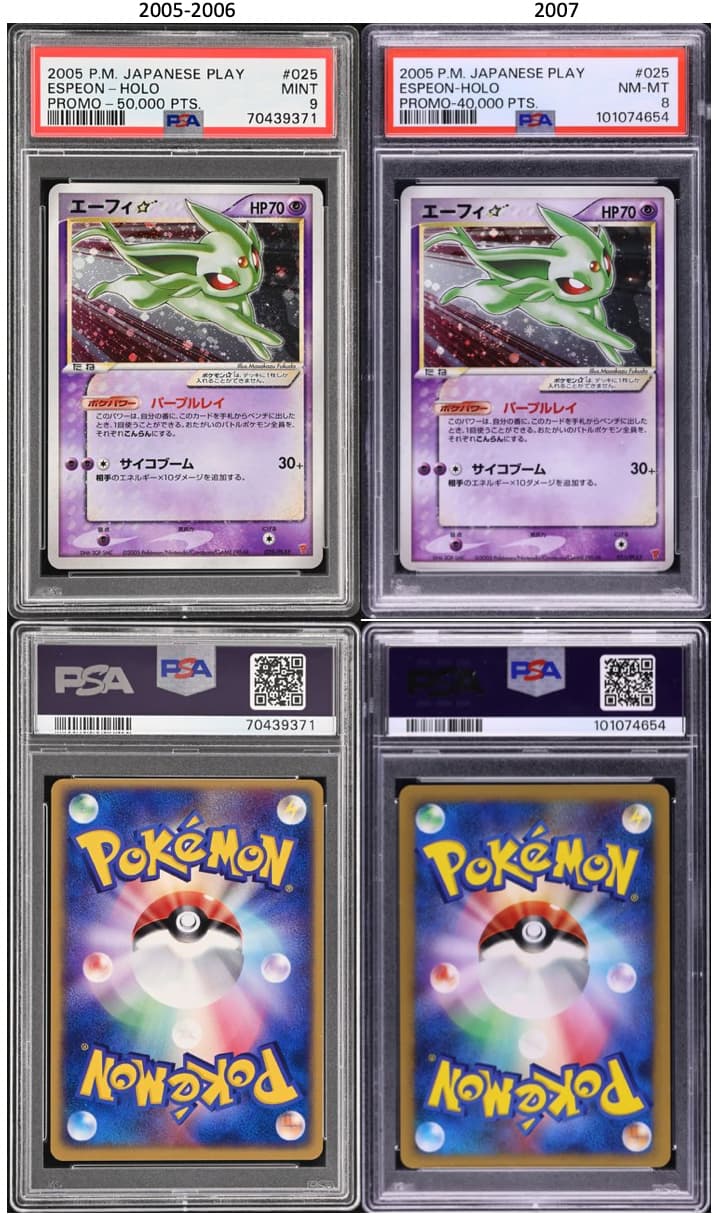
What I don’t quite get is this: for Espeon, it’s pretty clear that the 2007 version (or whatever the actual origin is) looks more saturated than the 2005 one, which makes the 2007 version look brighter, while the 2005 one has more of that… minty tone. (Personally, I much prefer that deeper mint-colored Espeon from 2005!)
But then, in your Umbreon Instagram post, you say the more saturated version of Umbreon (the right one) is the 2005 print. That seems contradictory compared to the Espeon case (even though both Umbreon are so amazing, love them both equally)…
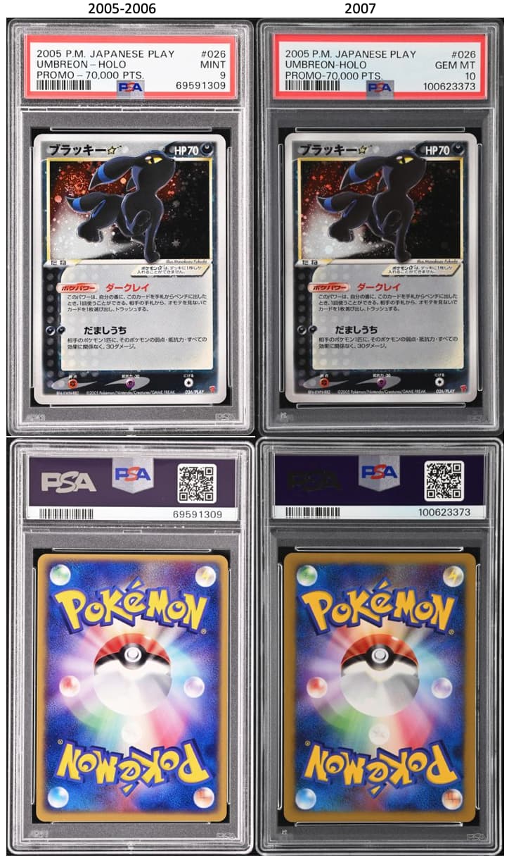
Hey no I’m saying in my opinion there’s deeper more saturated colors in all the 07 versions of each cards. For instance the umbreon is like jet black in the 07 Variant where it’s more of a navy dark blue in the 05 variant
I would agree with @xliveandplay, the umbreon on the left seems to have deeper saturation colors.
Agreed. That’s what I said from the start. Left one is the 07
I hate to bring it back up, but I also agree. The Espeon from 2005 looks more saturated than the 2007, but the reverse is true on the Umbreon. What are your thoughts on that? (Guessing just normal printer color behavior from that era)
Also can I see the backs of the Umbreon out of curiosity? Im sure the looks of the backs would clear it up on the different versions, so there is that.
But when you look at several scans, it gets all messy ![]()
This one is the other way around compared to the one just above :
So I won’t jump to any conclusions. The only thing that is certain to me is that the backs are different — either thin or thick. And the best way to compare them is not through scans, but by examining them in real life.
Hey thanks. I assumed since it was an older cert it wouldnt appear, so I appreciate you. ![]()
I think the back is the best way to tell for sure, and was interesting to look at.