Funny you mention that and my memory is already bad on which was correct and which wasn’t at the time but the WOTC employee I’m consigning these for said that Japan through a fit when the wrong color cheeks were printed.
4 Likes
Haha, well, yellow is “correct”, but the red cheeks look better imho. The exact order of which cheeks were printed first is just something fun to speculate about…
Wrt these cards though, maybe very obvious to others as not realistic, but is it possible that these are actually make readies (or an accident during prod) for MTG (not Pokemon)? And so the MTG card backs are actually printed over tests/scrap from an earlier Pokemon printing(s)? Rather than the other way around and these being MTG stock used as make readies for Pokemon…
If these all come from the same make ready for MTG card backs, then maybe they’re using a few scrap/test sheets from earlier Pokemon printings - the Pokemon wouldn’t need to be from a consistent deck or known sheet then.
@Nightvulture is this something that the +15/-15 phenomenon that you’re researching could shed some insight on?
1 Like
Unfortunately, I don’t think so… I’ve checked a bunch of red / yellow cheek shadowless scans already ![]()
2 Likes
@kamex is right, theyre the same, just a corrected “error”. Both cards were printed with - front plates. I believe by the time they were finished with thick stamp foils, they were using PBM for front plates and outsourcing mass produced backs from a secondary location possibly. Theres slight variation between the backs and front borders on shadowless with UV. I can group mine into 3 piles last i checked.
2 Likes
Hey you use discord any? Would love to pick your brain if you dont mind
Nope, I’m not on Discord.
Facebook is usually the easiest way to find me.
1 Like
I think I have info for both of those topics, cheek color and magenta screen angle differences, but most of it will have to wait for another day.
In the meantime, I’ve just left a long comment in the Protostoise topic which might shed some light on a few mysteries.
The short answer is yellow cheeks, then red, then back to yellow, but there’s a little more to the story.
6 Likes
Thanks! That confirmation of the order is very satisfying to me as an early base Pikachu collector. Will definitely be on the lookout for when you have time to share more of the Pikachu cheeks mystery / screen angle differences. Also, tagging @Quuador who has written about all the early Pikachu variations and I think has (maybe?) wondered about the order too.
1 Like
I just shot you a message on Facebook I think
Yep, you found me. ![]()
Yes, it’s possible that either image could have been printed first.
It’s pretty difficult to tell which image is applied first, but sometimes there’s clues.
Double printed areas always look darker because they’re extra saturated with ink.
Cards normally have a clear wear coat to protect the printing, and this reduces surface porosity, so the second printing appears a bit lighter since the ink can’t soak into the cardstock.
The black border around the Magic card appears fine, so I’m thinking either the Magic card was printed first, OR those Pokemon images didn’t reach the clear wear coat step of printing (incomplete / press was stopped).
If the Pokemon image didn’t have a wear coat AND was printed on top of the Magic image, you might be able to see that in how the light reflects off the surface of the card (won’t work inside a slab). Basically, the clear coat is glossy which reflects light, and printing on top of the gloss reduces its ability to reflect the light.
3 Likes
Oh neat - the clear coating is a good point. I wonder if PSA did that inspection already hence the labeling of this as a Pokemon card on MTG stock (implying the Pokemon image was printed over)…or if that was just the assumption that was made. Maybe pre-slabbed owners checked?
Hello,
Did you know that there are two versions of this Pikachu card?
One has a shadow in the illustration box, and the other does not.
Could it be that the presence or absence of the shadow was one of the reasons this test print was made?
If so, it might explain why only the illustration part was printed.


6 Likes
Oh that is cool to know - thanks for pointing that out!
2 Likes
Ok, I made it back to the Red Cheeks topic. ![]()
While 1st Edition was being sold, someone at WotC decided that Pikachu should have red cheeks. Maybe it was the Art Director, or perhaps a manager told the Art Director to do it.
However it happened, the updated artwork with Red Cheeks was given to the typesetter, who was told to use this for the next print run.
He did that, along with any other changes management had asked for.
That’s correct. I wonder if your WotC employee is Jill Waller? ![]()
She was the Production Coordinator at the time, and later became a Brand Manager.
She would certainly have a story to tell about this incident.
I found her through a couple mutual friends who worked at WotC, and tried to contact her in January 2024 about a Pokemon project I was working on, but she never replied.
When Japan wasn’t happy about the Red Cheeks, there was some finger pointing inside WotC.
The typesetter removed the Red Cheeks at the same time he added the shadow for Unlimited cards, along with whatever other changes they asked him to do.
Redo all of the cards & collation, and replicate the earlier sheet layout.
It seems that Japan being upset about Red Cheeks, is what stopped the Shadowless print run, and also stopped the E3 Promo print run.
The link below will explain the order for all the WotC early versions of Pikachu.
Print Run Order For Early WotC Pikachu Variations
6 Likes
Cool, thanks for pointing that out! ![]()
Assuming that both cards were printed near the same time, this strongly implies that these were made about the same time that red cheeks went away and Unlimited appeared.
It’s nice to have a better idea for when they were made.
Double printed cards wouldn’t be a very good way to look at the results of either card.
It obscures anything they’d be trying to see.
2 Likes
To add further context, the shadowed Pikachu differs in border size compared to the final retail version. It seems they experimented with various things.
Would it be reasonable to assume that printing on a blank sheet took place after this print?
Is there absolutely no possibility that this single sheet was printed just for a rough check?
However, why did PSA label it as “TEST PROOF”?
In the sports card world, there is a label called “MAKE READY” — if this went through the same process, I would have expected that label instead.
PSA’s use of former employee testimony makes it unlikely that they misunderstand the difference between a make ready and a proof — which is why this labeling is a bit perplexing.
2 Likes
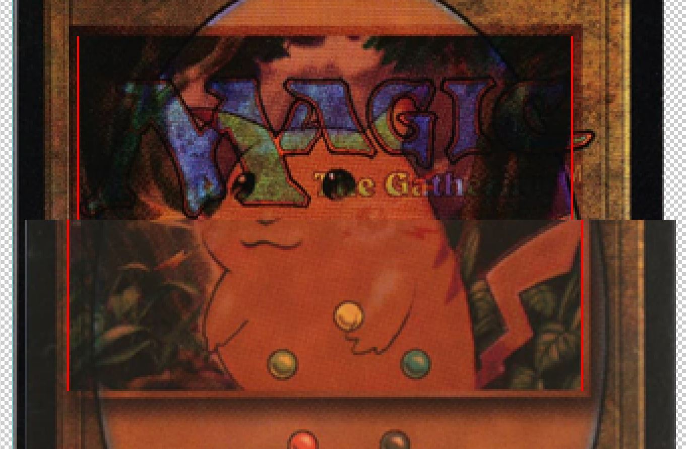
I had to take a look at that. Here’s a couple pics to help everyone see.

Yep, it’s both wider and taller. (this pic only shows width, but I checked both.)
Regular shadowless & Unlimited have identical art sizes.
The double printed card that’s shadowless, is normal size.
This pic also helps show that the shadow version is larger.
Red lines are on the edge of the artwork.
I think it’s pretty unlikely that the art size could change accidentally, so this would be further evidence that these cards weren’t made with any normal printing plates for a regular set.
In other words, they couldn’t be misprints from regular production, and can only be real if there’s some mysterious printing plates that we’ve never seen before.
That mystery is why these require extra scrutiny, because they can’t be explained with anything that’s known to exist.
Only the artwork, and at the wrong size, is quite odd.
I’ll run these new details past the typesetter and pressman when I get a moment, just to see if it jogs any memories or if they think it’s possible.
If these are Make Readies, yes, definitely.
I don’t think so.
Assuming that some kind of weird test print plates with only the artwork existed, then these would be Make Readies for that print run.
Every print run has Make Readies, even Test Print runs.
The main purpose of Make Ready is to calibrate the press and get all the printing plates aligned with each other.
They run scrap sheets through the press while this is happening, and every now and then they send a blank sheet through to check their progress.
They don’t look at the double printed scrap sheets, they wait to look at the blank sheet, because it’s too difficult to check the plate Registration with other images on the cardstock.
Those occasional blank sheets being sent through, are also Make Readies.
Once the Make Ready process is complete, there’s a Press Check (the pressmen have the boss inspect their work), and then regular production begins.
Everything before the Press Check is a Make Ready, and is supposed to be destroyed.
If it’s a regular print run, everything after the Press Check is a regular card.
If it’s a Test Print print run, everything after the Press Check is a Test Print, which is supposed to be sent to WotC for review.
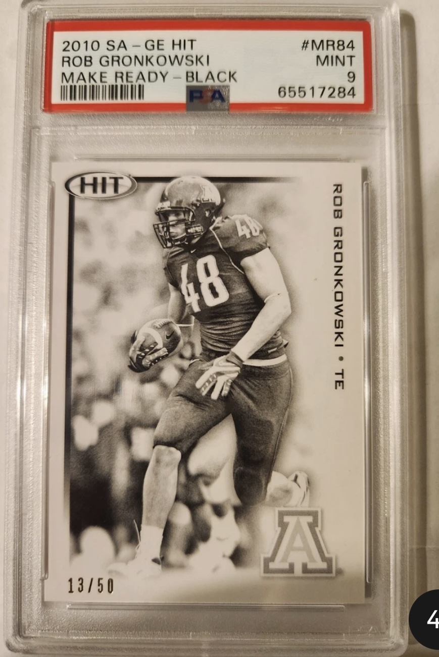
That’s awesome, I’m glad to see that PSA is using the Make Ready term.
I have to wonder if they’re using it correctly though, because that sports card appears to be only black ink. When you’re aligning the plates, you typically have more than one plate being used.
I can think of a couple other reasons why a card might have only black ink, but that’s off topic.
Test Proof is very odd terminology.
A Test Print is an expensive small print run which happens at the print facility, and is returned to WotC for review.
A Proof is something used for proofreading. There’s several different kinds, but it’s a preproduction thing. It’s for checking things out before you spend a lot of money on production.
Just recently, I heard a current WotC employee (friend of a friend) use the Phrase Test Proof, so it is a real term. I dug into it, to figure out what it was.
For the past few years, WotC has been extra creative in pushing the boundaries of card design. They come up with a lot of ideas and variations on those ideas, which they need to show to other WotC people in order to decide which design to move forward with, but Test Prints are too expensive, and plain office paper doesn’t look good enough to convey the ideas.
Their solution, was to get a high end large format inkjet printer that’s specifically designed for proofing, and has a variety of special papers that can be used to mimic foil and other treatments.
When they use this machine inside WotC headquarters to print out all their ideas, the resulting “cards” that get passed around the office, are called Test Proofs.
Test Proofs are fancy inkjet prints, on special paper that’s not the same cardstock as regular cards.
Here’s a picture of some WotC Test Proofs from the Duskmourn Magic set.
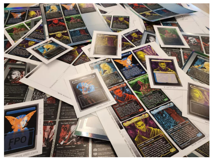
(bottom left card says FPO, which is For Position Only, kind of neat)
These are not Color Proofs like the old Matchprints. Color Proofing comes later, just before sending stuff to the print facility.
These Test Proofs are just the concept stage of card design.
I’m not sure who PSA spoke to (or if they spoke to anyone at all), but with Test Proof being a relatively new term, I have to wonder if they reached out to current WotC, instead of someone who was around when this card was made.
5 Likes