E4 ART CONTEST 2023 Thread! (Complete! Special Announcement for next year)

Thank you guys @c0ll3ct0r @liron , you really, really are too kind!

N’s Hisuian Typhlosion was made digitally with Procreate (ipad + apple pencil), but with the intention to mimic tradional art! I used a free digital charcoal brush and a lot of patience.

Palmette1a
This is a little time lapse to show my workflow. I would say it took several days to complete, and it was a trial and error process

I really like drawing with this texture heavy colorful style, so I put some more effort into replicate the Komiya touch a bit referencing his artworks (with a sprinkle of Kanda). Combining it with N was a friend’s idea, and I thought it was super cool!

Regarding my 3d submission:

I took the model from here, and then I open them in blender. I’m really a noob so I wasn’t able to do any rigging or complex composition.


Early stage of my artwork, it’s just some point lights and models placed in the granite cave from oras!
Palmette2
Then some cool effects in Procreate. You can do the same thing in blender, but like I said I wasn’t able to do more complex stuff lol

18 Likes

Very nice behind the scenes! I could have sworn your Typhlosion piece was traditional haha. Very convincing! Awesome job on both btw.

5 Likes

Ive got a ton of comments for others Ive been waiting to share but I’ll hide most of them so I dont kill those who like to scroll. Thank you anyone who liked what I did, Im still working on the piece that was intended for this and I’ll post it once it hopefully reaches completion. By this point I think my style is being obscure but very particular whether in subject or style but that can be a drawback when I am being detailed. The best part of this is I have made this blank unnumbered stained glass birds that Im sharing only here with you all to print and color your own whatever way that youd like or to give it to your kids to do that if you’d like.

Thanks again @brendantheclayboy and @azulryu for running this, its always a joy to be creative and despite sometimes being critical of my own work, its nice to share with such a great group of people.

A quick note about my intents and thoughts behind my pieces.
Red’s clefairy’s metronome overkill

Summary

was something I wanted to do because I wanted to play on the meme of hyperbeam being used on a fairly weak pokemon. I wanted it slightly different in that it was more of a miscalculation with metronome coming out with a hyperbeam in a battle between who is the best of Red’s pokemon. The manga the characters are based on allows a lot more cliche anime expressions than most so that manga was the basis for character designs which is something that I thought would be more fun than the usual small eyed or vacant look. It was interesting that there was a recent post about the true mascot of the pokemon company since I already had in my head to show a fight between them. Wish I could have done more with the background but I was rushing to submit the last 5mins and I literally couldnt think of a background that matched until after submissions closed, I would have gone with a skyline at dusk similar to the new cleffa AR card.

Stained birds color by number

Summary

was plan C in my art attempts for this. Plan B was to still using this card but to cut it out of wood scraps and stain the wood pieces so that the woods growth rings could function as the texture. I am doing too many personal projects to get time to shape the wood cut outs and the art itself was very time consuming to recreate around the text. I made it really hard on myself by not using Ai. I used multiple languages of the card to try to view the art in its entirety due to the graphic position changes based on how much text there was. Lots of redrawing and some digital editing to remove slight mistakes or clear up the lines. Also going back through to input digital numbers in every section but in a light gray so that it could still be colored by others was time consuming. The color key I listed in the submission post should work pretty well for it though. I am very proud of this because while it may not be perfect or look great, it took a lot of effort and is the closest recreation that follows the original art and glass layout that Ive seen. Also Im sharing the unnumbered version here so that anyone can print it out and try the coloring themselves.

My thoughts on everyone elses work:

Summary

@kromaticlanturn Your shiny ninetales started off the competition at a needlessly high level lol. It looks awesome and while you lost some of the wildness from the original it also radiates power like crazy.

@Dyl Your Rowlets are so happy! Is there any reason you chose Rowlet?

@zyxxke Your Regice gives me such a war of the worlds feel. The details of the wear and age on it looks great and gives an impressive feeling.

@Josh Oh my on that mewtwo. But really its very picasso like in its perspective. Definitely fun to look at though.

@bbobrob You are quite talented in your crafts. Crocheted Rowlet on a branch with a cute background is so pleasant feeling. Psyducks birthday despair is awesome. I love the stitched borders and embellishments. Talk about impressive, 5 card recreations in one! They all go together great and you did a phenomenal job with your color choices.

@martin definitely one of my child favorites. The perspective is great because its something that looks like its actually from a childs height. Also persion looks so pleased with itself you cant be mad at it even though its causing mischief which is also exactly what youd expect it to do. Im not sure its ears would flop like a dogs but it doesnt look wrong like that and overall its an adorable piece. Your jolteon is great! The layered paper gives a great depth and you did an awesome job on recreating the original. Its also one of my favorites.

@Gus Dratini looks so happy coming from a party

@cyberurchin Dialga running around space as a giant cosmic terror is so fun but also so childish. I also like the planet details. Your Lugia hunting during a storm looks very powerful. Your shadows and lighting are very nicely done.

@swolepoke I like all the different perspectives you gave the pokemon. Everbody is sleeping a different way with different dreams on their minds. Very cool.

@niece A ride through the clouds on a charizard with a child (or grandchild) sounds amazing. Love the details on the humans like the expression and the charmander doll. Your recreation from a different perspective is quite impressive with so much life happening just out of view of the original. Very well done on not just the plants but the pokemon look great as well.

@boogus Wow, how did you decide to try doing it this way? With the limited 3D models it looks great for a recreation or a 3D submission. All the pokemon line up so well with the original. The hydreigon makes me think of boss fights on jrpg’s so that was a really fun memory to get thrown to from it. Thanks.

@northerninfernape Your lugia looks really good but the tentacruel is so fun coming out of the darkness

@liron Thats the smallest happiest onix Ive ever seen lol. All the details of the pokemon having fun are amazing. Your recreation is spot on with the expressions and lines looking so clean. Definitely deserve those placements, congrats!

@ayoveer That Murkrow is amazing. I love the symmetry while hating that its offcenter. It feels very real because of that but I could see this being on a card that matches with the PE Mismagius.

@SeasidePokemon You did a great job with the background blending with sugimori stock art. It absolutely looks like it could be on a WOTC trainer card. Your layering, blurring out of focus, and lens flare all work great with it but the blurring is the only part that throws off from actual art since I dont think there are many that blur the background pokemon. The surfing pikachu is always great to see as well.

@Rattlesnake I love your Golduck and that you snuck so many pokemon and other elements into it. For the scyther is it physical or digital? I think you did great with it but Im not getting a lot of rage from it, maybe heavier shadows are would give it that feeling more?

@livindavido Your child drawing makes me feel terrible for cubone on such a nice day. I like the gyarados kite. The Giovanni looks really cool but I think the layout makes me think N64 007 but if it was glitching in a couple spots with a couple elements that just seem slightly out of place. The design is cool and well balanced.

@decoypalmette Both your pieces are stunning. The Typhlosion has great mixes of color that really work together. The chalky look to it really looks great. The kabutops has really raised the bar on the 3d portion of the competition with the lighting, layout, and details. It looks like there is a kabuto temple ritual going on with the unknown glowing in a fun easter egg. The background details behind kabutops blend really well as well. Congrats on the wins!

@chefonaquest Your eevee stretching is really cute, definitely could see this style on an actual card. I am most impressed but your recreation though. You did an amazing job matching the intricate details. I really love the level of detail you put into the shading. Its easy to do when coloring but to match your energy card cuts with the shading in mind for each pokemon and to capture it flowing so naturally is mindblowing. I really like how the grass energys design is incorporated into the leaf pattern and gives it texture, same with the weepinbell and the purple flowers. Absolutely amazing and appreciated. Have you done this before?

@fazool I have no idea what is happening with those voltorb but its definitely original and fun. Nice job picking an idea and running with it while executing it well… i think?

@defluo Shame it couldnt be finished but I always love your concepts and how world appropriate but dark they can be. Hope to see more of your stuff in the future because your subtle details really tell the story like the cracking bone from the attack. Marowak defending cubones is expected but possibly losing that battle leading to what makes cubones not have moms is a cool realization to get when looking deeper at it.

@veks Your spritework is awesome. The scizor has such a striking and powerful pose for 16bits.

@lookaclara Very nice and smooth watercolors. That you took it from real life inspiration is even better. Your bellossom has such a happy and excited feeling.

@mrbubbles your concepts and layouts look great. I really like the way they are laid out.

@gott006 Its so minimal but clear on subject and feeling. I only wish you stuck with the single dark squiggle lines for shadings instead of the lighter gray squiggles on psyduck because it makes it too busy for me. Awesome job though.

@coil They look so happy… well as happy as they can look. Your Aron looks like its had too much though and is taking a nap lol.

@MaxyMaxy Yep, Im certain that you can be disqualified for submitting official art. But really this looks so good. Your colors and shading look really great!

@glenngould98 The only one who looks happy about electrodes pool party is the boy behind the ditto. I love this submission. Its so playful and direct. Electrode has such a great attitude shown in it.

@gareth Cute concept, nice background, sad you couldnt submit everything you wanted.

@khairis Those mareep are amazing. That front one is jumping like 10ft which is hilarious and also probably appropriate given its evolution line.

@pfm Cool composition looking at it from mewtwos perspective. I find it interesting how you used the lightscreen as a mirror to center mewtwo as the subject. Very cool.

@Versy Both of your submissions are amazing. I love the expression on the surprised back Girafarig. Your style is so dynamic and fun. Also great card to recreate! Congrats on the 1st place.

@Schileru Your child piece is a bit dark for me but your original is very cute and relaxing.

@totodile_in_pursuit Awesome concept on the electrode. I love how you did the city and if the electrode was a bit more smoothed out I could absolutely see this as a card art.

@oxidelake I like the concept with lesser represented pokemon. I also really like your coloring as it gets deeper. Very nice work.

Cant wait for next year and hope to participate more this year in @bbobrob’s artwork and craft post. Nice job everyone!

15 Likes

Thank you so much for voting for my drawings!! :purple_heart::pray: The turnout of creativity for this event was amazing! This is my first year participating and I had no idea what to expect. You can tell you guys really are passionate about the subject matter here, there’s so much love for underrepresented pokemon and niche card references.

Congrats to the other winners, your pieces are excellent and it felt like the results really came down to the wire!

@liron your recreation piece I legit thought was official art at first. Took me a minute to realize it was your submission! Love the execution and vintage homage!

@decoypalmette your komiya-inspired typhlosion piece has amazing colors! I love the textured look and you pulled it off excellently with lovely color choices!

@martin I looove this one! What a cheerful Persian. I just never see happy Persian, and the cheeky little grin with the pawprints. If this was a card it would be my favorite Persian card hands down.

I wanted to mention a few pieces that didn’t end up on the top 3 / honorable mentions that made an impression on me:

@bbobrob your Psyduck piece I found very creative, mixing a few different cards into the same scene to tell a story! Love it! The embroidery was an interesting choice as well, would love to see more like that.

@cyberurchin your Lugia piece has such a powerful tone to it, I love the lightning in the distance, it definitely looks like Lugia is the king of that domain! Also, gotta love rim lighting. :grin:

@swolepoke All the little dreamin’ fellas… I just love it. It’s so cute.

@oxidelake Your Binacle piece is lovely! Could Binacle be the most forgotten, unpopular pokemon?? I never see anyone draw it. But you made it so cute and put it in a wonderful, inviting-looking ecosystem.

@defluo Sad to see your piece couldn’t get finished! Would love to see the rest of it, it looks very cool!

I’ll also share a couple of my WIPs for my winning piece, if anyone is interested to see the process. I didn’t save a pic of where I block in the shapes, but you can imagine random colors everywhere lol.


My sketches are typically very clean so I can trace the shapes easily.

If it’s a complex scene I usually do a rough color pass to get an idea of what I want to do with the color.

After that I block in the shapes and basically recreate my colored “sketch” and add any “post-processing” such as color shifts etc.
What a blast! Thank you guys again and for the gracious hosts who organized it!

19 Likes

See, it’s this follow up from everybody that makes every second worth all of it. I’m overwhelmingly overjoyed. Art is life. What better than to combine that spirit with the thing that brings us all here?

Ok so here’s my book on my favorites, and some of them overlap as winners, so a little of both.

Child is one of the categories that was impossible for me to vote in. Now that there have been a few years, we’ve been versed on some art contest veterans’ styles. Here is one such example where we cannot be surprised he won back his champion title. @maxymaxy ’s Dratini meeting is oozing with jazz. He’s got the spunk, kid. He has mastered this style, and everybody loves it. Each Pokemon is very maxy in their expression. They look childlike, within a childlike portrait. Everything is perfectly disproportionate, yet larger than life. The color and texture is youthful and innocent. Just go make cards professionally already. Now he is the two-time champ to beat. @Martin ’s feline morning delight is purfect. Feels like Baba’s Raichu, a masterpiece in itself, features one of my favorite Pokemon, it’s so satisfying to see most others agree it’s top notch. I love not only that its delivery and composition is stellar, but that the story idea it’s telling is both Pokemon-spirited, childlike, and humorous, with the title to fit. Just amazing, well deserved. Geez, @rattlesnake ’s peeking duck is, oh my god, admittedly my favorite in the whole contest. There is nothing but deep, deep joy I feel when I see this card. It’s sitting as my desktop background right now. If I begin to talk at great length about it alone, this (what is already going to be a ridiculously long post) would be an actual novella. I will just say, thank you so much for blessing the world with this divine piece of artwork. I am in awe. Also, I swear on my honor, the idea I was going to do for my trophy (#2) was almost exactly like this. Instead of him peeking, he was going to be diving into aquapolis-like ruins, but with a very similar atmosphere. That is the cherry on top of this all, to see yours.

@gus , I stared at your dratini party at dragonspiral tower for a long time. I adore it. It also invoked sentiments and memories in me of marioparty 1 on n64, Mario’s rainbow castle. It felt so much like that. I hear it when I see your art

Everything that I love of this category is embodied in your piece. It’s so damn good. I love your work each time around, your color pencil approach is so looked forward to. @khairis , year #2 champ, your work is even better than last year. Such a hard competition this year. Love the reference, love the look, love the detail. Yet another one that just works perfectly. @schileru , Mr. Mime is another one of my favorite Pokemon, and yours is one of my favorites of all. I love love love love your piece, and it made me laugh hysterically for several minutes, and more minutes again each time I revisited it. It’s amazing, man this category was brutal as hell this year. I can’t imagine a year ever being this hard again in child. No way.

Recreation was gut-wrenchingly hard too. Not as many particular favorites, but, objectively, nearly as hard. I thought the winners all brought something great to the table. @kromaticlanturn, you are not only a friend, but I will always love your art style. I voted Ninetales high, I think it is just as good as your previous golduck. @lookaclara ’s petals awakened was one I thought was utterly brilliant and was perfect for the category. As I’ve said before, your watercolor is vibrant and brimming with joy and the love of artistic expression. You made it better than Nishida did hers. Yes, I said it.

For 3D, I was in agony over who might take first place. I’m a massive fan of @fazool artwork and always look forward to his work, and his rocket’s gengar is basically as good as you can get for this category (with imagining the artwork as a card). It has everything I love about cards, and it’s fazool style. Nightmarishly excellent. @decoypalmette ’s EX fossil dungeon is otherworldly. Celestial might be the right word. Also perfect for the category, perfect understanding of the guidelines. Both these were amazing and I chef kissed them both, and they both ranked highest. It’s actually almost like fossil dungeon is the light, and gengar is the dark. Wasn’t this just a perfect top 2 for the category, conceptually? Another category where I think it will be hard to upstage in the future. I look forward to both of your works next time! And truth be told, I thoroughly enjoyed every single sub in this category. They were all gritty and eye catching. Well composed, great ideas.

Oh, original. You bugger. There’s way too much to unpack here. Forgive me. I do need to talk about the top 2 winners in addition to favorites, since this is the most celebrated category, and these artworks are so deserving. @decoypalmette ’s N’s Hisuian Typhlosion is incredible and so well deserved in its placement. It feels like Komiya, but is completely different, has transcendental atmosphere, some of the best I’ve seen in a card. Love the star lit yet dingy, warped forest, but the light that comes from within this gesture of love. It’s perfection. So phenomenal that I actually like this variant of Typhlosion now. You have that sort of artistic power, yes. You too, just go make cards professionally, geez. @versy ’s flash of lightning is of exactly the same in manner of quality. Unbelievable composition, lighting, color, pose, dynamic, naturalism, character… I could go on and on. I truly think this is deserving of champion. That sort of polished digital look, the one I’m not very fond of ordinarily… you do it the best. Better than any of the tcg artists that employ this. I speak to you in earnest. This card is BY FAR and away better than all 3 of the tcpi 2022 illustration contest winners. So yeah, our contest is better. Pokemon, get these people some jobs already, gawd.

@totodile_in_pursuit ’s Electrode’s City became better and better every time I looked at it. Pardon the pun… it is exploding with creativity. It also has excellent atmosphere. Those gritty cityscape dreamscape scenes make me weak in the knees. I love models, I love that it is photography as well as model work, making the depth of field an artistic factor. Would love to have this as a card, very much. It is definitely an E series card right here. Better than Morii. @rattlesnake clearly knows how to get me with his art. Scyther’s rage is both Kusube and not. It’s yours. This scyther, lurking in the black of night, revealing its face from the zero visibility conditions, menacingly arching its head out from the blackness, feels like a David Lynch still frame in my mind. I can feel his breathing. It feels very full of life. Quite surreal. Minimalistically as it needs to be. @lyleberr ’s Red’s Clefairy’s Metronome Overkill needs mention. Wow, do I love it. I would love it even more with a detailed background, but there is something to be said of its quality even as is. It’s purgatory, in the wiped mind of the Pikachu to where clefairy brought it upon the summoning of the metronome. I wouldn’t want to mess with that sort of omnipotence. @lookaclara ’s Delcatty’s Fern in the Sun is everything I said about the recreation sub, but better in every way. A watercolor masterclass in hue, in strokes, and texture. @gareth. Gareth Gareth Gareth. Just. go. make. cards. professionally. Already. Lilypad Pikachu is another masterpiece. You’re a visionary man. I want to buy art from you. Not only what you bring to this contest outside of the submissions, but I always heavily look forward to seeing your work. You’re a true artist. @bbobrob ’s The Sentry also deserves mention for being so whimsical, blending himself with 2 very well known tcg artists and creating a world of wonder. I love it. Last but not least (these were all in no particular order) is @cyberurchin ’s Crystal Lugia on the Hunt. Oh man is this acidic. One of the best subs. Compositionally and atmospherically the style I love to see. The light and air quality is really unique, the dotty aura surrounding Lugia is awesome. I am a fan of yours. And after reading these poetic posts so far, I want to add that @niece 's inspiration story is tearjerking and profound, and hearing it adds to the power of an already exquisite work that I thoroughly enjoyed. That’s the exact thing I and many wanted to hear from the artists in what led to their creation.

I think this category and child were the most brutal. Where I needed to pick more than 3, but couldn’t. Objectively there were more than 3 best artworks in these categories.

And all those I didn’t mention, I enjoyed seeing every single one. Just because I didn’t write something about all of them, doesn’t mean I didn’t have much to think and say about them. All full of love, life, and creativity.

Since Azul said something beautiful about his creating his trophy (which I was so happy he did), I’ll do something I haven’t done before, with regard to that.

sketch for trophy 2


I always look eagerly forward to making my trophy, one of my favorite parts of the contest prep.

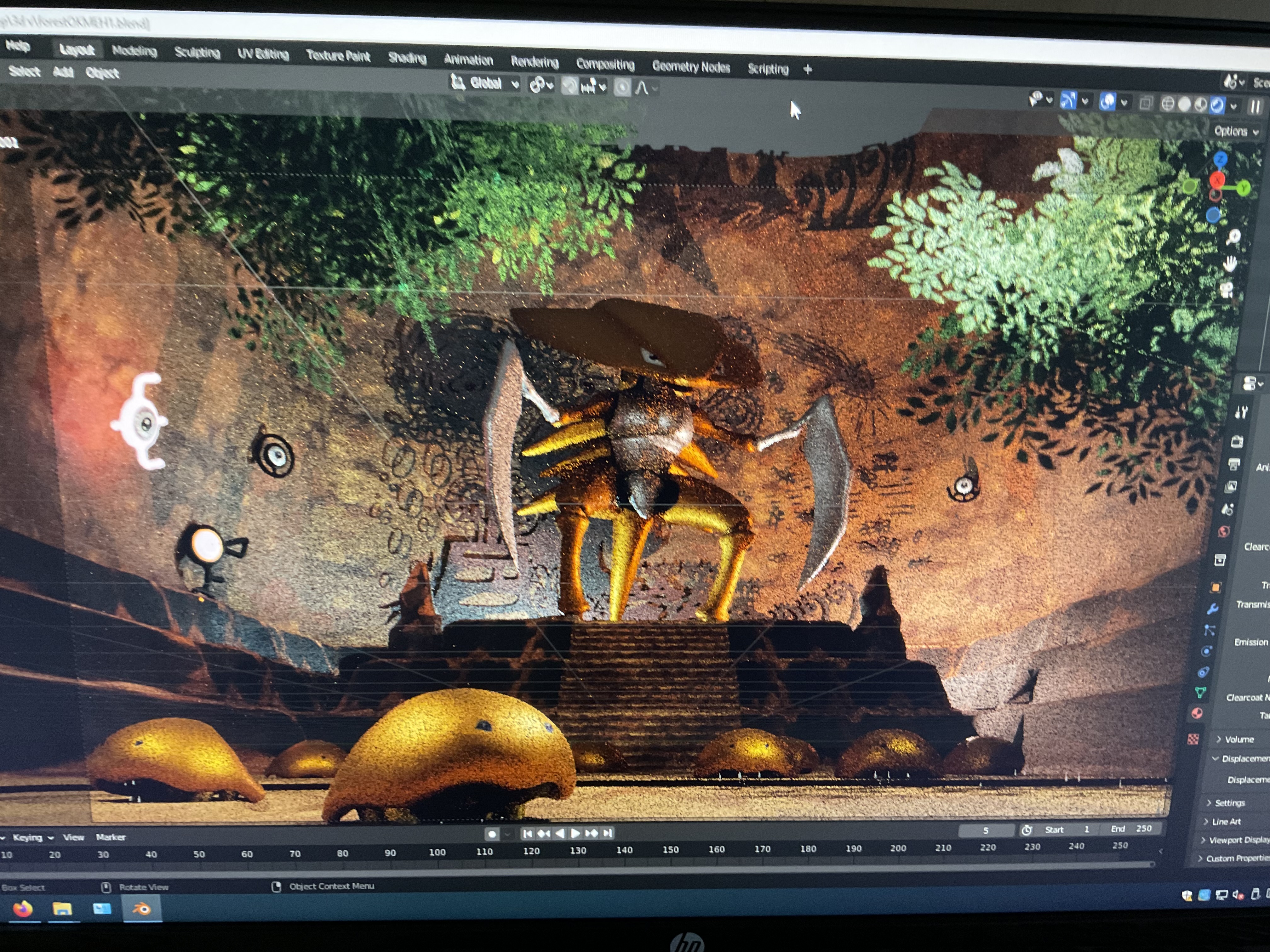
Here’s a sort halfway point picture. I shockingly didn’t take a full frame one, must’ve been engrossed in it late at night. This pic was supposed to be to show Azul the idea for more paintings on the wall, but the final version only went with the pokemon legendaries.
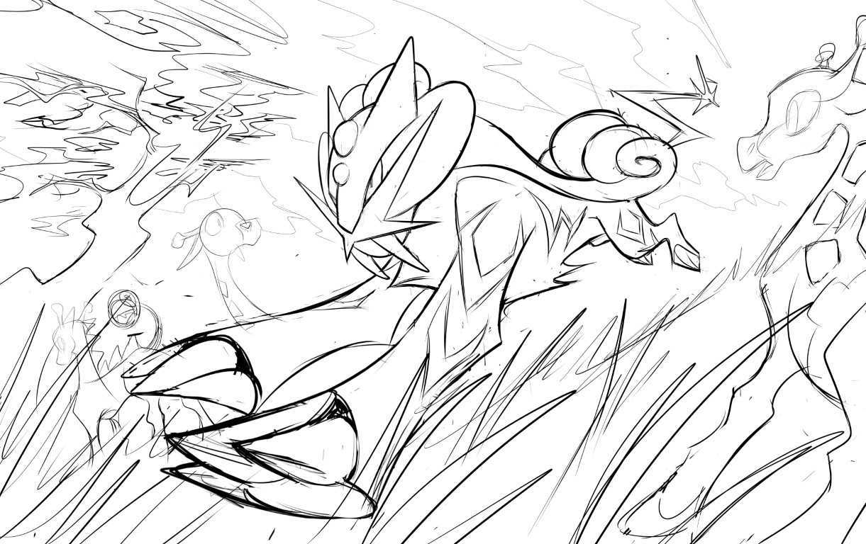
sketch for trophy 1


I loved bringing Azul’s conception to life. He completely wrote and sketched the idea, photographed it, sent it and described it to me, so this is my depiction of his creation. He’s got a brilliant creative mind, as much as he shoots down his talent, he’s underestimating himself =p


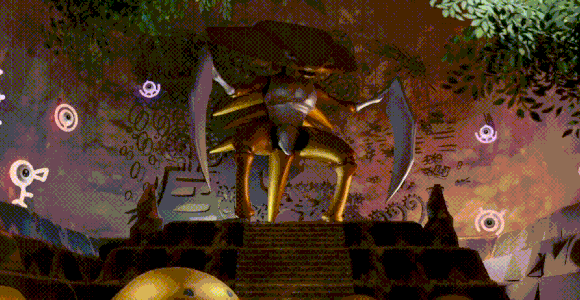
Sorta halfway point picture. As much as I would love to share the complete versions of these, that and the card they are placed in is reserved for the winners!

17 Likes

Thanks brendan for the kind words! And thanks so much for heading up the effort and organization of the art contest year after year with @azulryu !

We really appreciate it. :smile:

6 Likes

Oh wow i had no idea this thing was happening. Good luck to participants!

3 Likes

No way! Thank you all for voting for my art :smiley: Really shocked that I was able to place at all with such tough competition. Big thanks to @brendantheclayboy, @azulryu and others for putting on such a great event.

@lyleberr I appreciate the kind words! I have been making these energy card pieces for a while (shameless self-plug for my Instagram page if you want to check them out). I have a process where I plan everything out ahead of time in Procreate. This allows me to cut the cards in a way that will satisfy the original shading of the piece I’m recreating, and make sure that most of the separations between cards are hidden by the black cardstock layer. Though, I often make exceptions since this is a very limiting medium.

Finally, for those who are curious, here are some more notes on both of the pieces I submitted, including WIP pics. Also wanted to give shoutouts to some pieces that really stood out to me:

Recreation Notes

Recreating this piece by Kagemaru Himeno took many hours of work across multiple days. The black cardstock layer covers 77 individual pieces which were cut from 21 Pokemon cards.

I had to extend the image length-wise because the original image did not fit the dimensions of the frame I planned to use, so I added Exeggutor’s leg, Weepinbell’s stem, and other background filler. All planning was done in Procreate.

Over the years I’ve accumulated many energy cards across generations, and that allows me to add a lot of variety in my pieces. Psychic Brilliant Stars energies to make the flowers pop, Sun/Moon Metal energies to give off a stormy sky vibe, etc.

The only non-energy I used was Pikipek from Vivid Voltage. You may be wondering why I don’t just use a VSTAR energy for the white pieces, but these Pikipek cards actually have more uninterrupted white space in some parts of the card that make it better for shapes like Poliwag’s stomach, for example. Also, I started making these pieces before VSTAR energies existed, and I bought a bunch of bulk Vivid Voltage Pikipeks for cheap, so they’ve always been my go-to.

One of the biggest difficulties is cutting/placing the loose pieces that aren’t connected with the line-art. They can get really small, especially in a 4"x6" piece like this. I actually lost a few, and if you zoom into my recreation, you’ll see I actually had to draw on these black portions with a Posca marker, haha.

Anyway, this was a blast to make, and I’m so glad people enjoyed the submission!

Original Notes

As an Eevee collector, I obviously had to do an Eevee piece for the original category. I haven’t put much time into digital illustration in a while (as you’d see by my Instagram feed) but I was inspired by the competition to get back into it!

Everything was done in Procreate. Stylistically, I was inspired by artists like Hyogonosuke. But more specifically, Eevee was referenced from this picture I took of my cat Pancake last year, who blessed us with this big stretch after I woke her up from a nap on my suitcase, lol.

Here’s some progress pics of the piece as well:

Shoutouts

@bbobrob Your tiny knitted Rowlet perched on a branch is just so adorable. And the mashup of styles work so well together. Love the story you created with your recreation as well.

@swolepoke Your pseudo-legendary drawing was too cute not to vote for. Such a wholesome and unique concept that really stood out to me. Really exemplified the Childlike category imo.

@liron The faithfulness of your Recreation is so impressive, and your mastery of watercolor is inspiring!

@decoypalmette If there’s any Original piece I could see being used for an official Pokemon card, this is it. Just an incredible composition, vibrant colors, and your use of Komiya’s style is executed so well.

@martin As someone who is also into layered paper art, and anything to do with Eevee and Eeveelutions, this submission made me incredibly happy.

@pfm Big fan of your Original piece. Staraptor was a staple of my Gen 4 team, and your art is giving heavy Aya Kusube VS series vibes.

@Versy I’ve been following your art on Instagram for a while now, and I can’t say I’m surprised that you dropped two absolute masterpieces for this contest. The perspective and speed you convey in your original drawing is just unreal. And your recreation was by far my favorite of the bunch. Stuff like this has inspired me to keep working at improving my original illustrations, so thank you!

@Schileru Had a good laugh over your Child category submission. Really top tier stuff, lol.

@oxidelake Your Original submission is so vibrant and fun to look at! Love all of the cameo Pokemon scattered throughout the drawing.

@khairis Words can’t express how much I enjoy your Magearna drawing. Probably my favorite of the entire competition. The concept is just too clever, and your style is incredibly nostalgic.

So many great submissions overall, I wish I had the time to give my complements to everyone.

10 Likes

Congratulations to the winners and all the participants! I feel like anyone could have been in the top 3 this year, so many beautiful artworks! What an amazing celebration of creativity this contest has been. Thank you @brendantheclayboy and @azulryu for organising the event and making it possible for this wonderful thread full of positive vibes to happen!

Also, thank you for all the votes and mentions, I am so happy I could brighten up someone’s day with my art! :artist:

Working on both submissions was real fun, especially the Persian, as it was literally shaping as I was drawing. First, I knew I wanted to draw a Persian. And knowing Fido, I was quite sure he likes knocking things off the shelves too. So I added a window, table, chair, flower and then there it was. A morning view that every cat owner knows :cat2: :face_with_peeking_eye:

The Jolteon was fun too, as I wanted to try these layered papers already for a long time. Putting everything together felt quite like a puzzle. At the beginning, I was not sure how it would turn out but in the end I was really happy with the outcome!

Already looking forward to next year’s art contest and all the amazing artworks!

6 Likes

Really enjoy reading through people’s inspirations and seeing the work-in-progress images!

For my Original submission, I’ve been wanting to make a composition like this for a while, especially because I absolutely love the look of Sachiko Adachi’s cards. I also very much enjoyed having to learn a bit of Photoshop to figure out how to merge the separate planes of focus. Just wanted to share a couple of pictures regarding the submission:

An alternate angle I was considering (just the raw photo)

And a photo showing off the actual size (for these tiny pieces, I always like showing off the small scale of them)! For those not in the US (who don’t really have a feel for the size of a dime), the Rowlet is roughly a centimeter tall.

For the Recreation submission, Komiya’s illustrations are always so expressive that I thought it would be neat to place some of those emotive Pokemon in a single piece. I knew I wanted to use the Psyduck and Swinub (I really like this illustration in particular because Swinub is almost always portrayed as very mellow) and looked for others that fit the bill of making an interesting composition.

For the medium, I had first started making these embroidered pieces a long time ago when first started selling cards, in hopes of building some good feedback (also because I enjoyed it in general). But they were slightly time-consuming, so I stopped. I only brought it back recently when sending some E4 members some cards and remembered how much I enjoyed the look of it (despite its simplicity).

For this piece, I just wanted to share these silhouettes that I thought looked pretty neat when I was making the holes to guide the embroidery stitches.

Can’t wait for next year’s contest!

16 Likes

Procreate is cool software that it lets me save my timelapse of what I was drawing.

At first I was thinking that Darkrai is cool Pokemon and I want to make a drawing that is about it but after I started drawing it just didn’t feel like it would work out. I usually start by copying already excisting art to get inspired but after I did Darkrai is just didn’t feel like I could make it work. So I scrapped Darkrai and did couple of Murkrow studies off of this canvas and I felt much better.

Murkrow is pretty simple shaped Pokemon so I was fun to think what is the most dynamic pose Murkrow can be in. Since I already had the moon in the background flying “from” the moon seemed good idea at the time. If I’d draw this peace again I would add more scenery, like city skyline or something like that. In the end I like how this one turned out and I’m happy with it.

11 Likes

Thank you so much for your kind words and for running a great contest this year! That’s awesome you have it as your background I love that.

My original inspiration for this is actually spearfishing and freediving. Obviously alot of golduck cards are underwater, but when spearfishing fish, a lot of people will hide in rocks or caves to hunt certain fish that are more weary or difficult to hunt. This is especially the case in Hawaii where fish are very skittish and difficult to hunt compared to other places. Spearfishing “MU” aka Big Eyed Emporor fish, or “Uku” aka Green Job Fish are the two most difficult to hunt.

I had lots of fun adding in the extra Pokémon including the ones in hiding and the Easter egg! Hopefully you found that (shout out to Saya Tsuruta). Here are some progress pictures of the piece.


20 Likes

@Rattlesnake Another one of my top votes!
Absolutely love what you created here :heart_eyes:

I always loved underwater scenes too, and it feels like Golduck is always so underappreciated.
I love Golduck’s scheming, and all the cool small details in the water and on the surface.

Great job!!

6 Likes

Oh woah, thanks everyone! I’m reminded every year how special this event is, truly best in the biz. Speaking of best in the biz @azulryu @brendantheclayboy yall’s tireless efforts are incredible!! Also please post more of your paintings. Thanks to all the rest of the mods and collaborators!!
Truth be told I was not happy with how my painting went. Learning gouache over the past year has been very fun but also painful. It can be so so punishing with the muddyness and what not. There’s still so much I don’t know but yall’s kind words have truly encouraged me to keep pushing!! (Also I’ve made less messy paintings this year I promise haha)

@Rattlesnake Gosh I loved your piece so much! I really liked your approach to the underwater seascape. I also loved doing spreadout landscapes where you have so much room for fun designs. The rocks and flora are so fun and inspired me to paint! Also was very impressed with the composition. Golduck positioning is very clever!!! Also that Syther could be straight out of vending series!

@bbobrob So much to say! The creativity. The skill. The alchemy!? Multimedia Rowlet really takes me there. And the way you captured Komiya’s gestures!! So darn cool. nuff’ said.

@decoypalmette Woah! You really captured Komiya’s layering/scratchy depth of color so well but made it your own, As someone who really loves that technique just know that I SEE YOU!!

@martin Big respect!! We all love that sweet sweet Kizuki homage! So sick

@coil Loved picnic so much! Such a fun painting and I respect your love for magneton. Reminded me alot of that computer error card.

@lookaclara I’ve stared at so much cold press paper this past year so your piece was very welcoming to see The Delcatty was so cute and I love your fern designs ahh!! Made me wanna paint some ferns. Feel like I could picture this one on a VS series card.

@totodile_in_pursuit I am always amazed at 3d creations like this!! Something so awesome and atmospheric about it!! Excellent work, truly.

Everyone’s submission brought me so much joy!! THANK YOU

10 Likes

Ah Dang I still have art to talk about!! heheh
@lyleberr That menacing Clefable design was so cool, straight up summoning.
@kromaticlanturn Very very nice color choices. Texture is so nice too!! True Ninetails scholar if I may

7 Likes

Can we make e4 tshirts/hoodys with top 3+ art contest winners w/ disclaimer as fan art for 2023 winners or collage of honorable subs in back? for memory sake, ty. I would buy one

2 Likes

Finally, I received my gorgeous prize. The only one, the beautiful, hand made, POP 1, Kabutops Illustrator from @brendantheclayboy and @azulryu

Already graded and on its way to PWCC

Thank you!

37 Likes

Top tier prize! Thats amazing and Im jealous, but your art looks phenomenal like that. Congrats again!

5 Likes

Wow that looks good!

3 Likes

Looks so good! Congrats!

3 Likes