Just playing a bit since the reminders were obviously needed for many. I hope the organizers can participate at some point in the future.
We actually discussed this almost from the get-go. We had wanted to participate originally but thought that having our involvement would be too much since we had already decided we would design and illustrate the “Trophy Cards” and Stamp you see in the banner (credited mostly to @kingboo64 and @brendantheclayboy since my art skills are meh). This was prior to when we learned we wouldn’t be able to make any physical cards as “prizes”. So who knows! Maybe we’ll participate in the future if the rest of the community doesn’t seem to have an issue with it. But we all agreed that, at least for the first one, it should go to all of the people who decided to sign up for it and we’d step out.
This is absolutely incredible. Thank you everyone for sharing their talents I enjoyed every pixel of this thread.
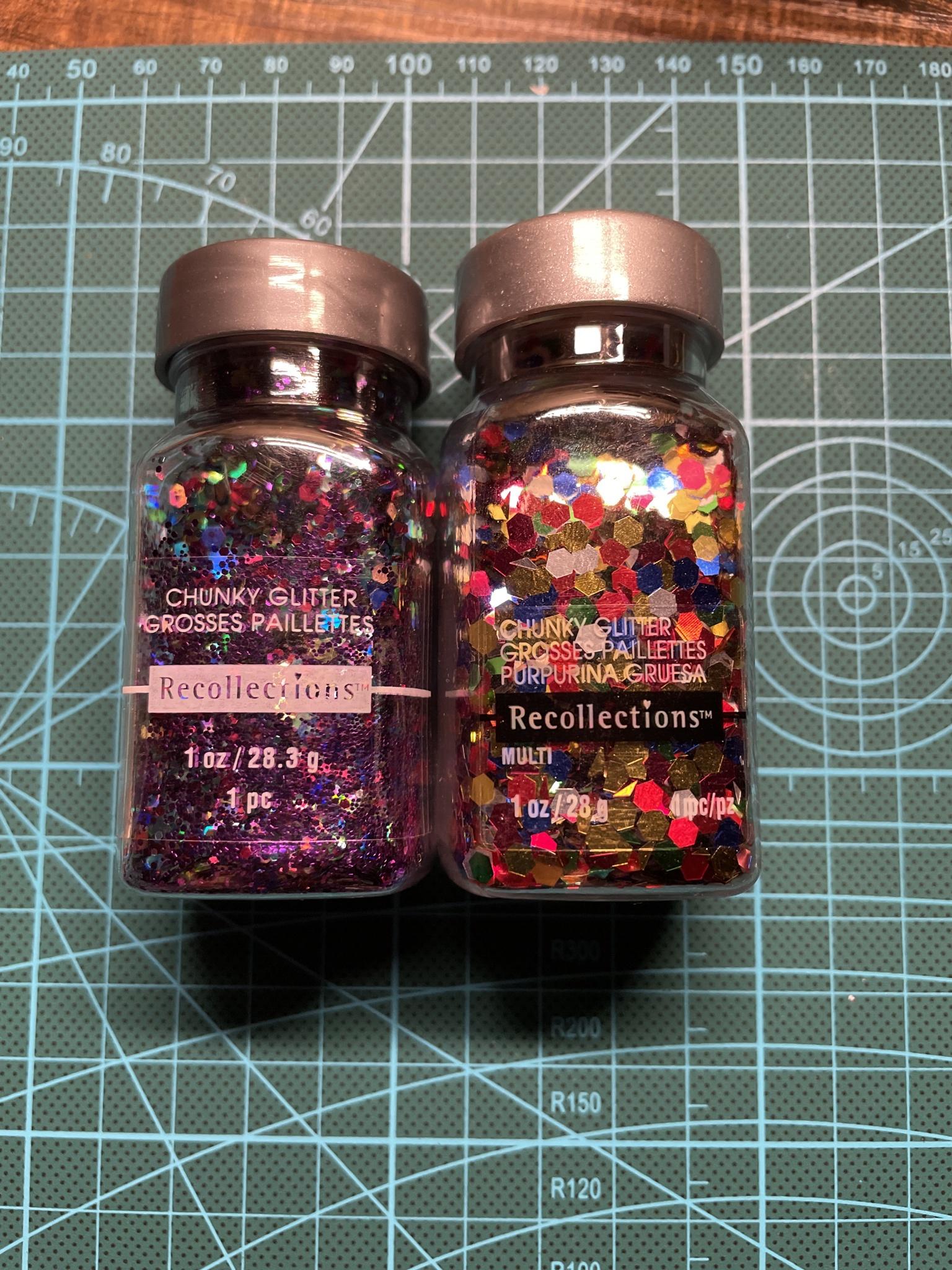
@lyleberr ,Thank you for the mentions too, glitter seems to be a kind, benevolent but very powerful overlord of my home now.
@azulryu , this is how the background I used looked after drying, it’s nothing too crazy: good old cardboard, acrylics and glitter, the supreme leader. I used the acrylics’ stickyness to stick the glitter, some of it came off immediately after I prompted it up.
After taking a few pictures of the figure with the background I took more pictures of just the background to use it for editing and adding highlights to it.
Your browser does not support video embedding. Please update your browser.
This is one of the best threads in the history of E4!
Seeing the process behind these is so good.
@pokesoap I adored that Doduo, the gloss on that paint job made me think it was clay, but i’d have never have guessed it was 3d printed. Such an interesting process throughout.
@fate I thought that glitter background was such a good approach to that background.
Great work every1, fun thread.
Yall’s art makes me want to keep drawing. I know it’s been said already but the E4 art contest binder is definitely a new collection goal
Congratulations to the winners! (and all other participants, ofcourse)
It was great to see what everyone came up with, as anything was possible.
I’ve already got a couple other designs ready for next year. (We need more ‘shining’ cards, right?)
Looking forward to it!
@muk, thank you for your kind words. It was indeed my initial thought to make something to fall in line with skyridge / aquapolis and others. For my daily work I only tend to work in black/white so my watercolor skills were a bit rusty as it had been quite a couple years. If I had made it a bit larger in real life I could’ve put more details / smoother shading in it but thought it was a nice addition that it was just double the true card’s size.
@lyleberr, I absolutely loved your original take on the shining gyarados! My personal n1. Thanks!
Thanks to all who were involved in making this contest come to fruition. I really enjoyed seeing these posts exhibiting the shear amount of effort and thought that went into everyone’s pieces. I thought I would share a super sped up video of my submission. It shows my charizard’s very derpy beginnings, my continuous changes in design, and the embarrassing moment of when I finally realized why my “z” in charizard’s name didn’t look quite right. I had a lot of fun with this and can’t wait for the next contest. Congrats again to all the winners, your talents are seriously next level.
Thank you very much @muk, glad you appreciated it! It means a lot!
Congratulations to all the winners by the way!
I honestly felt a bit sad when I saw the results, but at the same time, I experienced how hard it was to select only three entries.I struggled to choose the n°1 in Recreation between pokesoap and lyleberr because they both did an amazing job, it just ooze creativity and I was genuinely impressed by their work.
It got even harder for Original Creation, there were so many cool artworks with strong concepts! My personal favorites were : Ghost Café (my number 1), King Whiscash, Blaze Kick!, Haunter Dream eater, Japanese Tattoo inspired Dark Blastoise, “Fairy World Cup 3rd Place Trophy: Cleffa” and Charizard Tax. So congrats to all the persons who made these beautiful pieces!
More generally, congrats to all the contestants! The competition was tough and it seemed you all had a lot of fun!
Wow, amazing results
Way to go everyone, and thank you so much
I’m happy to see some of my tops picks here too, definitely well-deserving.
I personally had so many honorable mentions too, it was very hard to decide!!
Congratulations to the organizers for pulling off this event!

First, Thank you to the organizers for setting this up and putting in time to make it a reality.
Second, thanks to all the participants who put in serious work and thought into their drawings. Whether you found some crayons or went all in with 3d resin printing (Holy cow @pokesoap ), it takes effort to put something up for people to vote on so great job everyone.
Next, thanks to all the voters! Wasn’t expecting to get 1st but its really appreciated and I’m glad you all like it. Amazing to see all the other artists who’s work was enjoyed as well.
Now for what Ive been dying for, a quick critique of some of the submissions, everyone deserves to be mentioned but then this post would be forever long so I’ll just try being brief with ones I have comments on:
@liron , This marril is great and I really like how happy it feels. The multiple colors for shading and the lack of perspective for if marril is on water or in water is really childlike.
@khairis , The color blending is great between all the different colors and shades, personally it looks too good for a child drawing but maybe if it was an older child who was good at art? Awesome job.
@imakunizauntie , Congrats on the win, the colors and expressions look awesome with a fun unique style.
@muk , This is such a great concept and really cute.
@raichuforyou , This looks like a fun promotion for something, “Try the new Pokesnacks! Theyre Raichu approved!”
@liron , This one is really impressive, it looks awesome and a great twist on the original. The watercolors look great, the linework looks great, the style is a great match!
@pokesoap , I thought it was clay with a bit of photoshop but holy cow did you put work into making this. It came out amazing, thank you for detailing the process.
@fazool , The face looks great, overall looks really good with the clay.
@fate , I thought this one got the spirit of the originals colors right in a fun unique way. I appreciate you sacrificing your house to glitter for this though.
@kurtblakeinfini, No offense but the style is too dark, chaotic, and murdery for me but I absolutely loved the bottom border with the original pokemon sprites, great detail!
@pokesoap , Such a fun looking piece, I could see this being a card. Its so dynamic and fun with the action and the colors. Just fun to look at.
@thebackroom_Collectibles, That shading looks really good!
@defluo , Im sorry, I keep seeing this and I know its Haunter eating a dream but my brain tells me Haunter is eating a dying Pikachu’s soul. It looks awesome and has such an intense feeling to the Haunter.
@dreamtech , The colors are great, the symmetry is awesome, but am I not seeing Rayquaza and Suicune? They probably would have thrown off the symmetry so still put me on the list of “I’d buy this print”
@fate , I love this as a trophy card! Cleffa sucking on a lollipop while teary eyed looks adorable as well as the tiny Swablu.
@moredoom , It looks great. Your shading and watercolors look really good and the poses are wonderfully well done. You are quite talented.
@dunsparce0p , The sableye and the rocks have a style that looks like its from a childrens book. Really pleasant to look at.
@flukoluko , Great concept and great looking action. Very reminiscent to me of how the anime portrayed them as being more interested in fun with some mischief.Again, thanks to everyone who participated in some way.
More about making Shining Gyarados:
Ive been wanting to try something new for a while and I’ve seen some really nice looks from a style called Quilling. Its taking thin strips of paper and curling/folding them and placing and gluing them down to create an image. Many times they are curled into tiny little rolls but I wanted something a little more flowy. Bought a starter kit, watched some youtube videos, and decided to get started… its harder than youtube makes it out to be. Also, theres only like 1 other person out there who’s done Pokemon in a similar style and only with a couple pokemon in basic poses. So it was a bit of a challenge sketching out shining gyarados with some swirl designs to try following to not make it overly busy but not make it too empty. Overall, I think I took a week of working on it in the evenings (Since it took a bit to get material in) and even though it started as a test run, it was taking longer than I thought so I had to scrap a few more of the details like the person on the raft and the water running down Gyarados (which would have been done by cutting some placed slips and running some blue down between the cuts and also by cutting some small blue strips and placing them between inplace swirls , using both ways would hopefully give it a bit more depth and mostly not let it look so deliberate), and make it the real thing, no time for a practice run.
The cool thing about it is that since it exists in 3 dimensions, the lighting and angle can make it look more interesting or way worse. The scans really gave it a nice look with the colors being clean, but it did take out some of the color that is seen in person. Ive added a few photos from different angles to show what I mean.Now that I have everything for this, I’ll probably try a couple more pokemon card designs (GB promo Dragonite I think would look great) and see how they turn out. Also, since I wont be in a rush (cough, @azulryu , cough), I should be able to make things look a bit smoother.
Sorry for the long post, but Ive been excited since I saw everyones art and kept looking at them and couldnt wait to comment once voting was done.
Your Gyarados was definitely a top pick for me You’ve done an amazing job!
Thank you for the kind words and critique
Wow, everyone’s contribution is amazing, these are my favorite kind of threads!
Congrats to the winners! Everyone did a fabulous job. I had a ton of fun looking through all of the submissions.

First, Thank you to the organizers for setting this up and putting in time to make it a reality.
Second, thanks to all the participants who put in serious work and thought into their drawings. Whether you found some crayons or went all in with 3d resin printing (Holy cow @pokesoap ), it takes effort to put something up for people to vote on so great job everyone.
Next, thanks to all the voters! Wasn’t expecting to get 1st but its really appreciated and I’m glad you all like it. Amazing to see all the other artists who’s work was enjoyed as well.
Now for what Ive been dying for, a quick critique of some of the submissions, everyone deserves to be mentioned but then this post would be forever long so I’ll just try being brief with ones I have comments on:
@liron , This marril is great and I really like how happy it feels. The multiple colors for shading and the lack of perspective for if marril is on water or in water is really childlike.
@khairis , The color blending is great between all the different colors and shades, personally it looks too good for a child drawing but maybe if it was an older child who was good at art? Awesome job.
@imakunizauntie , Congrats on the win, the colors and expressions look awesome with a fun unique style.
@muk , This is such a great concept and really cute.
@raichuforyou , This looks like a fun promotion for something, “Try the new Pokesnacks! Theyre Raichu approved!”
@liron , This one is really impressive, it looks awesome and a great twist on the original. The watercolors look great, the linework looks great, the style is a great match!
@pokesoap , I thought it was clay with a bit of photoshop but holy cow did you put work into making this. It came out amazing, thank you for detailing the process.
@fazool , The face looks great, overall looks really good with the clay.
@fate , I thought this one got the spirit of the originals colors right in a fun unique way. I appreciate you sacrificing your house to glitter for this though.
@kurtblakeinfini, No offense but the style is too dark, chaotic, and murdery for me but I absolutely loved the bottom border with the original pokemon sprites, great detail!
@pokesoap , Such a fun looking piece, I could see this being a card. Its so dynamic and fun with the action and the colors. Just fun to look at.
@thebackroom_Collectibles, That shading looks really good!
@defluo , Im sorry, I keep seeing this and I know its Haunter eating a dream but my brain tells me Haunter is eating a dying Pikachu’s soul. It looks awesome and has such an intense feeling to the Haunter.
@dreamtech , The colors are great, the symmetry is awesome, but am I not seeing Rayquaza and Suicune? They probably would have thrown off the symmetry so still put me on the list of “I’d buy this print”
@fate , I love this as a trophy card! Cleffa sucking on a lollipop while teary eyed looks adorable as well as the tiny Swablu.
@moredoom , It looks great. Your shading and watercolors look really good and the poses are wonderfully well done. You are quite talented.
@dunsparce0p , The sableye and the rocks have a style that looks like its from a childrens book. Really pleasant to look at.
@flukoluko , Great concept and great looking action. Very reminiscent to me of how the anime portrayed them as being more interested in fun with some mischief.Again, thanks to everyone who participated in some way.
More about making Shining Gyarados:
Ive been wanting to try something new for a while and I’ve seen some really nice looks from a style called Quilling. Its taking thin strips of paper and curling/folding them and placing and gluing them down to create an image. Many times they are curled into tiny little rolls but I wanted something a little more flowy. Bought a starter kit, watched some youtube videos, and decided to get started… its harder than youtube makes it out to be. Also, theres only like 1 other person out there who’s done Pokemon in a similar style and only with a couple pokemon in basic poses. So it was a bit of a challenge sketching out shining gyarados with some swirl designs to try following to not make it overly busy but not make it too empty. Overall, I think I took a week of working on it in the evenings (Since it took a bit to get material in) and even though it started as a test run, it was taking longer than I thought so I had to scrap a few more of the details like the person on the raft and the water running down Gyarados (which would have been done by cutting some placed slips and running some blue down between the cuts and also by cutting some small blue strips and placing them between inplace swirls , using both ways would hopefully give it a bit more depth and mostly not let it look so deliberate), and make it the real thing, no time for a practice run.
The cool thing about it is that since it exists in 3 dimensions, the lighting and angle can make it look more interesting or way worse. The scans really gave it a nice look with the colors being clean, but it did take out some of the color that is seen in person. Ive added a few photos from different angles to show what I mean.Now that I have everything for this, I’ll probably try a couple more pokemon card designs (GB promo Dragonite I think would look great) and see how they turn out. Also, since I wont be in a rush (cough, @azulryu , cough), I should be able to make things look a bit smoother.
Sorry for the long post, but Ive been excited since I saw everyones art and kept looking at them and couldnt wait to comment once voting was done.

First, Thank you to the organizers for setting this up and putting in time to make it a reality.
Second, thanks to all the participants who put in serious work and thought into their drawings. Whether you found some crayons or went all in with 3d resin printing (Holy cow @pokesoap), it takes effort to put something up for people to vote on so great job everyone.
Next, thanks to all the voters! Wasn’t expecting to get 1st but its really appreciated and I’m glad you all like it. Amazing to see all the other artists who’s work was enjoyed as well.
Now for what Ive been dying for, a quick critique of some of the submissions, everyone deserves to be mentioned but then this post would be forever long so I’ll just try being brief with ones I have comments on:
@liron, This marril is great and I really like how happy it feels. The multiple colors for shading and the lack of perspective for if marril is on water or in water is really childlike.
@khairis, The color blending is great between all the different colors and shades, personally it looks too good for a child drawing but maybe if it was an older child who was good at art? Awesome job.
@imakunizauntie, Congrats on the win, the colors and expressions look awesome with a fun unique style.
@muk, This is such a great concept and really cute.
@raichuforyou, This looks like a fun promotion for something, “Try the new Pokesnacks! Theyre Raichu approved!”
@liron, This one is really impressive, it looks awesome and a great twist on the original. The watercolors look great, the linework looks great, the style is a great match!
@pokesoap, I thought it was clay with a bit of photoshop but holy cow did you put work into making this. It came out amazing, thank you for detailing the process.
@fazool, The face looks great, overall looks really good with the clay.
@fate, I thought this one got the spirit of the originals colors right in a fun unique way. I appreciate you sacrificing your house to glitter for this though.
@kurtblakeinfini, No offense but the style is too dark, chaotic, and murdery for me but I absolutely loved the bottom border with the original pokemon sprites, great detail!
@pokesoap, Such a fun looking piece, I could see this being a card. Its so dynamic and fun with the action and the colors. Just fun to look at.
@thebackroom_Collectibles, That shading looks really good!
@defluo, Im sorry, I keep seeing this and I know its Haunter eating a dream but my brain tells me Haunter is eating a dying Pikachu’s soul. It looks awesome and has such an intense feeling to the Haunter.
@dreamtech, The colors are great, the symmetry is awesome, but am I not seeing Rayquaza and Suicune? They probably would have thrown off the symmetry so still put me on the list of “I’d buy this print”
@fate, I love this as a trophy card! Cleffa sucking on a lollipop while teary eyed looks adorable as well as the tiny Swablu.
@moredoom, It looks great. Your shading and watercolors look really good and the poses are wonderfully well done. You are quite talented.
@dunsparce0p, The sableye and the rocks have a style that looks like its from a childrens book. Really pleasant to look at.
@flukoluko, Great concept and great looking action. Very reminiscent to me of how the anime portrayed them as being more interested in fun with some mischief.Again, thanks to everyone who participated in some way.
More about making Shining Gyarados:
Ive been wanting to try something new for a while and I’ve seen some really nice looks from a style called Quilling. Its taking thin strips of paper and curling/folding them and placing and gluing them down to create an image. Many times they are curled into tiny little rolls but I wanted something a little more flowy. Bought a starter kit, watched some youtube videos, and decided to get started… its harder than youtube makes it out to be. Also, theres only like 1 other person out there who’s done Pokemon in a similar style and only with a couple pokemon in basic poses. So it was a bit of a challenge sketching out shining gyarados with some swirl designs to try following to not make it overly busy but not make it too empty. Overall, I think I took a week of working on it in the evenings (Since it took a bit to get material in) and even though it started as a test run, it was taking longer than I thought so I had to scrap a few more of the details like the person on the raft and the water running down Gyarados (which would have been done by cutting some placed slips and running some blue down between the cuts and also by cutting some small blue strips and placing them between inplace swirls , using both ways would hopefully give it a bit more depth and mostly not let it look so deliberate), and make it the real thing, no time for a practice run.
The cool thing about it is that since it exists in 3 dimensions, the lighting and angle can make it look more interesting or way worse. The scans really gave it a nice look with the colors being clean, but it did take out some of the color that is seen in person. Ive added a few photos from different angles to show what I mean.Now that I have everything for this, I’ll probably try a couple more pokemon card designs (GB promo Dragonite I think would look great) and see how they turn out. Also, since I wont be in a rush (cough, @azulryu, cough), I should be able to make things look a bit smoother.
Sorry for the long post, but Ive been excited since I saw everyones art and kept looking at them and couldnt wait to comment once voting was done.
Thank you for your praise on mewtwo’s shading . I wanted to do a dark cave scene, but illuminated by his shadow ball. I loved drawing mewtwo
wow Wow WOW!!! This was such an incredible success! Huge congratulations to all of the winners! I’m blown away by all of the amazing pieces submitted. Looking through this thread even got me a little emotional at all of the hard work, dedication, and passion of the contestants and the organizers (although it seems like everything makes me emotional the older I get haha). Thank you so much to everyone that made this possible! These are the types of things that will truly stay in people’s memories for a lifetime. Thanks everyone, just for making my day a little brighter.
Congrats to the winners, especially! And as an artist, congratulations to all those who took part, putting your self-criticism and doubt aside and making something unique. There are some really cool things here, and definitely one of my favorite threads thus far! Not going to label favorites, as I’m so glad to see so many clever and creative minds here in the community.

Ahhh everyone did such an amazing job, and I’m still blown away by everyone’s entries!!! If we could get an E4 art contest card set, I would for sure buy a whole booster case.
Also, thank you so much for the votes everyone! I really really appreciate that you guys liked my work, it means a ton, and I’m honored to be besides such amazing artists!!!
Thank you soooo much for the kind words on my Imakuni’s Doduo @muk ,!!!
If it’s OK, I would love to share some progress photos, since I had a fun time putting this guy together! (If you need me to edit this post and put it under spoilers, please let me know)
I sculpted Doduo and Imakuni? in Zbrush! This is a screenshot from the initial blocking phase.
After refining the sculpture, I broke it up into several pieces and added pegs using Live Boolean in Zbrush.
After that, it was off to printing! I have a Elegoo Mars 2 Pro Resin 3D printer, and I use Chitubox as my slicer. In total, it took this guy about 4 hours to print.
I can hold him!!! Wow!!!
Getting ready to paint!
And the finished product! Ta da! Sorry I don’t have a lot of progress photos of the paint job since I was pretty much painting this guy all day Sunday before the deadline lol. I used Mr. Color Lacquer paints and a Platinum Procon Boy Mr. Airbrush 0.2 Nozzle to throw color on this dude. Lacquer paints are amazing, and flow so well from an airbrush, but be warned! They are toxic! When working with Lacquers always have good ventilation and wear a respirator mask! Safety first!
Imakuni is easily my favorite part of the model, I’m really happy with him. All of the details on his face are hand painted using a method called enamel wiping. You lay down a clear glossy coat of laquer before hand painting enamel on top. You can remove the enamel paint with enamel thinner (highly recommend Tamiya thinner) and it does not effect the lacquer paint underneath. So, you can erase your mistakes and achieve pretty fine hand painting!
The final image I submitted was edited in photoshop! : DMy plans for this model are to work more on the construction in Zbrush, adding more stability to the sculpt and adjusting the pegs, running another test print, and making the model available for free download. I want others to be able to print their own Doduo! If you have any questions about any of the stuff I shared let me know! I love building and and painting models, and I hope I can work on more projects like this soon!
Legendary Hall of Fame worthy post.
Thank you so much!
Thank you @pokesoap , @lyleberr & @fate for sharing your processes, they’re awe-inspiring in what is already the most effort-driven thread I’ve seen here. Big obvious in case I didn’t write this before (gleaming sun on my screen) but everyone who participated should do something they enjoy to celebrate themselves as together!
If anyone is interested still I’m in the mood for elaborating my piece in a lengthy visual dissertation of the mind if anyone would like to see it?