Any of you who have seen my small collecting thread know that I am trying to recollect the base set after 20 years to mark the anniversary as well as be able to share with my son who was born this year when he is older the cards his dad had as a kid.
Anyway now that I’m going on 30 and reliving all the memories of when I was 9,10,11 years old, I thought I would make a thread about a particular aspect of base set (Its the only set I ever collected) that makes it stand apart from the other early sets and that is the horizons featured on many of the cards. From rolling hills to moody mountains to dry deserts they are really beautiful! I did a rough count and around about 20 of the cards from the set have this as part of the illustration. This is more than double than in any other early set by my calculations. Feel free to post any that you like from base or other early sets as well!
I love the sunrise on Dratini over the rocky mountains in the distance!
For all the Sugimori base set artowrk, it looks as if the pokemon was placed on an already pre-drawn background and then a small shadow was drawn below the pokemon as an attempt to integrate the two. It’s as if the two were created in entirely separate processes and then merged together. I love the base set artwork, but this has bothered me recently.
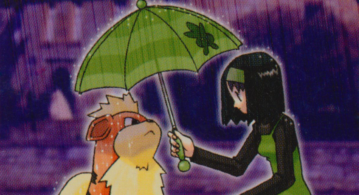
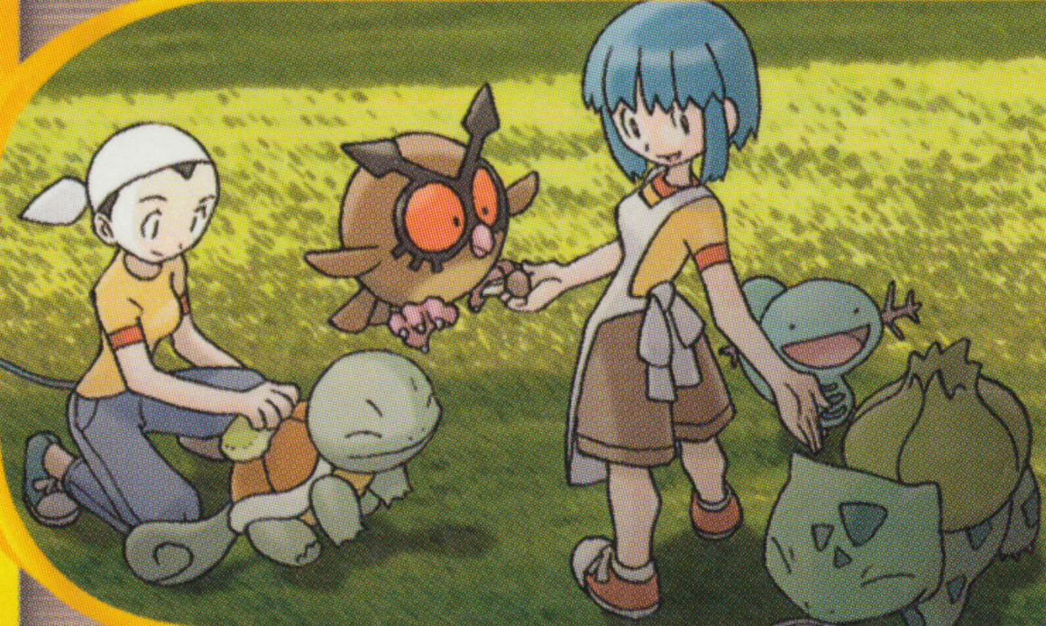
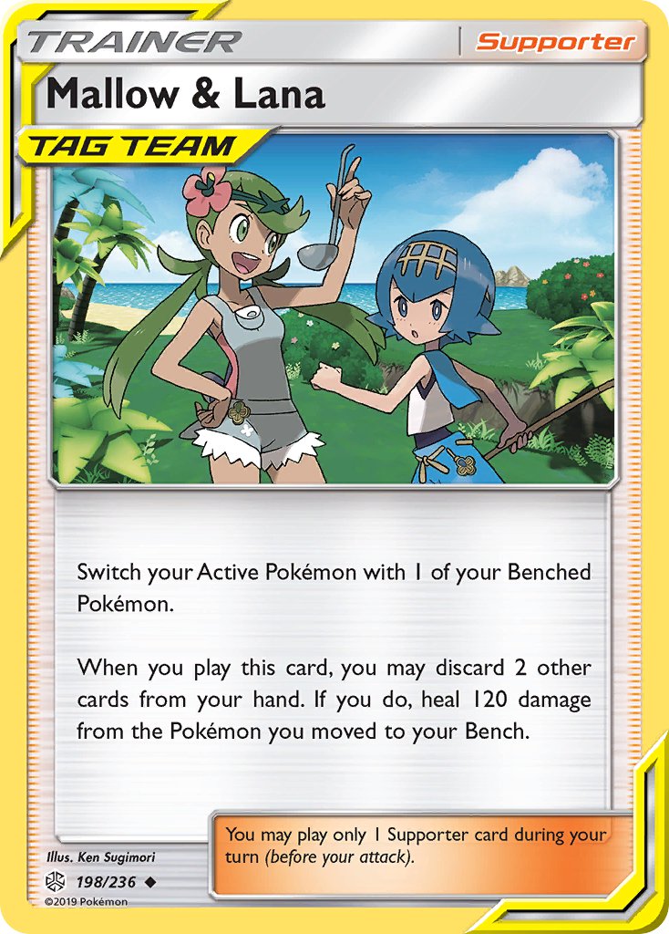
This is exactly how the majority of cards credited to Ken Sugimori are done. Funny enough most of the original art done by Sugimori for the TCG are on trainer cards that are typically overlooked. Stuff like this:
I am a huge fan of sunset/sunrise artworks in the TCG. Just so many beautiful colors and opportunities! You can’t go wrong with a Pokemon and a sunset.
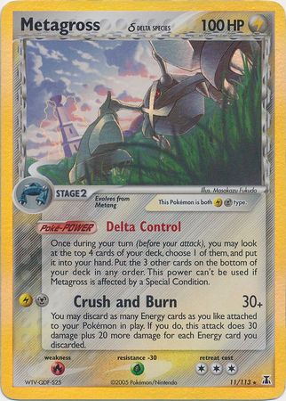
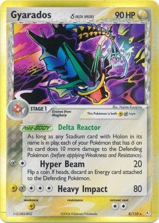
Delta Species era had probably the best art of the TCG in my opinion. Two killer cards here:
Newer cards aren’t letting up either. Tag Team GXs were really doing such a great job with the sunset artwork too!
As you know, the Pokemon are definitely done by him but are typically artwork that is already existing. For instance, Blaine’s Charizord is the same art as the Japanese box of Pokemon Red.
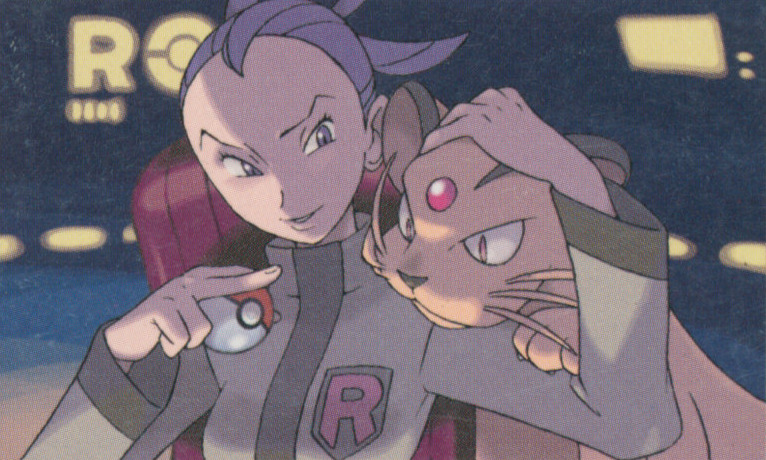
I honestly don’t know who does the backgrounds for his cards. If I had to take a total guess, I think he may have done the watercolour-style backgrounds that you see in base set. But then you see stuff like the Gym series cards. I’m really skeptical that Sugimori was involved in something like Giovanni’s Persian at all outside from originally drawing the stock image of Persian. Even today, I don’t think Ken Sugimori is doing background stuff like this:
Such a beautiful card is it just me or has it waned in popularity in recent times? I don’t see it mentioned much now where as it seemed to be very popular around 2015.
I don’t know if it’s the nostalgia hitting me or what, but I actually really like how the backgrounds feel “separate” from the Pokemon art. It helps bring the Pokemon into focus.
Just thought I’d throw this out there… This thread made me think of country artist Chris Young’s song “neon” that has a line that says “if you ain’t seen a Santa fe sunset you ain’t seen red”
Go have a listen everyone! It’s a most enjoyable song.