Text is too blurry but umbreon looks a bit like Shinji Kanda’s work and that would be awesome!
4 Likes
Hard to decide since the 3rd is a low quality pic, but I’d probably pick the VSTAR. 3rd one does have a chance though.
2 Likes
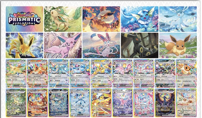
Leafeon, glaceon, and sylveon all look nice. Vaporeon looks like one of the faux stained glass etsy cards. Flareon looks good if you like that style. I have no idea what is happening with espeon but umbreon may look good depending on the fine details.
3 Likes
Thinking the same thing!
3 Likes
I like how there was an attempt made to integrate each Eeveelution’s typing with the background and art style. It lessens the blow of the silly cheese hats somewhat. That said, some look a lot better than others (namely Leafeon, Sylveon, Umbreon).
5 Likes
i think some of the stellar tera SARs have a lot of potential to be amazing. some feel week. overall, it’s hard to form a strong opinion currently, but moreorless, they are roughly what i was expecting.
for those of us who have been following this generation closely, it isn’t too big of a surprise to see tera SARs in this sort of pop-art style. I can only think of a few exceptions (eiscue and the recent hydregon come to mind). Usually they are closer to fancy full arts than they are to AR/SAR special arts.
7 Likes
That fan made umbreon was kinda close ngl
4 Likes
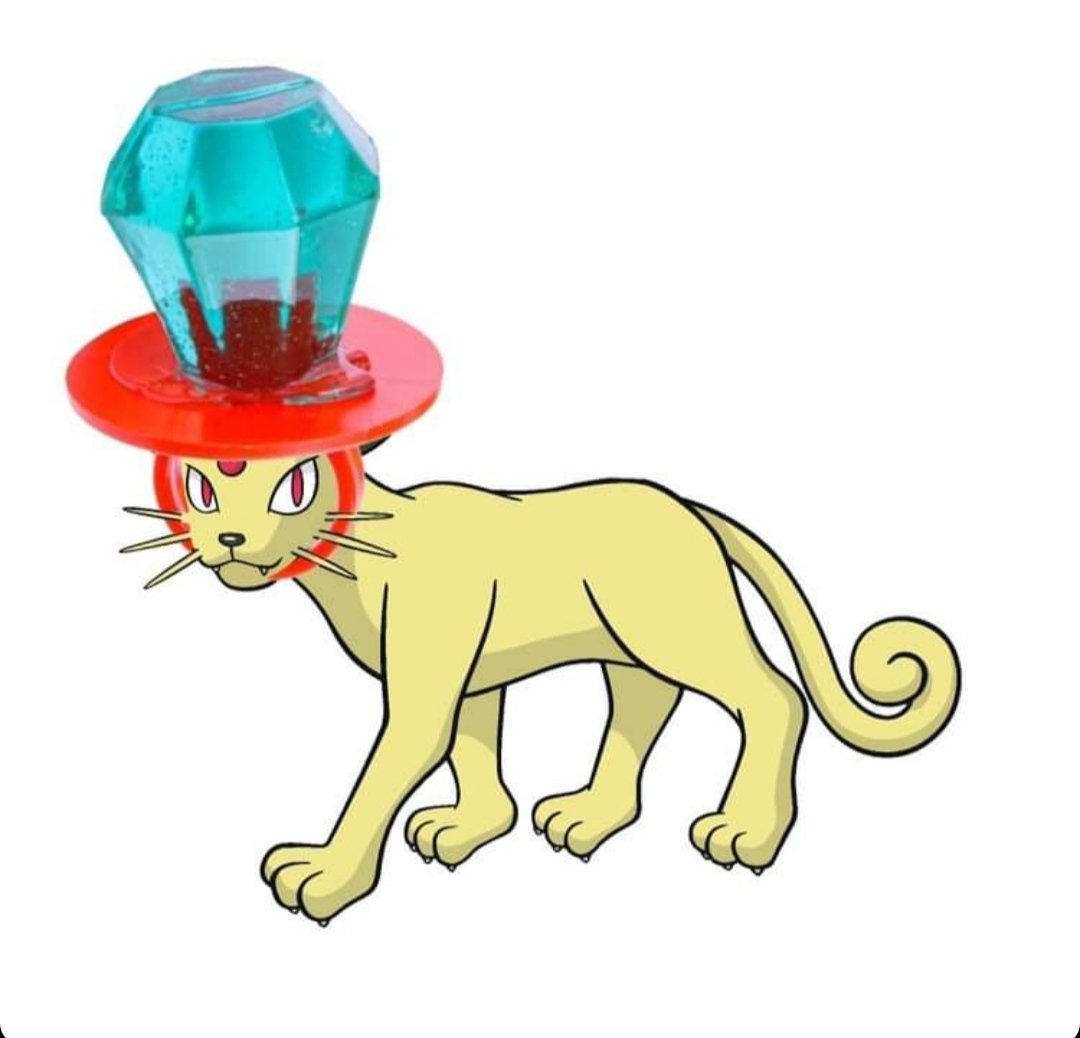
That’s exactly it. Literal ring pop Pokémon, I just can’t
3 Likes
I was going to say…
Maybe a hot take but the hats ruin the set
17 Likes
I dont think thats a hot take. I agree with that as well
I do though remember when Obsidian Flames “Stained glass” Charizard was revealed, the initial sentiment was very similar. Now its some of peoples “favorite” artwork from the SV era
The whole crown thing isnt for me though.
3 Likes
I think they’re fine, but the absence of Illustration Rares for regular Eeveelutions will hurt it more
2 Likes
Yeah, I personally think the Tera crowns are the worst aesthetic thing they’ve added to the games. And the artwork with them on the TCG ranges from awful to acceptable at best to me.
8 Likes
I think we’re all too focused on the crowns and generations from now, we will take a look back and realize it wasn’t that bad. I may be biased since I’m an Eeveelution collector, but different variations of Pokemon keeps things fresh.
6 Likes
I agree that different variations are good. That’s why I’ve been ok with mega evolutions, dynamic, and regional forms. But the crystals just don’t do it for me. It’s not so much a variation on a Pokemon as much as it is just throwing at ring pop on it. I’m sure it’ll be remembered more fondly in the future, if past opinions on the games through the years is anything to go by. But for me, this one just doesn’t do it for me.
2 Likes
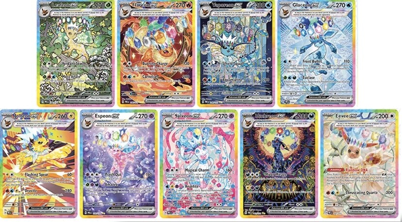
Let me put it this way: every card with the hat would look better without it. Maybe the only exception I can think of is this

The hat is kind of a scar on this whole era.
15 Likes
100% agreed.
The past four generations have had a major polarizing gimmick:
- XY: Mega Evolutions
- SM: Z-Moves & Ultra Beasts
- SW/SH: Dynamaxing & Gigantamaxing
- S/V: Terastallization
Out of these, terastallization looks the worst and is most difficult to integrate into mainstream TCG art.
12 Likes
The rainbow borders made it worst tbh, now every SAR stella tera card regardless of typing has that rainbow border…
3 Likes
What’s the consensus on why TPC keeps introducing these flashy gimmicks?
Keeping audience attention? Easier to add gimmicks to existing pokemon than creating new characters/ideas? Unnecessary attempts to keep the franchise fresh?
They could strip away the crowns and ridiculous floating gem rings, and still be left with the pearlescent crystalline skin effect, which by itself would be relatively inoffensive to the eyes but still fit in more tastefully with the prismatic theme.
2 Likes