Can someone organize a crowdfunding with a goal for both cards? 
EDIT: Now I’m thinking about a card set with an E4 stamp on it. 
Can someone organize a crowdfunding with a goal for both cards?
EDIT: Now I’m thinking about a card set with an E4 stamp on it.
Wow! Thrilled to win 1st in the Original category with my Gen 4 piece. Had a lot of fun trying something different from my usual art style so I’m glad people liked it 
@pikachutcg @banks You can add cosmos holofoil to a card by UV printing w/ cosmos holofoil (sold by folks like this). However, UV printers are fairly expensive, so if you just want a few cards made there are a lot of folks on Etsy who will take your original files and print out for you. Most that I’ve seen use a much more bootleg-looking star pattern holofoil, but you might be able to find one that replicates cosmos well.
I have just returned from a work trip into the remote areas with only brief satellite connection to keep my log in streak going. Now that I’m back.
Wow! I struggle to put into words how humbled, and appreciative I am for all your support of my art. Thank you all . I am honored to place in the top 3. The 3D piece was a challenge for me and I am so happy that you all enjoyed it. I am also grateful to have the chance to push myself, one of the hidden rewards of this event. ‘Patience” certainly is a special piece for me. The inspiration was such an awakening, I got fully immersed in it, and as mentioned in my process. I was true joy to create. That does not always happen. When it does it is exciting. When others recognize it. It is glorious! I am ecstatic that others were able to resonate with this piece. Like many artistic people, self doubt comes far too often. Not to get too sappy here, @brendantheclayboy when I read your comments on the piece , I was emotional. Thank you for those beautiful words about my art. They express what I was hoping to convey. Thank you @azulryu and Brendan, receiving Judges Choice blew me away! It was a great welcome back! I hope to post my comments for others soon. Congratulations to all! Those that placed, and those that participated! There are so many talented and creative people here on e4!
Thank you! There is no better compliment I could receive.
Thank you! I loved your submissions and look forward to seeing more of your art in the future.
Here are my added thoughts on the many really great works submitted. I really hope I have not missed anyone. If I did It is only because I was away and had to catch up. I really do appreciate every entry. Again I parrot what others have said this is one of e4 finest events. It is so inclusive allows for style and creativity at all levels. Thank you @azulryu and @brendantheclayboy for continuing to make this event a highlight on e4.
@tediorso Giga Butterfree. What a wonderful piece. As someone just learning this medium I appreciate the skill in the composition. The light is just wonderful. It reminds me so much of the Free Butterfree" anime episode. One of my favorites.
Ilex Forest Again lighting is super great. So magical and mysterious
@khairis The joy and innocence in this makes me smile. The Pokemon are so happy to be there. Crayons are one of my favorite mediums. Nothing says child creation more.
@ShiriusuSutaa
Wow. So dynamic and intense. This could be a banner
@viridian Van Gogh is one of my all time favorite artist. I love that this captures his essence. What is even more impressive is the Pokemon choice. What a perfect Pokemon for a starry night
@dromanyte Your are the OG! Your style is just fantastic. Both your pieces push the boundaries between traditional and conventional art. They are also so bright the energy just jumps out . I feel that this style emanates some traditional story telling art if older cultures. I enjoy it immensely .
@rattlesnake
Congratulations on your placing. I love the Cubone replacement. Seems almost more relevant than abra. The attention to detail while maintaining your style is inspiring. Cubone is such a complicated Pokémon. This piece simplifies its essence.
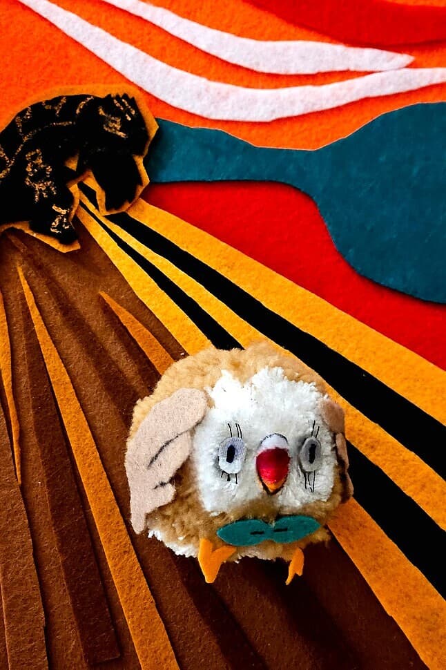
@viridian Ha the meme reference made me laugh. Rowlet is clearly distressed and capturing that in the medium of choice had to be a challenge
@MaxyMaxy Shendinja Garden . I love this! The style so reminds me of one of my favorite artist Komiya. Expression fluidity with a focus on the emotion of the Pokemon subject! Perfect.
@smpratte
Brilliant! Nothing says child like chalk!
@banks . You my friend are brilliant! What an awesome concept. Way to elevate this category to a new level. I absolutely loved this work and appreciate your vision.
@pfm CMYeon
That was an amazing process. So creative and outside the box.playing with pixels IS interesting! That is just cool.
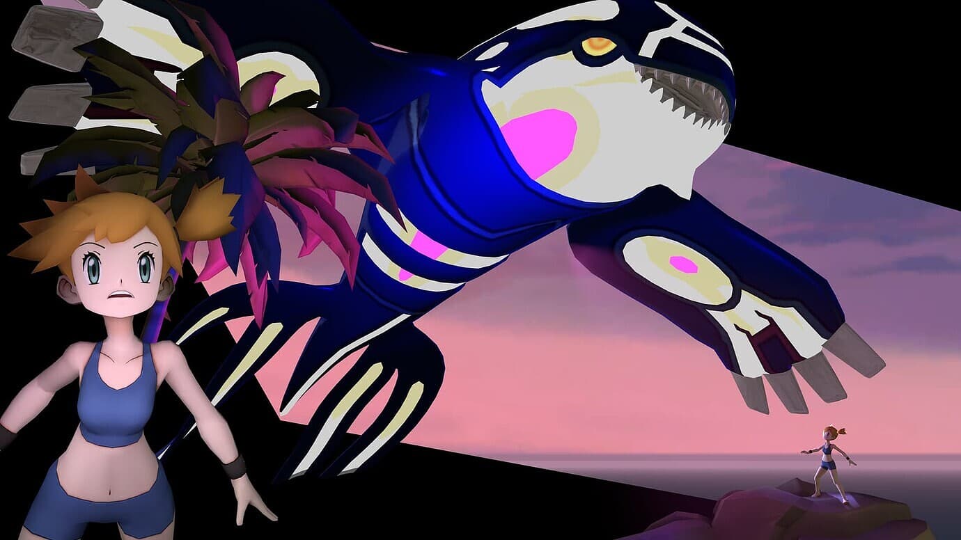
@fazool. Again you show that the 3D category can be dynamic. The double is of the trainer is great
@totodile_in_pursuit so glad you participated this round. The mixed medium has a great effect it highlights the Pokemon in the scene . It is spot on. It is so creative
@chefonaquest You can change you name, but the fact remains the art you created cutting out energies is amazing. It gets better every year. I do appreciate your attention to detail and precision . Congrats in placing again!
spring picnic is so amazing. I can barely sew a button. Sewing this very colorful and funny scene must have taken forever. The patterns really lend to old school quilting that only adds to the unique vibe of this piece. Make it a pillow, add a frame. I’d buy!
@lyleberr
I always admire your willingness to push beyond and adventure into new perspective. Both your pieces display this quality. Retro Conversion 3 is just such a better version of the original. It captures the essence of the Pokemon in a way the original could not imagine. 151 Is such a great take on lore. How could it not be liked! It is amazing how you can connect what was and is in a truly creative way. I do appreciate what you do. It is beyond what I could do. Well done!
@Silphnaut
Love Beyond Ultra space
What wonderful lore to accompany a traditional illustration. The traditional illustration for the lore makes it feel real. The flow and colors are wonderful. I love the expression on Espeons face. Says it all
@coil
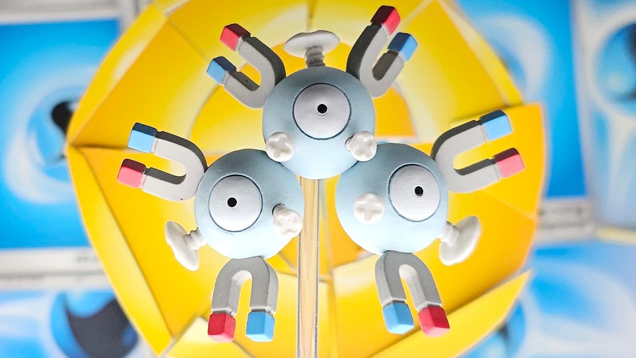
Your Magneton just pops. When you are an electric Pokemon. Pop means a lot!
Congratulations to the winners! 
 This was super fun!
That is just amazing
I so appreciate this process. I look forward to your next step! I am certain that in a small space of time you will find a new medium that accentuates your strengths in a new medium and perspectives. I look forward to following the prosses.
Consistency is hard. 3-peats are historic! Congratulations in reaching the pinnacle of achievement. I look forward to your push to rise to become legendary!
Really happy to announce that prizes have all been made and have been awarded and winners will soon have their last prize. As I always get excited about it, I think the illustrators look AWESOME.
That said, I did, for my part, want to sing praise to some works I particularly was very fond of or whom I feel the need to single out for praise on any level. The winners kinda go without saying, so I will try to keep it to those who didn’t place. Azul and I always share more in depth stuff with them and their awards.
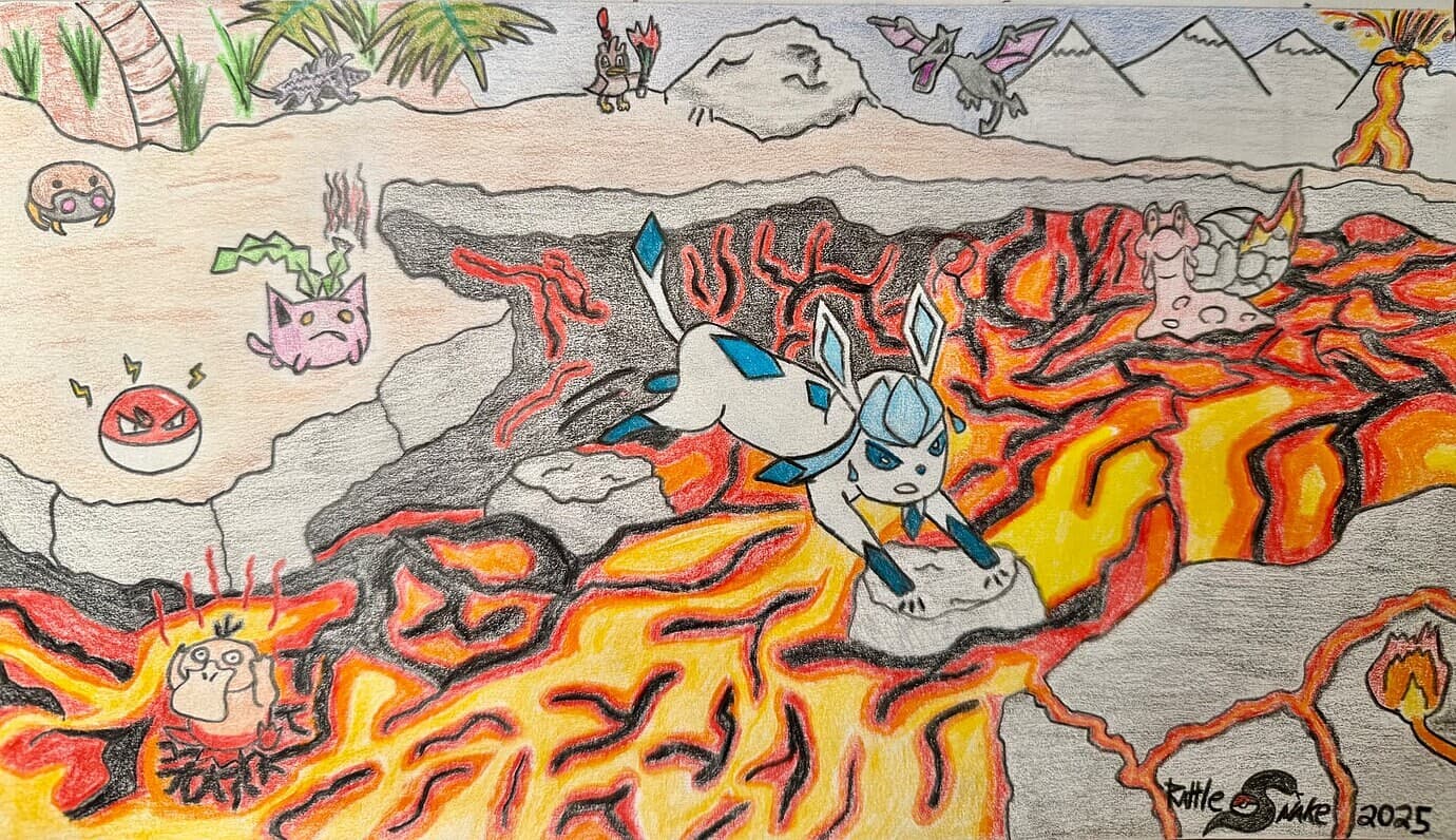
Rattlesnake, while you placed with your other piece, I just want to say how much I adore your work. Clearly everybody does too because it always performs well and you typically find yourself ranking since you joined. This is just so so much fun, so vivid and colorful… your color pencil crayon work is like me looking at baba work, it brings me great joy. You put so much love into it, and it is very clear. Glaceon cat leaping over the lava is such a phenomenal central idea.
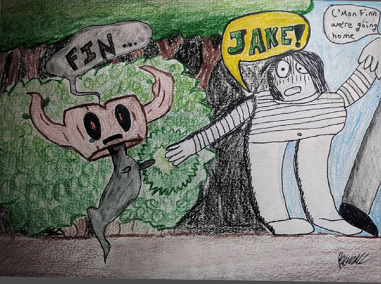
BANKS this work is amazing for very similar reasons to snake’s. Wonderfully thoughtful and creative, truly unique. I love tonally strong things like this, the black and white lost boy is such a nice touch. Great darkness. Bravo.
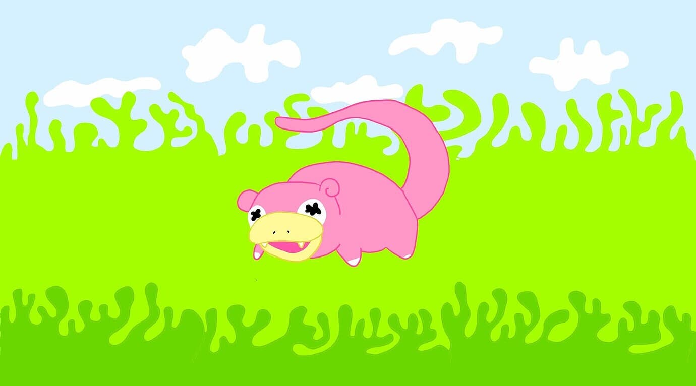
slowqueen, this just made me laugh in the best way. It had to be done, it’s awesome, can’t believe anyone’s ever thought of a rehash this obvious up to this point. I mean c’mon. Perfection.
viridian you are so amazing at recreations. Everybody loves your work, you do the category so much justice. By dramatically changing and re-envisioning the original thing in such charming ways. Mixed media too!
Coil your work here is the most underrated in the whole contest. Just like I’ve said with others’ recreations fulfilling the true purpose of recreation, this does this and so much more. I think the true potential, the fullest capacity of the category is realized when you take a bland and near-forgettable gen 3 sugimori and SUBSTANTIALLY improve and completely reimagine it. It’s like a movie remake. Some work really great even if the original is really good. But when the original is meh, the remake has potential to be all it can be, and this is like it. It’s FABULOUS. And extremely creative with the mixed media. What a great job man!
Fazool man you always have a perfect rendition and vision for the category — every year you have been a part you have knocked it out of the park and I’m your fan. I’m here to bear witness to your cosmic work. Keep doing fazool things, you have your own unique tone every time, we could see 20 3D’s and I’d without any doubt know which one yours is.
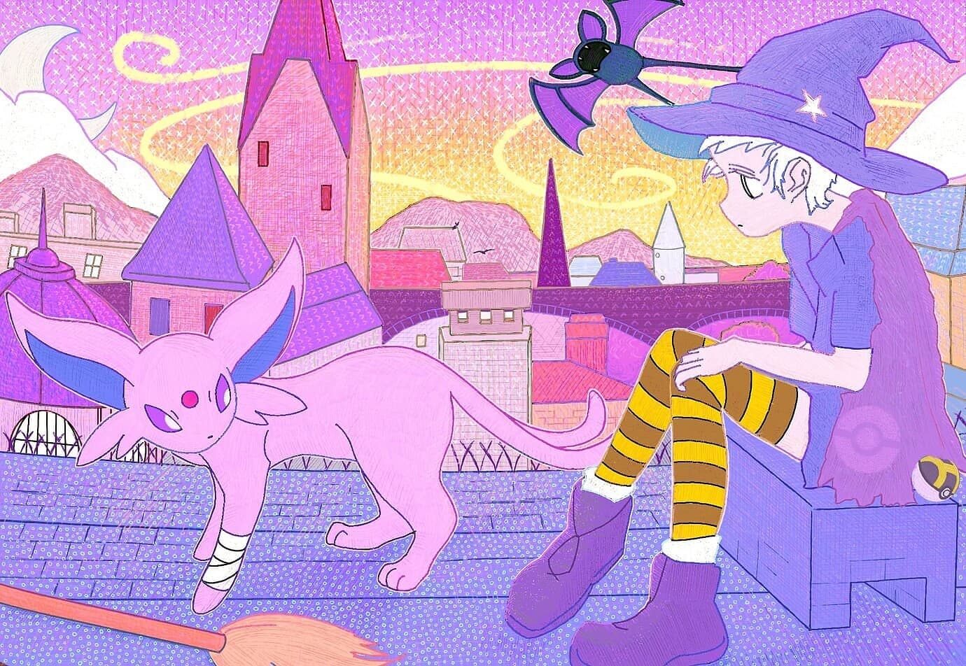
“decoy’s espeon”. decoy decoy decoy, I’m mesmerized, I’m in awe of this. One of my favorite arts I’ve ever seen in 5 years of doing this, this is a bonafide masterpiece. I’m keeping one of these for myself. Your decoy style in full bloom, your identity, the micro dots, the color palette, the little details like the ultra ball and the demeanor of the decoy, everything has such immaculate and attentive mood. What mood! You really are something else. 10/10, better than most real cards, it is stuff like this that always makes me eager to look forward to the contest — we all get to see cards better than 90% of modern, WOW.
ayoveer, I’ve been anxiously waiting to gush about this. You’ve been here every year. Every single one. I’ve watched you get better and better and better. This is your best work ever. Really proud of you on this one. Flawless. Easily another, probably top 3 most underrated in the whole of the contest, and really says a lot about how hard voting is. Make no mistake, you CRUSHED it with this one. I also want this card. It’s perfection for poliwag.
lookaclara another artist who I always eagerly anticipate and soak in with awe. While you normally do your perfect watercolors, seeing this embroidery quilt work is a sweeeet idea and it makes us consider how we need a mixed media non digital 3D sort of category to make things like this feel more special because it is oozing and ah’ing with brilliance and talent. I want this. It’s awesome.
Two more, I promise.
maxy maxy maxy. You god you. Another masterpiece. How can I really say much? I just wanted to shine the light on you and your flawless and genius work. Please never stop, big fanboy. You are the komiya of e4, but don’t worry — you are your own person. Just an analogy. In reality you follow after no one and you follow only after yourself you brilliant sir you. Aghhh. AGHH!
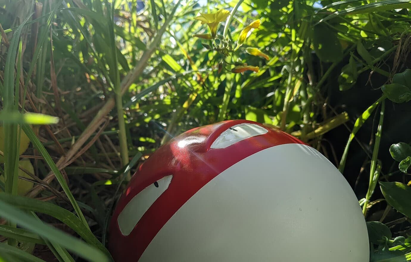
Last but certainly most. totodile_in_pursuit is absolutely imbued with creative genius. Don’t tell us if what I see was intended. Just accept that it is. Before I even talk about your creation and the photography… the lore alone. The voltorb mimicking the item ball in the wild grass… SHUT UP! The composition, the dedication to lore, your genius with your sculpture and paint, the placement, the love for the voltorbs and electrodes… The light, the flare… this is in my top 5 of all time. I voted for this. I celebrate and commend this masterpiece. I want this on a card. You, sir, are revered. Please continue to blow me away with your clever works. I’m in awe of this.
Marky, regarding this, all finalists get a few prizes. 1st thru 3rd all get corresponding #1 #2 and #3 trophies you see in the banner. None are allowed to share the original high res file here because that would be giving it away. However, we are super pleased to see that some will occasionally print them, and if it’s a real photo of them, that’s not only okay but encouraged 'cause they often turn out awesome. They also get badges given out by Azul and I but we also give to pfm to create a forum badge and they get that on their profile which they can also share on their signature – you’ll see a few of the contest alumni already using them here. Lastly, the 1st place winners get their illustrator card — now that one they are absolutely entitled to do with it however they please so if they want to share that here either digitally or in print that is completely welcome.
And I hope to see continued sharing of the artists’ processes and whatever stories / praise for others’ they have. It’s one of the more rewarding aspects of it all! If any winners decide to print their cards or trophies please share as well! Still gotta try one of these better printer experts some time cause I have some of my own stuff I’d love to see made hardcopy.
First, thank you to our lovely hosts- I mentioned this already in a pm, so I won’t tag again, but events like these are what keep the e4 community strong throughout the year, and I’m sure I’m not the only one who looks forward to them. I know these kinds of things take a ton of time and planning, and it’s important to acknowledge all of the hard work that goes in to both organization and the submissions of all of the contestants!
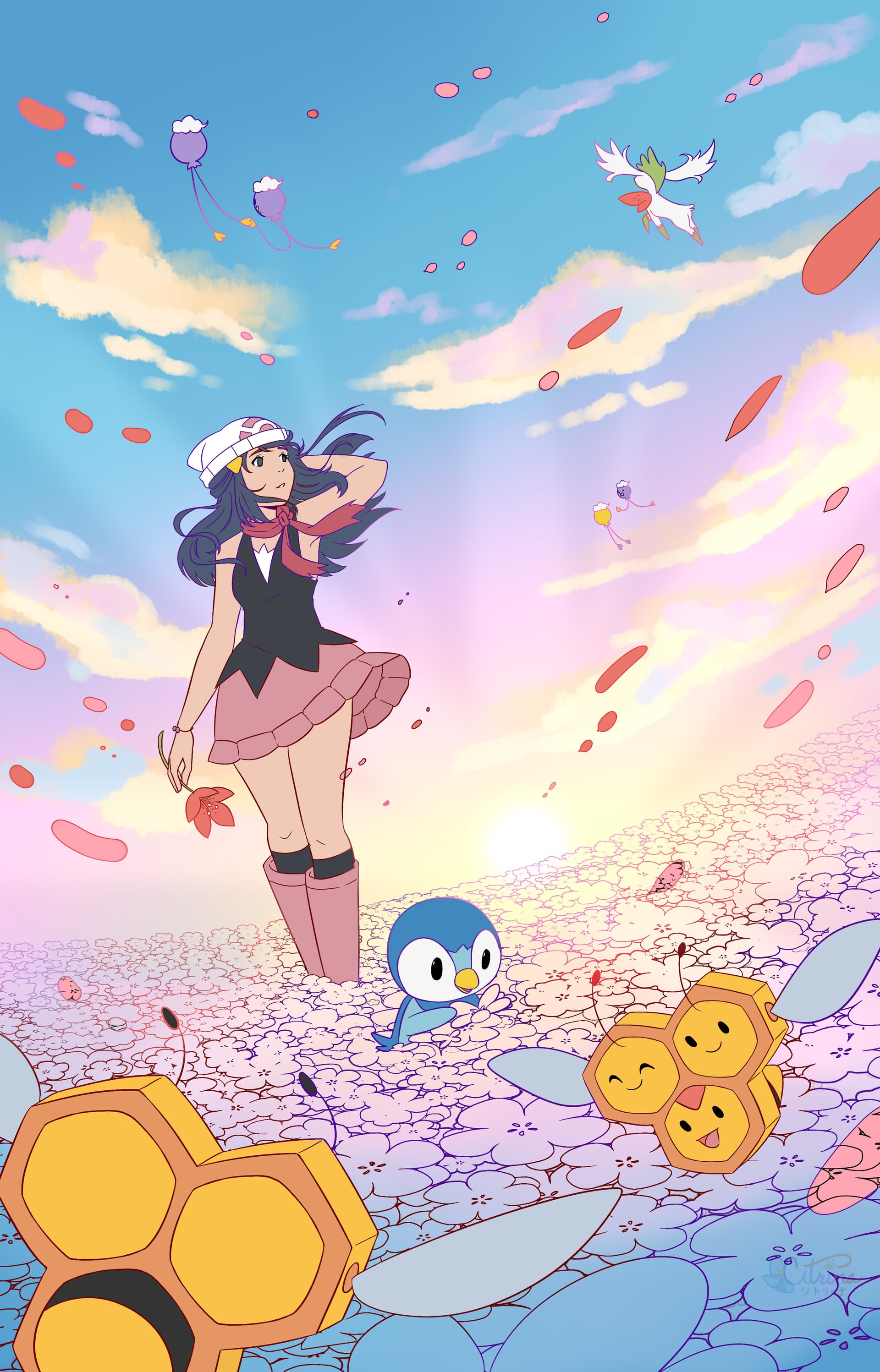
Congratulations to all of the winners, and thank you all for second in the original category! I’m very happy with how this one came out, and I’m glad to see that it resonated with you all as well.
I cropped the full piece for the competition, so here is the full extended artwork:
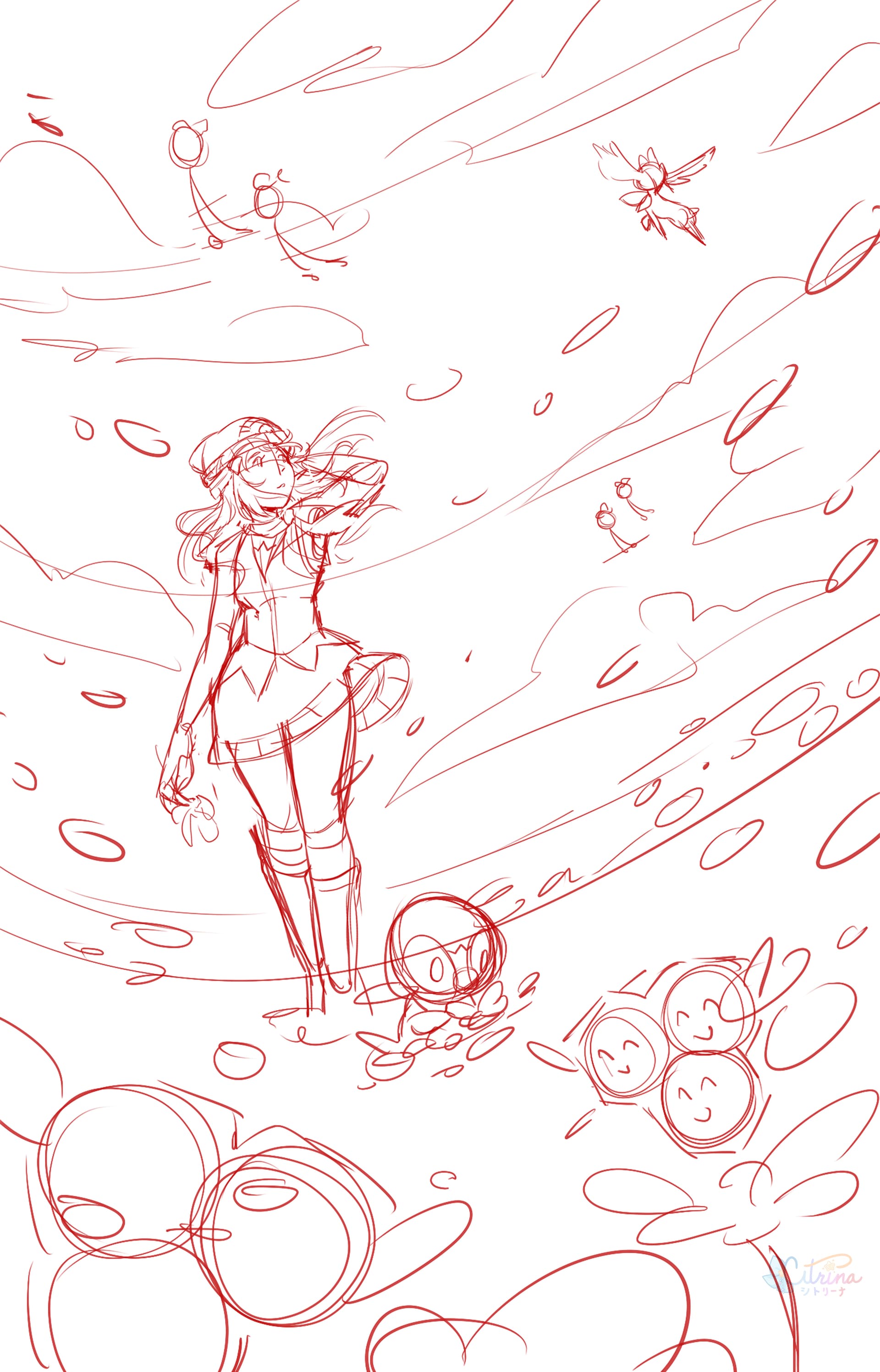
Sketch
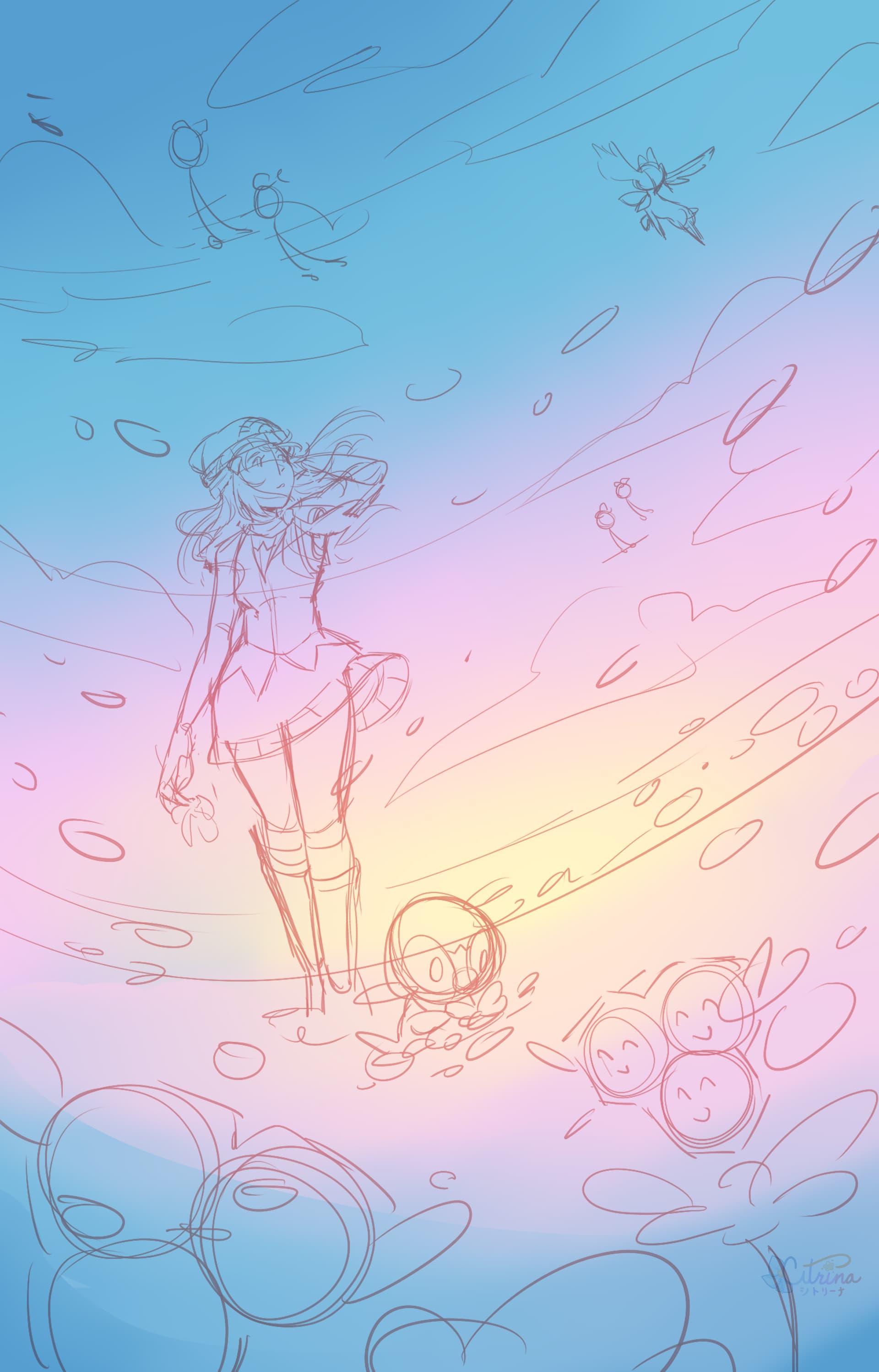
Background
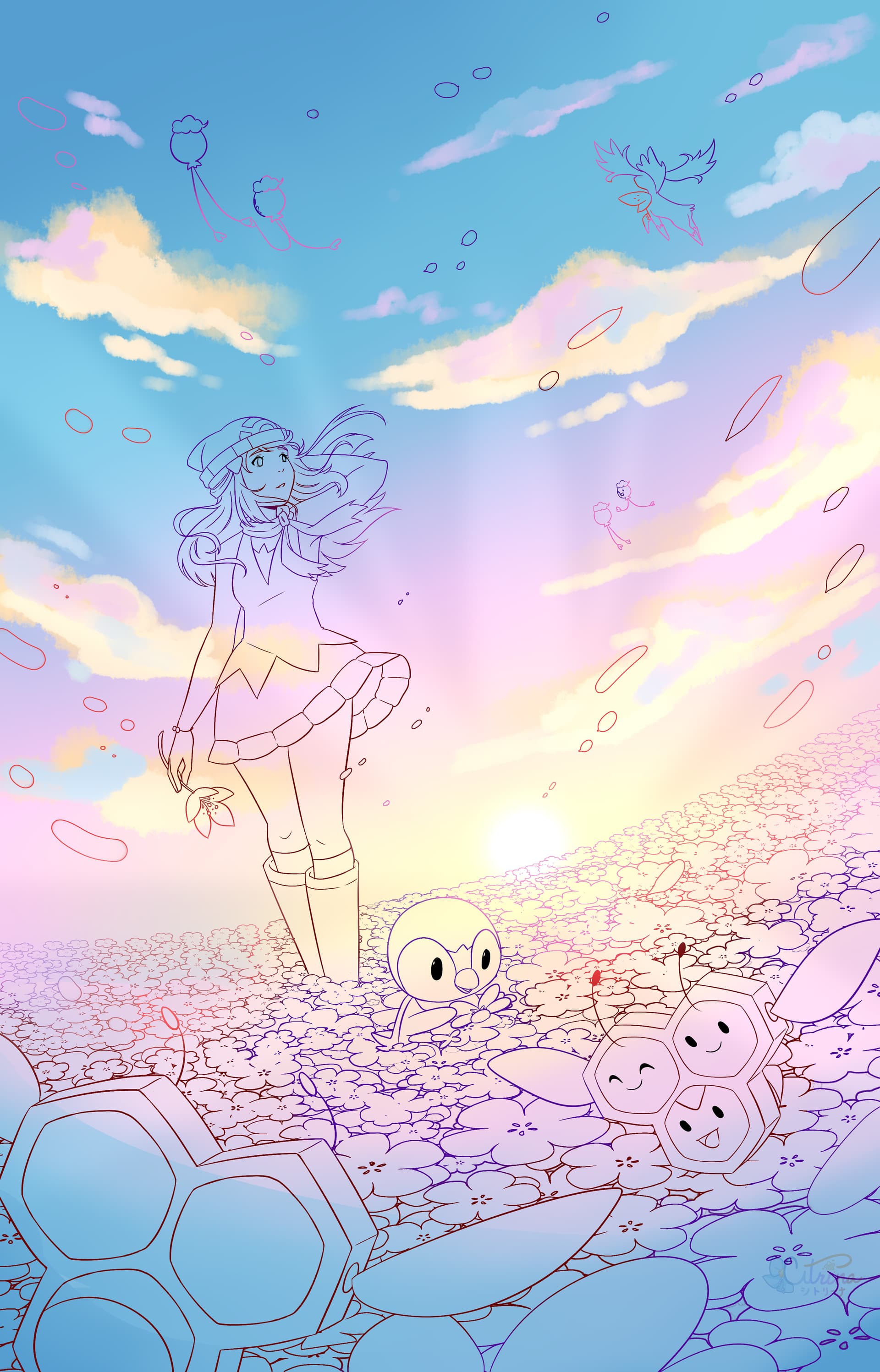
Linework
Base colors
Foreground Lighting
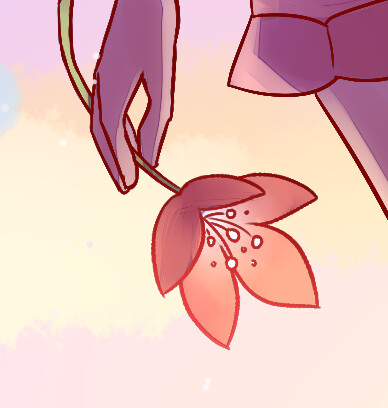
Flowers
Final touches
Once again, an amazing turnout this year. I hope to be around for many more e4 events to come!
My prize for Judge’s Choice
Congratulations to all of the winners! There are so many utterly talented people on this forum! Thank you all for sharing your talents 
I’d like to thank to the people who organized the contest and also, to all people who participated in this dynamic … Despite I didn’t win, I can’t deny that I had a lot of fun drawing the illustrations I’ve presented (which are Masaki Machamp (for Recreation category) & Pika Pop (for Original category) …
For both illustrations I decided to apply the Lineless Art Style. This Art Style was one of the 2 art styles that Sumiyoshi Kizuki used in the past for Pokémon cards (The other is Bold Art Style … that consists in thick black lines in the illustration seen in cards such as Neo Celebi)
Sumiyoshi Kizuki has inspired me a lot as an illustrator with her Lineless Art Style … Her Delibird (Skyridge) is my favourite card from all Pokémon cards and has influenced so much in the way I illustrate. Thank you so much Sumiyoshi Kizuki!!! 
I’m studying her art style in order to improve every day …
Both illustrations I’ve presented to this contest were made in Clip Studio Paint EXusing a Gaomon PD1161 Digital Tablet …
For Recreation category I’ve chosen Masaki Machamp. It’s one of the 5 Masaki cards that were distributed via Communication Evolution Campaign.
In Clip Studio Paint EX I used a lot of folders. In each folder there are layers for each aspect …
As always, I’ve included some references in the illustration …
Fun Fact: Originally I had planned to include Graveler or Golem. However, I ran out of space … so, I included Geodude instead …
In fact, these Pokémon make reference to Haymaker deck. In fact, the 3 Pokémon in this illustration make a reference to their attacks in the card …

These 2 were based on real cards. Unlike the trio from Haymaker, these 2 are not making a reference to any attack …
For Original category I’ve chosen Pika Pop. It’s one of the Pokémon minigames from the Nintendo e-Reader. In this minigame, Pikachu is in the middle of a party with Pichu & Togepi. However, radios start failing … Pikachu has to make radios start working again using ThunderShock.
This minigame was one of the few that were ported to PC to Pokémon Scoop: Winter 2004 along Rolling Voltorb & Follow Hoothoot …
In Clip Studio Paint EX I used a lot of folders. In each folder there are layers for each aspect …
As always, I’ve included some references in the illustration …
I hope you all liked my illustrations … I really enjoyed illustrating them …
If there’s an E4 Art Contest 2026, I’ll definitely participate
Thank you all so much!!!
Dr. Omanyte (Dark Magician Oma)

Thank you so much!!! The colours have a lot of energy … they’re full of life … that’s why I love this art style so much … I’m glad that you enjoy my illustrations!!!
That’s brilliant  Thank you for sharing.
A bit late, but I finally made some time to comment on everyone’s pieces. Every entry deserves recognition and brings a unique perspective/technique/concept to the table.
I really hope I didn’t miss anybody!
@khairis Not at all surprised Charmander’s Campfire won first place in the Child category. There’s something about the form of each pokemon and object that just perfectly evokes childhood imagination and “technique.” The coloring style and medium also greatly feed into the overall childhood mood of the piece. Layer this on top of a great composition, and we have a winner!
@pikachutcg I think I already spoke about your daughter’s entries, but she did an absolutely great job. The mixing of the browns and related colors in Eevee Espresso gives the piece such a good mood (like a pet that is enjoying the mess they made), and the Eevee itself is very well drawn–definitely deserving of an honorable mention! Leila’s Pikachu also looks great, and the bow is such a cute touch. I hope she continues to enjoy drawing 
@decoypalmette Your entries every year are always a pleasure to enjoy. You probably would have produced another banger in the 3D category again, but it’s great to see you branch out too. Chef Psyduck in Sir, There’s a Bug on my Southern Islands Pizza is absolute gold, and Kadabra’s expression is perfect (hard to exactly pinpoint what I’d say the expression is, but it works well!). The watercolor effect also looks great (assuming it’s digital). Of course, well deserving of honorable mention.
Hex Maniac Rooftop has such a vibe. The predominant use of purples and yellows gives the whole scene such a soft, dream-like feeling while the expressions of the Espeon and the Hex Maniac convey the somber feeling of letting go. These contrasting elements provide such good contrast. An absolutely excellent piece again in this year’s contest.
@slowqueen I’d like to think Slowpoke’s Big Day is a reflection of what you imagine every time you look at your amazing Slowpoke collection: a big ol’ Slowpoke welcoming you with open arms against the backdrop of a perfect day  Big congrats on third place in your first E4 art contest. We expect great things of your art-wise and collection-wise! (I can’t unsee big-chef-hat Slowpoke in this piece and have to constantly remind myself that it’s just a cloud) Maybe WHOApoke is just how Slowpoke views the world, which is why he always takes things a bit slow and always wants to lay there enjoying the world.
@Dyl Always enjoy seeing another experimental Rowlet-related piece from you. The concept behind Recycled Rowlet is very entertaining–kind of like a digital art piece where you can’t erase or undo any strokes. The concept would make for a really interesting competition 
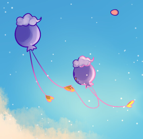
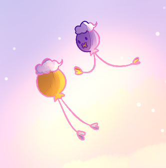
@mrbubbles TM46: The Drift Incident was definitely one of my favorites in the Child category. The whole things just screams child wonder and imagination. The dark implications beneath the veneer of the bright colors and happy kids give the piece a second layer of enjoyment. Glad you try to take the time to enter one piece in the Child category every year—the entries seem to be getting better and better! This piece placing highly was no surprise at all. (The face of the right-most Drifloon is just absolutely precious too)
@Silphnaut Espeon- Beyond the Eevee-verse definitely captures the imagination of a child, mashing different franchises together in interesting and wholly unique ways. The different Espeons do look a little like nightmare-fuel alternate-universe versions though, so hope the kids don’t make things like this and give themselves nightmares! (The centipede/worm-like one on the very right is probably the most disturbing)
Love Beyond Ultraspace captures the observer’s interest immediately given the large contrast between the Espeon’s expression and the overall dark mood and tone of the piece. But the accompanying story gives the piece a sense of hope, making it clear why the Espeon can seemingly persevere next to that tombstone.
@Rattlesnake The hat-trick master! We haven’t seen you much around here lately, but I’m glad you could find the time/motivation to join the art contest. Rest in Peace is a beautifully faithful recreation of the Vending Series Abra, but with a cute twist! The piece reminds me of the sleeping pokemon series by HYOGONOSUKE. Absolutely well done.
The concept of The Floor is Hot Lava is brilliant: combining a children’s game with your submission for the Child category. The color-pencil medium is also great for imparting the vibe of a child’s art piece. As always, it’s fun to see how all the different pokemon you’ve included are interacting with the environment. (That Hoppip doesn’t look too happy… but that Psyduck seems to think he’s in a hot tub—also, new fire-type regional Farfetch’d variant incoming? ) Also see the Conkquer in the back (still awaiting official pokedex acknowledgement of this new evolution species!).
@pfm Forest Floor is cute. I imagine the Pikachu laying himself on the forest floor to get a better vantage point for berry scavenging—I find myself doing the same when I drop things on the floor and can’t seem to find them. (The term pencil crayon, though, is an abomination)
CMYeon is such a fun concept. I just recently watched a Youtube video on how to tease apart the cyan, magenta, and yellow layers on a card art to see what the art (or card itself) would look like if it were a missing-layer variant or what it might look like if it was sun-bleached (if you subtract or weaken the magenta layer, as this layer tends to fade first). The masking of the different layers with the Eeveelution art and seeing the ghost of the Jungle Eevee emerge was very neat to see.
@smpratte A quick and dirty entry! But very appropriate for the category, with all the chalk art I’m sure everyone did as kids. The classic Mew art looks great, but I have to admit the Mewtwo was a bit hard to recognize  I thought it was a Lopunny at first.
@veks The pixel art master! Having jumped into pixel art for my entries this year, I have to say that drawing completely original pixel art is a feat to be admired. Dizzy Stomach and Dizzy Mind is such a funny concept and a very natural one at that too: kids drawing pokemon beating on each other is something that will likely never fade! In the end, it looks like one of these Poliwhirls is destined for Poliwrath evolution and the other, Politoed.
MetAAHHHHpod is also very fun. Nothing’s better than coming face to face with a drowsy-looking-yet-menacing Metapod. The coloring and different shades of green are all very well done here.
@banks The juxtaposition of the black-and-white world of the living and the colored forest world of the dead (with Phantump) is such a great juxtaposition. The reflections of this in the boy’s and Phantump’s chat bubbles are also a nice touch. The way Phantump’s chat bubble has “Fin” instead of “Finn” is also appropriately foreboding, as if Phantump will make Finn his permanent friend.
Having recently purchased a couple of Keiko Fukuyama’s Pokemon picture books, I can greatly appreciate your love for her artwork! The pokemon in the postcards are always so endearing, and every illustration has so much going on. They are absolute joys to look at. It makes complete sense to bring the focus to some individual pokemon in these arts to better appreciate the level of detail Keiko Fukuyama put into their activities and expressions. Nakama Garden is a great concept and a very easy second Southern-Islands-like set if anyone from TPC or TPCi is looking (hinthint).
@lyleberr Retro Conversion 3 is such an on-point piece. The electronic-chip aesthetic combined with the adaptability of Porygon (represented by the Porygon silhouette in the component colors making up the rainbow) is such a perfect way to visually represent both the Conversion attacks of Base Set Porygon and the data-aesthetic of our favorite polygon friend. 151 Genesis is a neat idea, but I’m more surprised that you have (I’m assuming, as I won’t be counting the stamps) a full set of these Pokemon stamps.
@ayoveer Fossil Slowpoke seems to have gotten quite a bit of love this in this contest. 1st Edition Post It Note Slowpoke is a simple, but effective, rendition of our favorite spacing-out pink fellow. Maybe this is also how Miki Tanaka first drew up the prototype of the final art
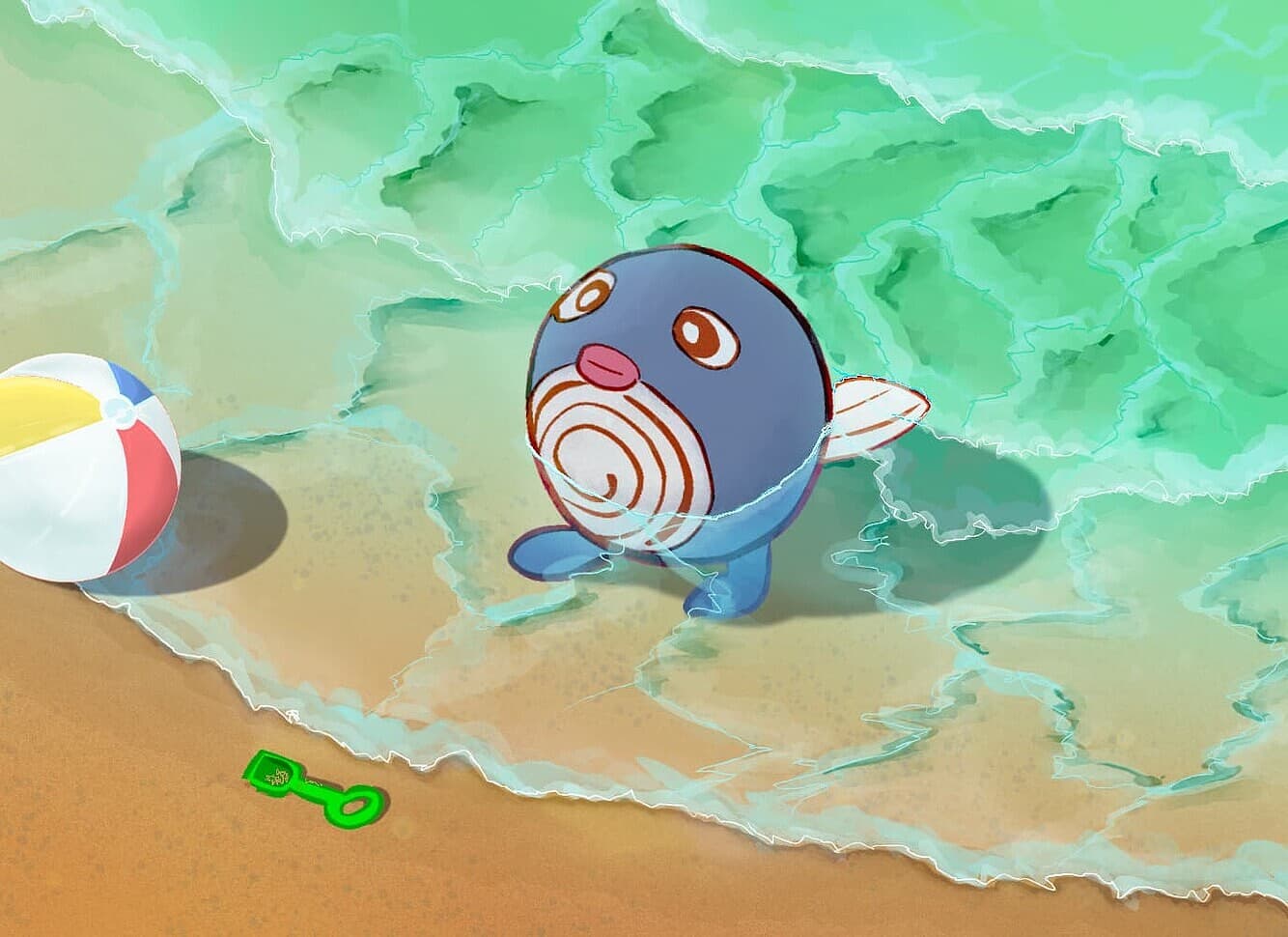
Beachball Poliwag is a great piece. The transition from beach to water, and the waves on the water itself, are expertly done. I was trying for a similar look/effect in my 3D entry, so I greatly appreciate just how good that water looks. That Poliwag also just looks so blissful and in his element on that beach!
@cyberurchin The Legendary Treasures Reshiram is an amazing recreation of Himeno’s work. I like the way roses/rose petals are depicted too—the scattering effect of the petals is great and makes the art feel more dynamic. This entry does the original art great justice!
Latios -Sparkles- is just another great piece in your portfolio of amazing art. I love the mood the dark blue and purples convey, and the parting of the waters really emphasize the supersonic speed of Latios. The angle/perspective of the composition also feels very fresh. Thanks for posting your speed-painting videos too—I always enjoy seeing the process of how these final art pieces emerge and in what order certain choices were made.
@Caterqu I can’t not love this, as a fellow crocheter. It’s a great recreation, straight down to the angle of the main Pyukumuku. And who doesn’t love a shiny pokemon!
@KantoHustle The Eightfold Convergence is a bit psychedelic (especially the patterns near the outside of the piece), but it’s great to see the eclectic origins of the different pokemon you chose (from different games, the anime, etc.). Snorlax sleeping on a bed of Voltorbs looks quite uncomfortable though!
@dromanyte The outline-less technique you chose to employ (borrowed from early Kizuki) and the different easter eggs you like to throw into your pieces are always welcome and fun to see. In Masaki Machamp, the little Farfetch’d on the right is definitely my favorite illustrated pokemon. His expression and rotundity make him very endearing.
I just looked up the Pika Pop e-Reader game, and it’s super cute! I can see the inspiration now, and I think it’s great that you were able to weave in your interest in the e-Reader data/games into this art contest.
@rtas No surprise this piece won first place! The concept and execution are top notch, and the way the art has that grainy/texture-y look shows great attention to detail. Cubone himself is also very well drawn. Definitely a well-deserved placement in the category!
@chefonaquest This piece was my absolute favorite in the category. Your energy-recreation pieces are always mind-blowingly good, and the meticulous planning you put into these pieces to achieve the color gradations and light effects really do not go unnoticed (e.g. the green in the ceiling next to the skylight). It’s always fun to see how different eras of energies have their own special uses. This particular piece looks pretty complex too, with a lot of small pieces and a ton of different colors. Well deserved second place in the Recreation category.
@Corylus Your watercolor technique is crazy good, and they always invoke feelings of Sugimori’s works. Charring Nostalgia feels like a fresh take (especially pose-wise) on a pokemon that already has so many arts. It also captures Charizard’s majesty as a (non)dragon very well.
For Clash of the Dragons, you mentioned that backgrounds aren’t your forte, but the background here looks really good. Apart from being good technically, it’s also really nice to see some of these new pokemon get the retro-style Sugimori-watercolor treatment. Every pokemon deserves to be depicted with this beautiful technique.
@viridian The pom-pom is back! (At least, I think it’s a pom-pom Rowlet) I still remember your pom-pom Torchic recreation from last year, and I’m glad you decided to use a similar pom-pom/felt technique/aesthetic for another piece this year. It’s a great recreation of the Munch Rowlet with a nice twist. Though, I can’t blame that Rowlet for looking like that with a Groudon not far behind!
Cleffa’s Starry Night is a great interpretation of a Pokemon x Van Gogh collab. Like you said, it’s a shame Starry Night wasn’t used in at least some aspect in the actual collaboration campaign. We see the great potential it would’ve had in exact piece you created. The technique with the acrylic paint also is to be praised, as it looks pretty complex (at least, to someone with no experience painting).
@lookaclara Cotton Breeze in the Recreation category is just so cute. I never get tired of looking at watercolor pieces too. Great work with this one!
I love needlework mediums, so A Spring Picnic was an absolute delight for me to see. I also recently purchased a sewing machine (though I haven’t had time to actually use it for much ), so I understand the urge to put it to use! The patchwork art is really such a neat idea, and after seeing it here, it’s something I may try in the future. I think seeing an official needlework TCG art (aside from Ito’s crochet works) would be a welcome fresh addition, and your entry here just shows what needlework can bring to the table!
@coil I didn’t know that Magneton card art existed until your post, and I actually quite like it, despite its simplicity. Your entry was a cute recreation of the art, and it highlights how simple, but still fun, entries can be for this contest.
@niece I already spoke about your entries prior, but I can speak to them again Into the Wonderball is a wonderful blend of the classic story and the Pokemon franchise and uses pokemon that are very fitting for their Alice in Wonderland counterparts (I am curious who you potentially had pinned for Tweedle-Dee and Tweedle-Dum). Also, I would have never guessed this was your first foray into 3D rigging/modeling—the positioning and lighting of each of the 3D characters looks very well done.
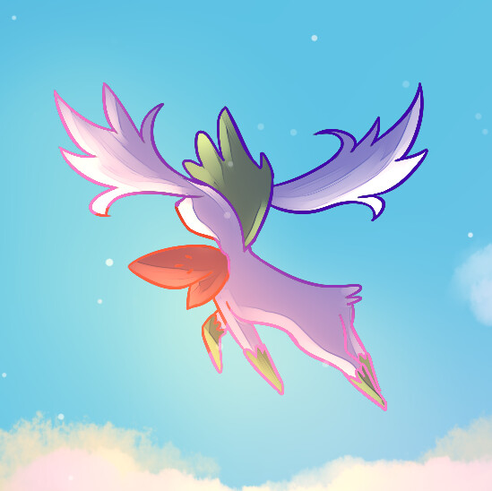
Patience is just a masterly crafted piece (right down to the little person at the end of the tunnel!). The blues mixed in with the earthy colors of the web and planks give the whole thing a sort of eerie glow. And the whole mood of the piece, right down to the sky and landscape, is perfectly fitting for the composition. Really, your accolades/placements in this contest are well deserved, and I very much look forward to what you come up with next year!
@fazool Your skill working with/rigging these 3D models is really a sight to behold. I love the relatively simple composition and background, really putting the focus on the absolute behemoth Primal Kyogre truly is. These legendaries are often relegated to mostly feeling like normal pokemon but with a bit more lore, but this piece really makes you feel and understand the gravity and weight of the legend of the sea.
@tediorso This is what I immediately thought of when I saw the piece:
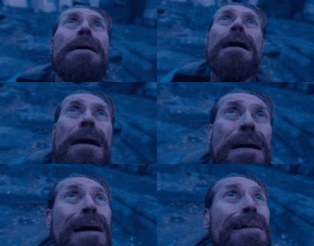
The entry makes the gigantamax Butterfree feel like an alien invader ominously gliding across the sky and really lends weight what should be a very scary phenomenon in Pokemon (i.e. gigantamaxing). The lighting of the piece, with the blinding sky right behind the giant Butterfree, also plays into the feeling of eeriness. The end of civilization might truly be near!
Ilex Forest is the complete opposite. Instead of being ominous or foreboding, Ilex Forest feels tranquil and quiet. The level of detail here in the flora is actually insane. It’s one thing to try and illustrate a location that’s been overrun by nature, and then it’s another thing to also overlay such realistic lighting on to that flora. The light peeking through the opening in the canopy and falling down on the shrine is such great composition. The level of detail in the Xerneas in the distance must also be praised. Absolutely stunning entry here.
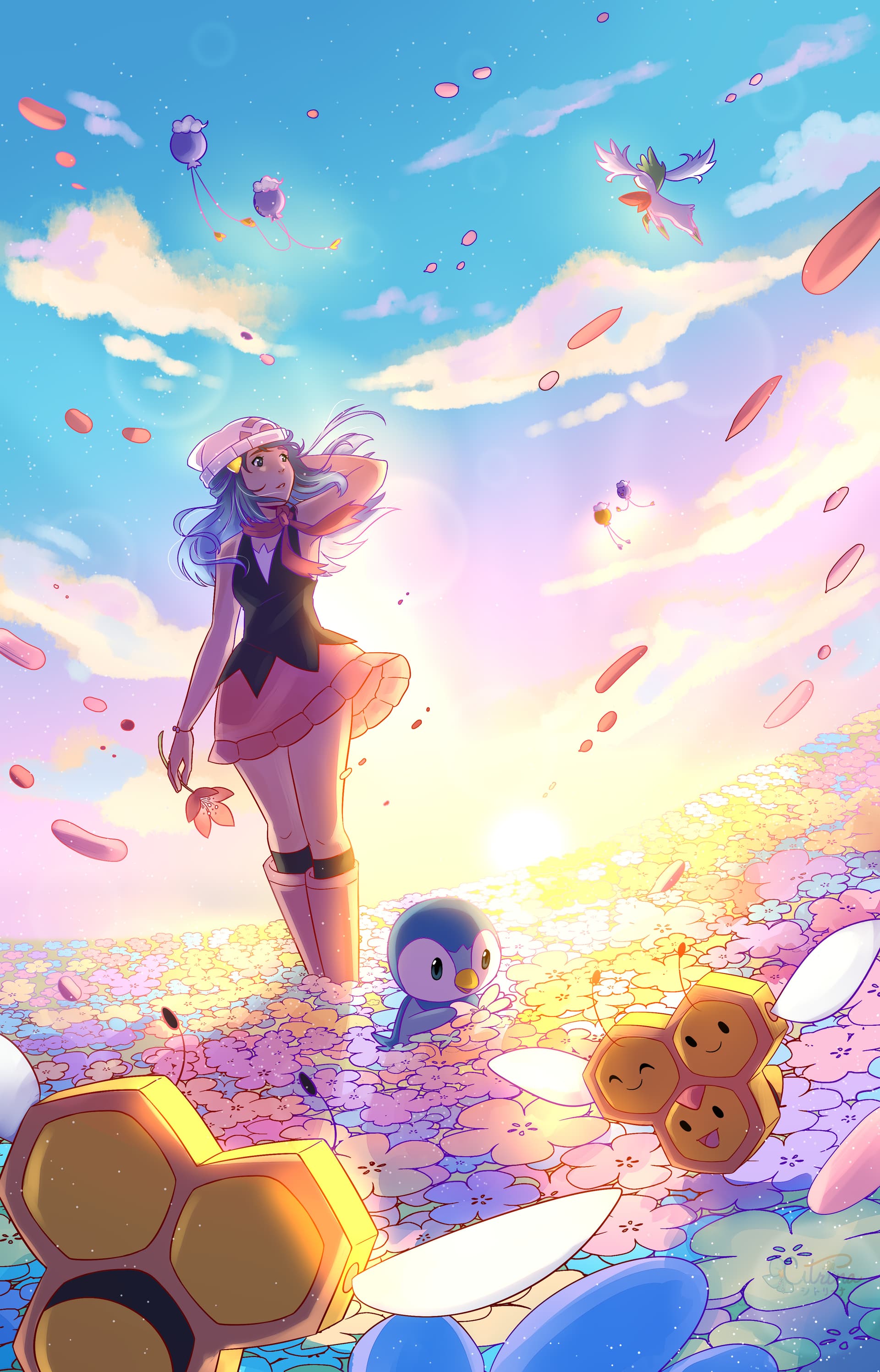
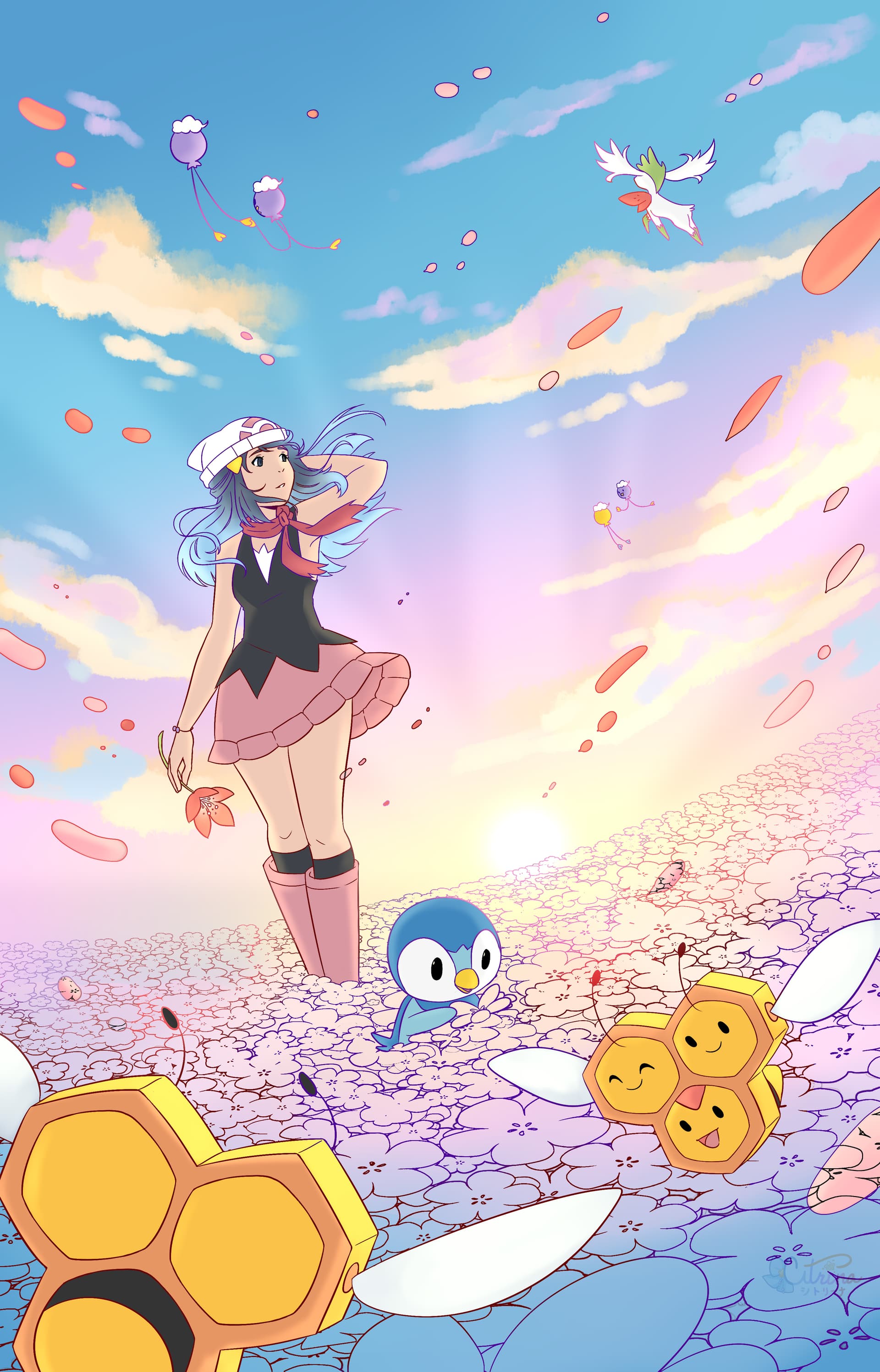
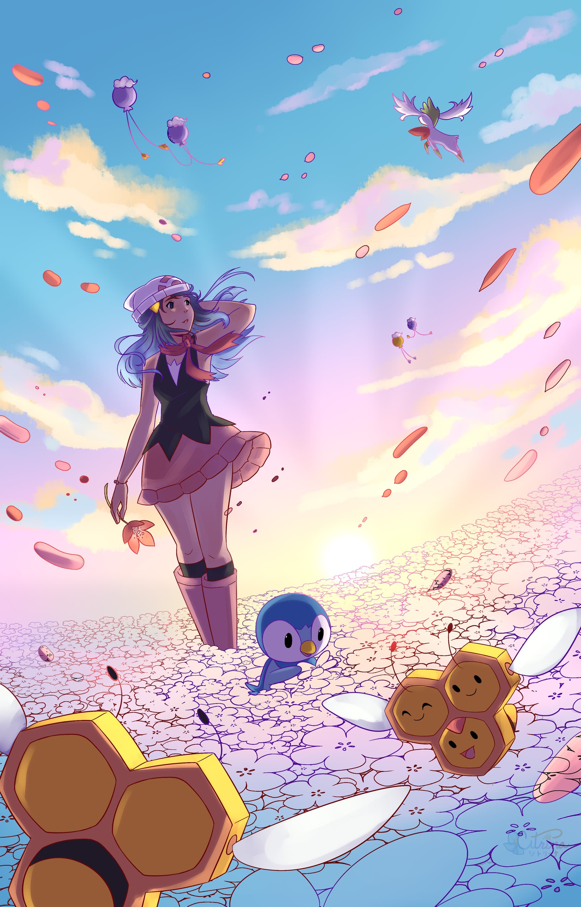
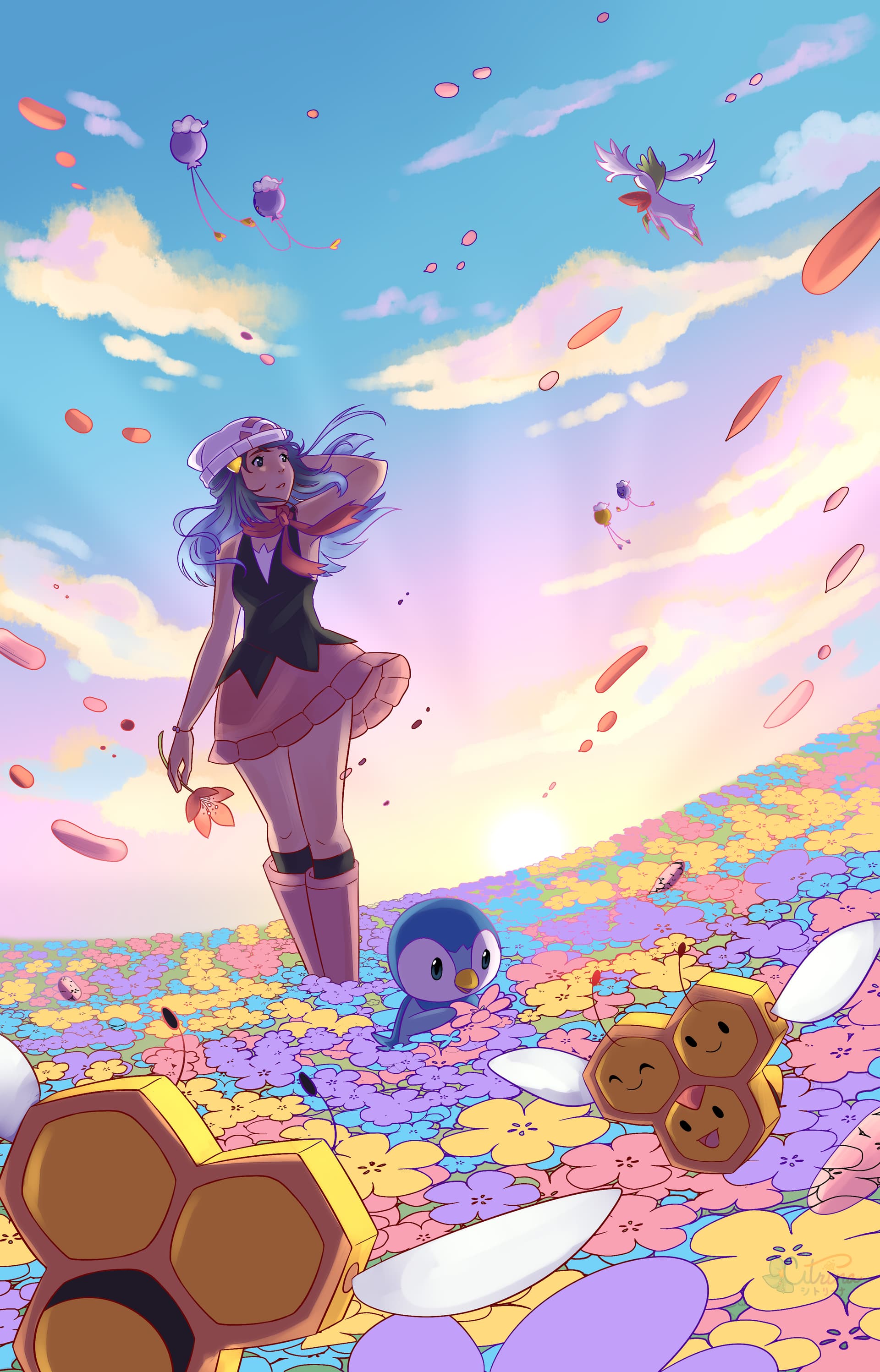
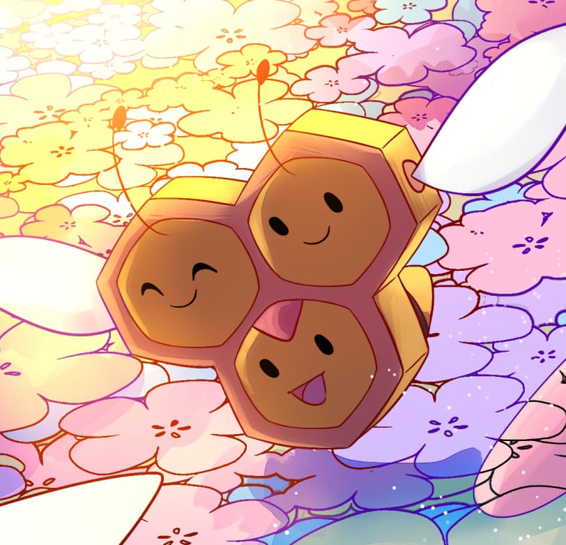
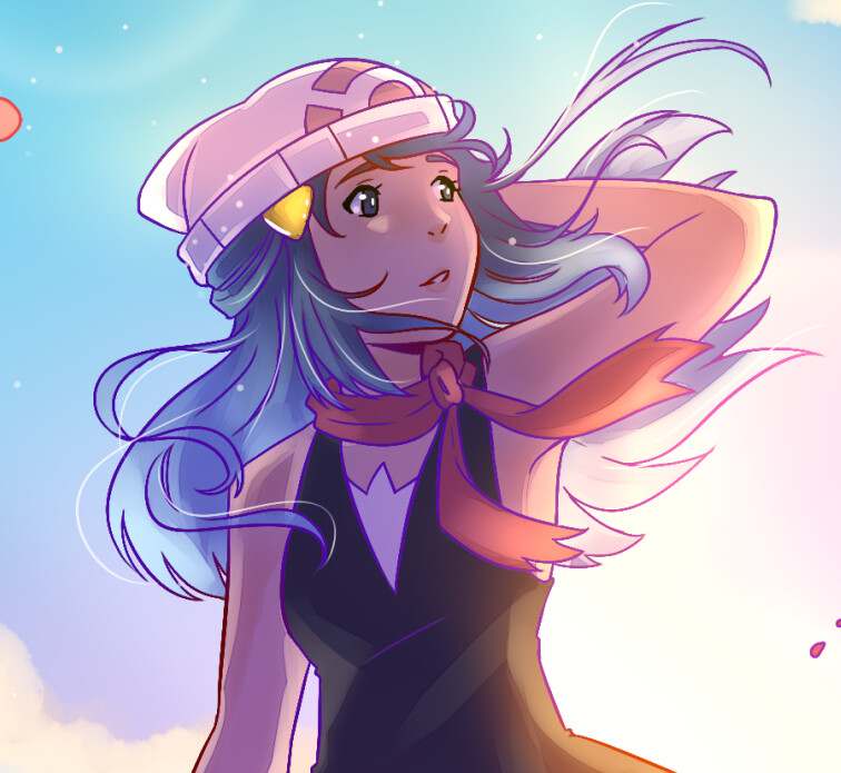
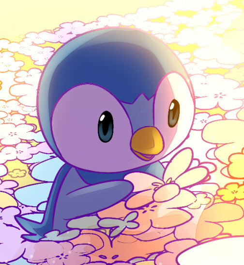
@citriina I think I’ve already spoken about it before, but I always appreciate the palette of colors you choose to employ. They always impart a warm and soft mood to your works, perfectly harmonizing with your art style. The Piplup here is absolutely adorable, and the composition with the fisheye-lens effect and the sun at the center gives the piece such a feeling of space, that we really are in a vast meadow. The backlighting is also so well done. Happy to see this one in second place in the most competitive category!
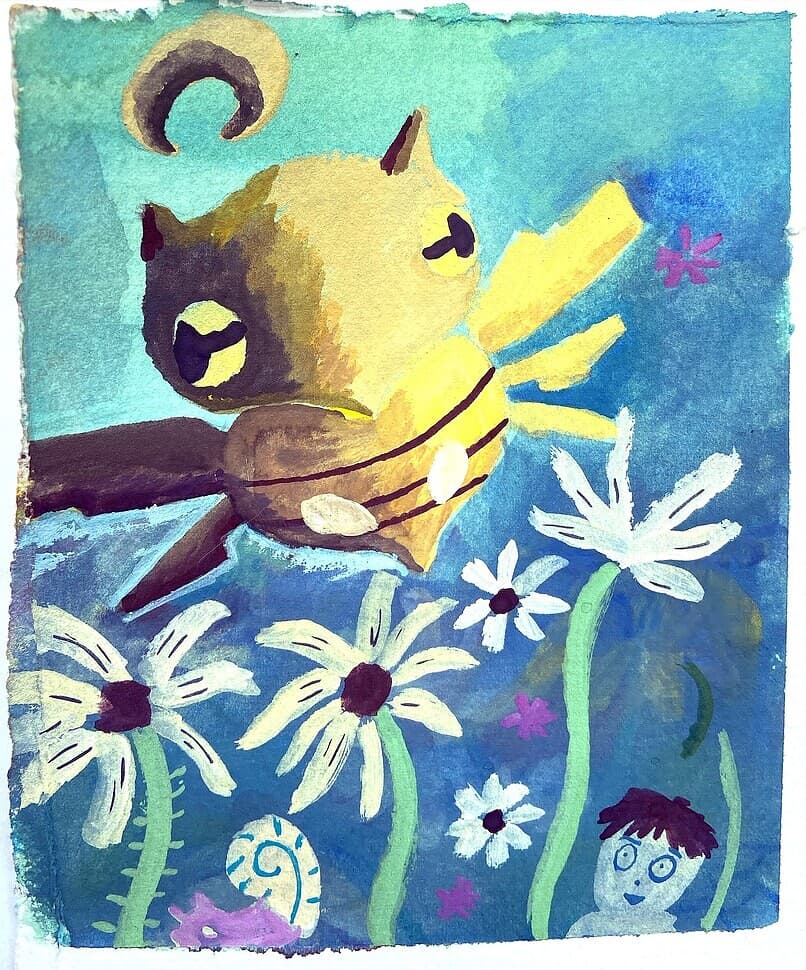
@MaxyMaxy Shedinja Garden could straight up be an actual TCG art. The style is reminiscent of Komiya, even down to the small people in the background (often with great expressions) that you can find in his work. I also love the heavy shading gradient used for Shedinja. The bright Shedinja juxtaposed against the mostly dark background and the simple flora/fauna elements naturally brings a lot of focus on the little ghost bug, leaving no room for too much distraction. Again, absolutely excellent entry.
@totodile_in_pursuit Winter’s Spring is also another entry that looks like it would be perfect for an actual TCG card. The composition and perspective is just on point, and I love all the TCG cards with the pokemon just staring at an emerging flower (there are quite a few, if I recall). I also love that the Voltorb was an actual physical object that was made. I do wish the blooming flower was a bit easier to notice, as it wasn’t something I saw on first glance. But once I did, the piece felt much more complete (even without noticing the flower though, I still loved it).
@ShiriusuSutaa Steel Gaze is just metal. From the sharp contrasts/shadows to the absolutely vicious look of Zamazenta. I love the other bright colors that were incorporated too (e.g. magenta, light blue, yellows)—they all add to the great contrast of the piece.
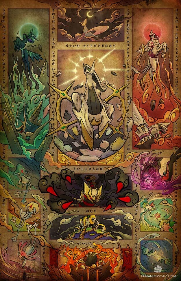
@HumanForScale The various comments and requests for prints speak for themselves about the absolute powerhouse this piece is. The Giratina is my favorite here, with the cloud-like arms/tendrils and completely menacing look. I’ll admit I don’t know the lore behind a lot of these legendary/mythical pokemon that well, but this piece makes me want learn about it all to piece together. The symmetry of the piece is also very aesthetically pleasing. Huge congrats on a well-deserved first place.
I had several Pokemon in mind for tweedle dee and dum. The egg shaped Pokemon seem pretty well adapted like. Happiney, Licktongue, is also a fun choice add a beanie with the prop it’s good to go. The vanilluxe is twinish.
Niece already submitted her COSMIC trophy for next year’s #1. WOWWWW. Just be excited. You won’t regret it.